Well, I’m on a roll here! Having plumped for internal beauty rather than – the currently forbidden – external beauty, I’m ready for another post.
Today being Easter Sunday, my previous post on egg cups would have been a good topic. But since I have already done that, I will turn to my other little collection, on couples. It is a celebration of my wife and me, of our coupledom (if that is a word), so I suppose it is a good topic for today, a day when – at least in this part of the world – families would normally get together and celebrate.
I started the collection with this piece, which I picked up in Singapore. I was there to lead an environmental audit of a microelectronics factory.
my photo
It’s carved in wood. Apart from its flowing lines, I rather liked his hand (perhaps this is patriarchal of me, but I feel that He is looking down at Her) cradling her head.
I got this next piece, also carved in wood, in one of the Alpine valleys behind Milan. I and a couple of colleagues were doing a job up there on a factory that had been closed down; we were doing an evaluation of what residual environmental problems there might be.
my photo
A hint of sadness, perhaps, in this couple? Or just quietness together? I’ve never been able to make up my mind.
I’m not quite sure where I got the next piece, made of ceramic and painted. Since it’s a knock-off of Botero and he’s Colombian, I rather suspect it was in Colombia’s capital Bogotá where I went once for a conference (for the life of me, I cannot remember what the conference was about; the only thing I do remember about the trip – etched into my memory for ever more – was having my travel bag stolen just hours before I was meant to leave: the joys of business travel…).
my photo
I know a lot of people like Botero, but to be honest I find him rather dull. He stumbled on this idea of painting fat people decades ago and that’s all he’s done ever since. It really gets a little tedious after a bit. But what’s there not to like about this happy couple?
I must have picked up this next piece, also painted ceramic, somewhere else in Latin America. I rather suspect it was in Central America. There was a moment when I was going there quite frequently since I was managing projects to establish Cleaner Production Centres in Costa Rica, El Salvador and Guatemala.
my photo
Judging from the couple’s ethnicity, I suspect it was El Salvador or Guatemala. A little-known fact about Costa Rica is the thorough ethnic cleansing that country undertook in the 19th Century.
I know exactly where I bought this next piece. It was in Cambridge (the English Cambridge, not the American one). I had taken my son there for an interview, and while he was interviewing I was wandering around the town centre. When I saw this piece, my brain said “it must be mine!” The craze that comes over collectors …
my photo
The piece, by the artist Lynn Muir, is made of wood and painted. It celebrates a song that came out in the 1930s or ’40s (I haven’t been able to pin this down). The tune was derived from one of Tchaikovsky’s piano concertos. I throw in the song’s lyrics since they explain the piece.
And when we meet, music starts
Upon the strings of our hearts,
And we don’t speak through the song,
For words are weak when love is strong.
And when we kiss there’s a sound of violins all around
And then the moment when we kiss again
Our song becomes a thrilling concerto for two,
For me and you.
And when we kiss,
There’s a sound like violins all around,
And then the moment when we kiss again
Our song becomes a thrilling concerto for two,
For me and you.
I just love the way her hair flows out behind her as she listens to his song! Formally, the piece is a box, but we’ve never used it to contain anything. All I have in there is a sheet of paper, giving a quick bio of Lynn Muir.
I’m not sure where the next piece comes from, or even if I bought it – I rather suspect our daughter did.
my photo
Its design harks back to the first piece – one head holding up another. It’s carved in stone, soapstone I think. Unfortunately, the stone is quite soft and the piece has got chipped over the years. But that doesn’t take away from the piece’s intimacy.
The final piece in this modest collection definitely comes from our daughter. There was a moment when she was charmed by this little collection and wanted to add to it. I hope she is still charmed by expressions of a couple’s love.
my photo
Like the previous piece, it is carved in stone. Unlike all the other pieces, it is she who supports him – he grows out of her, as it were, the opposite of the old Biblical story that Eve was created out of a rib in Adam’s side. A sign of the times perhaps?
With that, I wish all of my readers a happy Easter – or to put it in slightly less religious terms, a happy start to Spring!
I cannot believe it! We’ve been condemned to another three weeks of lockdown!! We are now scheduled to creep out of this apartment – pale from lack of sun, low on muscle mass, masked, jittery around other people – on 3 May. What a misery … I feel that I have been robbed of my Spring this year.
The worst of it is that I have written so little on this blog. I have been cut off from the outside world, which has nearly always been the source of my inspiration. (It’s true that I’ve also been sick; we’ve been debating ever since what I got: Covid-19 or just an ordinary flu? I was very asymptomatic – no fever, no cough – so I plump for the latter, but we will have to wait for a confirmatory test some time in the future when there are enough tests to go around). For the last three weeks, we have been forced to turn inwards, wandering from room to room in the apartment. This photo, which was emailed to me by an old colleague and is no doubt doing the rounds on social media, captures the feeling well. Well, I’ve finally decided to make the best of a bad job. If I can’t go outside, I shall look for inspiration for this blog in our apartment, and more specifically in all the knick-knacks which my wife and I have collected over our years together, as well as those which we inherited from my mother-in-law, a great collector of knick-knacks. I will start with our little collection of … egg cups.
I start with this trio of egg cups.
my photo
These were bought by my mother-in-law, who had a great eye for the picturesque knick-knack. I find them really cute, especially the middle one, with its blue and white striped socks. It’s my favourite egg cup for my boiled egg at breakfast. We didn’t really know much about them until that time we went to visit my friend Mark in the UK (who tragically died a few weeks ago). His wife Helen, who in retirement had gone into the antiques trade, had one exactly like them. She told us that they were collector’s items. I have since learned that they were made by Carlton Ware, a pottery manufacturer based in that bastion of English pottery, Stoke-on-Trent. The company was established in 1890, went into receivership in 1989, and was resurrected in 1997. My mother-in-law can’t possibly have bought them here in Italy. We have concluded that she must have come across them during a trip she did to the UK in the early 1980s with a busload of friends. They must have caught her eagle eye in some shop they visited.
My next trio of egg cups completes our egg-cup collection – as I said, a small collection.
my photo
My mother-in-law picked up the two bald-headed newspaper readers. Where she picked them up we have no idea. The pieces carry no identification marks, so its designer and manufacturer must remain in the shadows (unless a kind reader could help identify them?). I love them, but I musty admit they are not very practical. As anyone who eats boiled eggs knows, you really need 360 degrees access to the top of the egg to be able to eat the insides of the egg with ease. The newspaper rather blocks that access. So I do use them for my boiled egg at breakfast, but only from time to time.
The middle piece is my one and only addition to my mother-in-law’s egg-cup collection, and I must confess that I bought it more out of a sense of desperation than anything else. I had promised myself a number of years earlier that I would add to my mother-in-law’s collection, but I had failed to come across any picturesque egg cups. This one sort-of fitted the bill. It’s a little too obvious in its picturesqueness, and its actual depiction of a face rather spoils the idea of using the egg to complete a human figure with a faceless head. But it was the only egg cup I had come across after years of looking around that came anywhere close to the central theme of my mother-in-law’s collection. As a result, I hardly ever use it.
There is one piece that waits to be added to the collection. Last year, during our annual visit to our daughter in LA, I had accompanied her to the ceramics classes she was taking at the time. I used the occasion to make myself an egg cup, basing myself on the design idea behind my mother-in-law’s collection (the egg is the faceless head of a human body). We had already left when the piece was finally fired, but the idea was that when we went to visit our daughter this year, I would pick it up and bring it back. But this damned Covid-19 virus put a spoke in the wheels of that plan! Our flights were cancelled and we had to give up the whole trip. Hopefully, I can pick it up next year when we go and visit her.
If any of my readers know of any picturesque egg cups which would fit into my mother-in-law’s collection, I would be glad to hear about them. When we finally get out of this bloody apartment, I might be able to track them down.
A week ago, my wife and I were taking a walk from Santa Margherita Ligure up to the National Park of the Monte di Portofino, a park we walk in often when we are in Liguria. At some point, as we climbed, we got a magnificent view over the Gulf of Tigullio – it was a beautiful sunny day, with a little haze. Out there on the waters, I could barely make out the white sails of two sailing boats.
My photo
Those sails might have been mere specks on the water’s surface, but the sight of them was enough to bring me back to my – very modest – experience of sailing on the Norfolk Broads when I was a young lad.
I have always been fascinated by the three-dimensional shapes which more-or-less triangular or square sails will take under pressure from the wind. I’m sure there are articles which will give you mathematical descriptions of these three-dimensional shapes – I tried just now to find such an article but failed to find any for which I didn’t have to pay. But the point is that sails taut in the wind are just beautiful shapes to look at, whatever mathematical formulae are used to describe them.
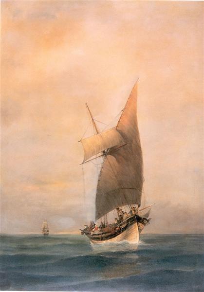
Many artists from ages past have also been touched by the sheer beauty of sails, so in memory of those days which I spent as a young boy looking at those sails taut and humming in the wind, I include here a little gallery of some of the nicer paintings I came across of boats under sail.
Simon de Vlieger’s “A Dutch Ferry Boat before the Breeze”, from the late 1640s
At this point, photography took over, black and white at first, then colour. So to complete my gallery, I throw in a couple of modern photos of old yachts.
After I had finished giving my course on sustainable industrial development at Kyoto University, my wife and I took a week off to walk the woods of Japan. Last year, we walked the Nakasendo Way. This year, we hiked along the old Kumano Kodo pilgrim trail. Just as had been the case when we walked the Nakasendo Way, we were struck by just how much water Japan has. In all its forms – rills, brooks, streams, rivers, waterfalls – the water welled out of the mountains we traversed and trickled, ran, poured off their flanks. The noise of water running across rock and stone was our constant companion.
our photoour photoour photoour photoOur photo
No wonder water is such an integral part of Japanese gardens, from falls
All this water, and the rain which is the source of it, means that there are high levels of humidity in Japan, excellent conditions for the growing of moss. I have read that of the roughly 12,000 species of moss known worldwide, some 2,500 varieties are found in Japan alone: one-fifth! That’s pretty good going. And they certainly beautify Japan. Moss casts a lovely green sheen on everything it touches. This is true everywhere but it is particularly true in Japan. On our walks there, we’ve seen it growing luxuriantly on felled trees and tree stumps.
our photoour photo
We’ve seen it clustering thickly around the base of standing trees.
our photo
and throwing a gauzy veil over their trunks.
our photo
We’ve seen it throw a light mantle over rocks.
our photo
It doesn’t stay in the forests. It will colonize the artifacts created by man.
Our photo
We’ve even seen it make the ugly concrete edges of a road look lovely!
Our photo
The genius of Japanese garden designers is to have fought off the instinct, which we seem to have in the West, of banishing moss from their gardens. Instead, they have welcomed it in with open arms and integrated it into their designs. As a result, no self-respecting Japanese garden is without its moss.
Our photoour photo
Given my weakness for Zen gardens, I love the way the designers of these gardens have incorporated moss into their designs.
our photoour photoour photo
Some gardens use moss the way we would use grass, creating “lawns” of moss.
our photoour photo
If the light is right, the effect can be quite magical.
our photo
A good number of temples have extensive moss gardens, where moss covers the floor of the whole garden. The most famous of these is Saiho-ji temple in the western outskirts of Kyoto. It’s become a UNESCO World Heritage Site. It’s difficult to visit. You have to book months in advance, using a system of return postcards, which is really primitive in this day and age and very difficult to do if you don’t live in the country. But we managed it this time.
our photo
A good number of years ago, as I relate in a previous post, I built my own Zen garden in a corner of our balcony. I had no moss, though, in that garden. The micro-climate on the balcony was too dry and harsh. But maybe, one day, somewhere, I’ll make myself another Zen garden, and this time I will try to incorporate moss.
My wife and I were recently walking to the library of the Italian Alpine Club, with the idea of looking at some guide books on a walk in the Dolomites which we will be doing in a few weeks (and on which I hope to write a post or two). The walk took us through a part of Milan with which I’m not familiar, and so it was that I found myself walking for the first time through a little square. In the middle of it was this very intriguing statue.
As readers can see, it consists of a man emerging from a stone plinth, naked but for some sort of cap with ear flaps on his head, holding a lit torch in one hand, and wearing a heroic expression. The name carved into the base of the plinth was Francesco Baracca. I asked my wife who it was. She wasn’t sure – a First World War general, she hazarded? But I wasn’t convinced. The cap looked too much like those leather caps worn by the early aviators. I mean, who doesn’t remember Snoopy on his way to fight the Red Baron?
No-one who is not British and not my age or older will know who this Biggles is. He was a fictional World War I fighter pilot about whom a series of exciting books were written. He was a very heroic figure and a Jolly Good Chap.
A bit more seriously, here is a photo of Charles Lindbergh, the first person to manage a solo crossing of the Atlantic non-stop, which he did in 1927.
Well, it turned out I was right. Francesco Baracca had indeed been an aviator. And not just any old aviator! He was Italy’s Ace of Aces during the First World War, racking up 34 recognized victories, the highest score for any Italian fighter pilot. Here we have him sitting in his plane with his flying cap on (and, contrary to his statue, with his clothes on; very sensible, it’s cold up there), ready to go and let the enemy have it.
Of course the government squeezed all the propaganda benefits they could out of his exploits. Anything heroic that could take the public’s mind off the bloody and ineffectual meat grinder of trench warfare was to be welcomed. And anyway, there was something terribly dashing about these aerial duels; it was the modern equivalent of Medieval knights jousting. As a result, he was lionized by the Italian public, who followed his every victory with enthusiasm.
It wasn’t just Italians who were enthused by the new forms of warfare in the air. On all sides of the war, the exploits of these new heroes of the air were followed avidly. But perhaps the Italians had a particular penchant for the exploits of aerial warfare. After all, it was in Italy that the Futurismo art movement was born, which had a total commitment to modern technology. To make the point, here are some key excerpts from two of the Futurist Manifestos that were published in 1910.
This is from the Futurist Painters Manifesto:
We want to fight with all our might the fanatical, senseless and snobbish worship of the past … We rebel against that spineless worshipping of old canvases, old statues and old bric-a-brac, against everything which is filthy and worm-ridden and corroded by time … Comrades! We declare to you that the triumphant progress of science has brought about such profound changes in humanity as to excavate an abyss between those docile slaves of past tradition and us, free, and confident in the radiant splendour of the future. … In the eyes of other countries, Italy is still a land of the dead, a vast Pompeii, whitened with sepulchres. But Italy is being reborn … In this land of illiterates, schools are multiplying; in this land of “dolce far niente” innumerable workshops now roar; in this land of traditional aesthetics are today taking flight inspirations dazzling in their novelty. Only art which draws its elements from the world around it is alive. Just as our forebears drew their artistic inspiration from a religious atmosphere which fed their souls, so must we inspire ourselves from the tangible miracles of contemporary life: the iron network of speedy communications which envelops the earth, the transatlantic liners, the dreadnoughts, those marvelous flights which furrow our skies, the profound courage of our submarine navigators and the spasmodic struggle to conquer the unknown.
And this is from the Futurism Manifesto penned by the poet Marinetti, the “Father of Futurism”, who laid out a decalogue of futurist thought.
1. We want to sing of a love of danger, and the practice of energy and rashness.
…
3. Literature has up to now magnified pensive immobility, ecstasy and slumber. We want to exalt aggressive movement, feverish sleeplessness, the double march, the perilous leap, the slap and the punch.
4. We affirm that the splendor of the world has been enriched by a new beauty: the beauty of speed. A racing car, its bonnet adorned with great tubes like serpents with explosive breath … a roaring motor car, which seems to run on machine-gun fire, is more beautiful than the Victory of Samothrace.
…
9. We want to glorify war – the only cleanser of the world – militarism, patriotism, the destructive gesture of liberals, beautiful ideas for which one dies, and contempt for women.
10. We want to destroy the museums and libraries, the academies of every type, and combat moralism, feminism, and against every opportunistic and utilitarian vileness.
11. We will sing of the great crowds agitated by work, pleasure and revolt; we will sing of the multi-colored and polyphonic tide of revolutions in the modern capitals; we will sing of the vibrant nocturnal fervour of the arsenals and construction sites, enflamed by violent electric moons; the ravenous railway stations, devourers of smoking serpents; the workshops suspended from the clouds by the twisted threads of their smoke; the bridges which, like giant gymnasts, leap across rivers, flashing in the sun with the glitter of knives; the adventurous steamers sniffing at the horizon, and the great-breasted locomotives, pawing at the rails like enormous steel horses harnessed with pipes, and the gliding flight of aeroplanes whose propellers flutter in the wind like a flag and seem to applaud like an enthusiastic crowd.
Pretty incendiary stuff …
Right from the start, Futurist paintings reflected this adoration of speed and power, although initially the focus was on terrestrial technology. For instance, from 1912-1913, we have Luigi Russolo’s Dynamism of an Automobile.
It was only in the 1930s that Futurist painter’s started painting airplanes. For instance, from 1930 we have Tato’s Flying Over the Colosseum in Spirals.
Perhaps it took a while for the painters to get into a cockpit and experience the sensation of flying.
Coming back to Baracca, he was eventually shot down, in June 1918. For propaganda purposes, the Italian government put it out that he had been hit by ground fire (to perpetuate the myth that no other aviator could shoot him down), although the Austrians claimed with good evidence that he was taken out by one of their planes. However it happened, his body was recovered and he was given a hero’s funeral. He was finally laid to rest in his home town of Lugo in Emilia-Romagna. Several decades later, the Fascists erected a large statue of him in the main square (this time with his clothes on)
while his co-citizens opened a museum about him – might as well make some money off the town’s most famous son …
This story has a fascinating coda, which was really why I wrote this post. To explain it properly, I have to go back a bit and give readers a thumbnail biography of Baracca. He was, as I said, a citizen of Lugo, a small town located close to Ravenna. His parents were well-off and to some degree aristocratic – his mother was a countess. After his schooling, he chose to join the army. After studying at a military academy, in 1909 he was assigned a regiment. Given his social status, this was a cavalry regiment, the 2nd “Royal Piedmont”, a regiment created in 1692 by Duke Vittorio Amedeo II of Savoy. Because of its importance to my story, I insert here the regiment’s traditional banner: a silver prancing horse on a red field.
In 1912, after watching an aerial exhibition in Rome, Baracca became wildly enthusiastic about the future of military aviation. He asked to join the newly-created aviation arm of the army, a request that was granted. He went for training in France and by the time Italy joined the War in 1915, he was trained and ready to go.
As his number of victories climbed, the High Command fawned over him. In 1917, he was given his own squadron, the 91st, and allowed to choose his own pilots. He took all the other Italian aces, so the squadron became known as “the squadron of the aces”. On the right side of his plane’s fuselage, he placed the squadron’s insignia, a rampant griffin. On the left side, he placed his personal insignia. For this, in recognition of his earlier affiliation with the 2nd cavalry regiment, he chose its prancing horse. He changed the colour scheme, though, making the horse black on a silver background. Here we see him standing in front of his plane on which we see plainly his personal insignia.
The insignia was an instant hit with the public, especially when the pilots of his squadron all adopted it in his honour after his death.
Fast forward a few years after the war, 1923 to be exact. I now introduce another character to this story, that of Enzo Ferrari, the fabled creator of the Ferrari racing team and car manufacturer. In 1923, he was just a driver for Alfa Romeo, racing their cars on various circuits. Racing was very popular in Italy, and the successful drivers were stars, rather like Baracca had been – and they wore the same leather caps as aviators.
In any event, in that year Ferrari won a race near Ravenna. On the race’s edges, he met Baracca’s father. This led to a second meeting, this time with Baracca’s mother. He must have told them how much he had admired their son. And maybe they saw the racing of cars as an honourable descendant of what their son had been doing with planes. Whatever the reason, Baracca’s mother uttered these fateful words: “Ferrari, put my son’s horse on your cars. It will bring you good luck.” And that is exactly what Ferrari did seven years later in 1930, when he created his own racing team. From then on, his cars sported Baracca’s prancing horse. The only changes he brought were to make the field behind the horse canary yellow, to honour his home town, Modena, whose coat of arms has the same yellow field, and to raise the horse’s tail.
One of the nice things about being in Milan at this time of the year is that it allows my wife and me to visit the various exhibitions which make up the city’s annual Design Week. This last week saw us tramping the highways and byways of Milan and dropping into exhibitions of design, mostly of furniture and furnishings, this week also being the time that Milan was holding the Salone del Mobile, its huge international exhibition of furniture and furnishings. I cannot say that I saw anything that knocked my socks off, or even just rolled them down. But it did allow us to visit a good number of old palazzi which were hosting exhibitions and which are out of bounds to the general public the rest of the year. It also allowed us to visit a small botanical garden that is tucked away behind the Brera Academy in the heart of Milan’s fashion district, a garden which neither of us knew existed. It is that visit which started off this post.
Our reason for going to the botanical garden was that ENI, Italy’s huge national oil and gas corporation, was holding an exhibition there on the theme of circular economy. This is an idea that is currently growing in importance in the environmental world and one which I have been running trainings on, and I was curious to see what ENI had to say on the subject. The short answer is: not terribly much. But I came away with this picture. For readers who might be interested, the white core of this ring is composed of fungal mycelium, which ENI reminds us is completely biodegradable, and the outer casing is made of birch wood, which ENI says will be reused once the exhibition is over. Without much exaggeration, that pretty much sums up what ENI had to say about the circular economy in its exhibition.
Of greater interest for this post is what the makers of this ring have etched into the mycelium: apart from the title of the exhibition and the company’s name, the company’s logo: the six-legged dog. It is this dog which is the subject of this post. Or rather, given where this post started, it is the design history of this dog which I will write about.
My story starts in 1949, when Enrico Mattei, the charismatic boss of Agip, Italy’s national oil company, announced that oil and gas reserves had been discovered in the Po River plain. In truth, the finds were quite modest: the oil fields were to run dry quite quickly, while the gas fields, although they continue to chug along, have only a very modest output. But Mattei talked up the finds, offering a vision of Italy finally being self-sufficient in the fuels it needed to power its economic development, and thereby created a huge national stir. By late 1951, Italian refineries were beginning to produce the first petrol derived from Italian crude oil and Mattei’s PR office had come up with a name for this purely Italian petrol: Supercortemaggiore (Corte Maggiore being the place where the find had been made). In May 1952, Mattei decided to crank up excitement levels by announcing that Agip would hold a public competition open to all Italian citizens, inviting them to come up with, among other things, a publicity poster for Supercortemaggiore petrol. He made 10 million lire (or about 160,000 euros in today’s money) available in prize money to further whet people’s appetites. He composed a jury of very eminent persons to judge the entries; to give readers an idea of their eminence , the chair of the jury was the world-famous architect Giò Ponti.
Creative Italy got to work. By the closure of the competition in September, some 4,000 entries had been received. The jury ploughed through the submissions and for the Supercortemaggiore poster, it plumped for this:
The caption read: “Supercortemaggiore: the powerful Italian petrol”. But what really dominated the poster was a six-legged shaggy black dog blowing out a red flame over its back. The whole poster had a bright yellow background. The original drawing as submitted actually had the dog facing frontward with the flame shooting out forward. Mattei decreed that this was too aggressive, people could imagine they were faced with a canine version of a flame-thrower. No problem! The head was swiveled 180 degrees so that the flame flared harmlessly back over the dog’s back. The net result was that by late 1952 Italians up and down the land found themselves faced with huge billboards such as these.
Most advertising ideas work OK, some are a complete flop, and some work spectacularly well. The six-legged, fire-breathing, backward-looking, shaggy black dog falls into the last category; it was an instant hit with Italians. So popular did it become that in 1953, when Mattei created the new national oil and gas holding company, the Ente Nazionale Idrocarburi or ENI, with Agip as one of its subsidiaries, he decided that the dog should become the corporate brand. And so quite soon when Italians went to fill up at their local Agip petrol station they were faced with something like this.
In fact, this was how I first came across this intriguing dog. This was in Asmara, the capital of Eritrea, where I was born a year or so after the shaggy black dog burst upon the scene. As an ex-Italian colony still full of Italians in the 1950s, Agip had a monopoly on the country’s petrol supply. It took a little while for the new ENI/Agip logo to grace every Agip petrol station, especially when the petrol stations were as far away from the center of the ENI empire as those in Asmara were. But they eventually got there, and I would have first seen the dog in 1958-59, from the back seat of the car as my father filled her up at the petrol station just behind our house.
Just to finish the design part, the dog has gone through some discreet remodelling as ENI has redesigned its look over the years. This is what it now looks like: slightly shorter than it was at the start and half out of the box rather than all in it. But the essentials are all still there.
At some point, everyone who looks at this dog asks themselves “why six legs?” or the more-or-less equivalent question “what kind of animal is this, actually?” To discuss this properly, I need to take a step sideways and relate a dramatic turn of evens which occurred in 1983, 30 or so years after Mattei held his competition. In that year, the startling news broke that Giuseppe Guzzi, the person who everyone had assumed was the creator of the dog – because the submission to the competition’s jury was in his name – was not in fact its author! He had been merely the front man for the dog’s real creator, Luigi Broggini, a respectable Milanese sculptor. Broggini died in 1983 and his children, who broke the news, felt that it was time for the real creator of the famous dog to get the credit he was due. It seems that Broggini was a bit of a cultural elitist; he felt that being linked to such a vulgar enterprise as designing a publicity poster for a brand of petrol was unworthy of a true artist such as he. This is a typical product of his artistic inclinations.
The cynic inside of me whispers that he probably didn’t deign to take the prize money; I only hope he shared it fairly with Guzzi to reward him for agreeing to be his front man.
So now we can return to the question of why six legs. Unfortunately, because Broggini died before his true role in this whole affair was revealed, we will never be able to ask the dog’s creator what he had in mind. I presume Broggini never told Guzzi, because it doesn’t seem that Guzzi ever gave any coherent response to this question. Maybe he would just smile mysteriously when asked and invite the questioners to come up with their own theory.
And come up with theories people have. One suggests that Broggini, thinking about the fact that the original crude oil lay underground, looked for possible models to the panoply of Greek and Roman gods and goddesses that peopled the shadowy underworld. Cerberus, the dog which guarded the entry to Hades, is considered one model. Cerberus was normally described as having three heads, a serpent for a tail, and snakes writhing out from his body in various places. But he had the normal amount of legs and he didn’t breathe fire. Here is a Greek vase depicting him.
So another theory suggests that Broggini took a cue from a local Lombard legend of a dragon named Tarantasio which lived in a lake near Lodi, south-east of Milan (and perhaps not coincidentally quite close to the natural gas finds which Mattei announced in 1949). It was said that its breath was pestilential and it liked to devour little children. The Visconti, Lords of Milan, claimed that their ancestor had killed the terrible child-eating dragon and took it as the symbol on their coat of arms.
So maybe Broggini was imagining a dog from the underworld with dragon-like characteristics. Adding a dragon to the mix might explain the flaming mouth, but as far as I can make out dragons are, like dogs, four-legged. So we still have no explanation for the six legs. The best I can think of is that Broggini liked the idea of using Cerberus as a model, perhaps allied to a dragon-like ability to breathe fire, but didn’t think having multiple heads was a good idea and so decided on multiple legs. Whatever the reason, the ENI PR office came up with a really pathetic slogan: “the dog with six legs, faithful friend to the man on four wheels”. And the man who came up with this slogan was none other than the great film director, Ettore Scola! As I always say to my wife in cases like these, he surely needed to pay his rent and electricity bills.
Let me finish this post recounting what happened to the man who started the whole business of the competition which brought us the dragon-dog, Enrico Mattei. For Mattei, the real point of the competition was to strengthen public support for a strong national oil and gas company, which he could translate into political support. He succeeded spectacularly well. A year after the competition, he got the politicians to back his idea of creating ENI. He used the profits which Agip petroli and its sister company Agip gas made from the Italian oil and gas finds to fund his ventures in foreign countries rich in oil and gas. His long-term strategy was for ENI to become a competitor to the Seven Sisters (a term he invented to describe the seven – mainly US – corporations which at that time dominated the world’s oil and gas markets). To make this happen, he went to places the Seven Sisters couldn’t or didn’t want to go to, he offered the countries really good deals in the share of profits, and he wasn’t above offering succulent bribes. Judging by ENI’s heft today in the world market, I would say that Mattei got it right. But in the process he stepped on many, many toes. In 1962, he died when his private plane crashed while coming in to land at Milan airport. The inquest was rushed through and arrived at the conclusion that it was an accident. But this is Italy. Rumors continued to circulate that his plane had been sabotaged. In the early 1990s, his body and that of one of the two passengers on the plane with him were exhumed, and examination of metal fragments in their bones showed they had been deformed by an explosion. In 1994, the case was reopened and eventually the episode was reclassified as a homicide by a person or persons unknown. There has been enormous amounts of speculation as to who these “unknown persons” might be. At one time or other, the finger has been pointed at the British Secret Service, the French Secret Service, the OAS (the French irredentists for a French Algeria), the CIA, the Mafia (as a favour to their cousins in America, the Cosa Nostra), one or more of the Seven Sisters, and I’m sure I’ve missed a few. We’ll no doubt never know.
But we can all thank Mattei for that splendid six-legged, backward-looking, fire-breathing, shaggy black dog which he bequeathed the world!
My wife and I have just returned from a whirlwind tour of Belgium with a cousin of mine and his wife – the battlefield of Waterloo, Tournai, Bruges, Ghent, Antwerp, Louvain (or Brugge, Gent, Antwerpen, Leuven, to give them their Flemish names), all in a mere six days. (in case any reader asks himself or herself, we left Brussels out because we had all been there before). I think the next couple of posts will be about various aspects of our trip (the exact number depending on how strongly my creative juices flow).
In this post, I want to focus on bricks. These became a source of fascination for me in Bruges. For those of my readers who haven’t yet been to Bruges, I should state that Bruges is a brick city par excellence. Much of it has been built in what is called the brick Gothic style, of which this – a picture of some street in Bruges – is a typical example.
Actually, I would call it the Dutch style. I know I’m entering a minefield here, since many Flemings would be indignant at having something of theirs called Dutch, but I’m afraid to say that I visited Amsterdam before I visited the lands of Flanders so for me the style is indelibly linked with the Netherlands. Perhaps, to try to avoid landing myself in the middle of local quarrels, I could call the style the Hanseatic style since our brief forays into other Hanseatic towns suggest that this is a style common to them all. (In passing, I should say that I was surprised to learn that Bruges was part of the Hanseatic league. I hadn’t known that it had extended this far south. I have made a mental note to buy myself a book on the Hanseatic league).
But actually it’s not the style of brick building that fascinated me in Bruges. It was the colour of the bricks. To put this in context, I should say that my feelings about brick colour have been very much shaped by the brick buildings in the UK, where bricks first impinged themselves on my retinae. Although it’s no doubt a gross exaggeration, I would classify British brick colours as pleasant, unpleasant, and frankly awful. In the pleasant category, I would put the country’s older brick buildings. Christchurch Mansion near Ipswich in Suffolk is a fine example.
Readers will note that the brick is not too red, you could almost say it has pink overtones, and the colour is pleasingly non-uniform.
In the unpleasant category, I would put just about every brick building put up in the UK since the Industrial Revolution. This picture of an old brick chimney – icon, I would say, of the industrial revolution – can stand in for this type of brick.
To make the point even more strongly, though, I also throw in a picture of an old factory
of one of the buildings in the original red brick universities (in this case Sheffield)
and of a row of normal houses.
Readers will note that the red is harsh, strong, crude, and that the bricks are much more uniform in colour than the older bricks. As far as I can make out, the much stronger red colour comes mainly from the bricks having been fired at higher temperatures, although it could also be due to the original clay holding more haematite (the iron mineral which mostly turn bricks red, although nowadays dyes – rather depressingly – are increasingly being used). As I understand from the little bit of technical literature I have boned up on, higher firing temperatures were used to make the bricks stronger and so more usable in larger structures. But I also read – though can scarce believe it – that at least in London redder bricks were used to make the buildings more visible in the fog (Peter Ackroyd’s Biography of London is given as the source of this nugget of information. I shall check it in my copy in Milan).
As for the frankly awful category, I would put all those bricks which are an unpleasant off-white. My grandmother’s old house in London can stand in for the genre.
But this brick was used extensively throughout London. Here’s a part of Waterloo Station.
It’s not just yesteryear that they used this brick. I throw in a picture of a modern use of bricks with this sickly colour.
I know there are readers out there who will indignantly tell me that it’s a beautiful colour, but as they say, “beauty is in the eye of the beholder” and in my eye that’s sick colour.
Now, after my trip to Bruges, I can add another brick hue to my pleasant category – indeed, perhaps I should create a new category, “very pleasant”, for this hue. This picture is an example of the type.
As I hope readers can see, the buildings in this case give off a very definite orange “glow”. A somewhat hasty study of such buildings as we moved from one place to another has led me to conclude that the colouring comes from a brick which indeed has more orange than pink hues but also from a savant mix of this brick with bricks of the hideous sick colour the effect of which is to give rise to a paler orange than might otherwise be the case. I throw in pictures which I took of some other buildings with the same light orange hue.
Very nice …
And oh, by the way, Bruges is a very pleasant place to visit. A bit overrun by tourists, perhaps, but at least in June still acceptable. Don’t be fooled by such idiot titles as “the Venice of Flanders”. The place has a few canals but in no way do they compare to Venice.
___________________
Bruges street: https://www.gettyimages.at/detail/foto/old-street-with-crow-stepped-gable-houses-in-bruges-stock-fotografie/578469816
Christchurch mansion: https://www.tripadvisor.co.uk/LocationPhotoDirectLink-g190725-d1575683-i74779233-Christchurch_Mansion-Ipswich_Suffolk_East_Anglia_England.html
Old factory chimney: https://www.istockphoto.com/at/foto/alte-industrielle-gemauerten-schornstein-gm932649592-255603992
Old factory: http://www.antiqueslink.com/antiques/antique-archaeology-492420.html
Firth Court, University of Sheffield: http://www.geograph.org.uk/photo/2889648
Brick houses: https://en.wikipedia.org/wiki/Accrington_brick
My grandmother’s house: https://www.buildington.co.uk/london-sw7/40-montpelier-square/40-montpelier-square/id/3544
Waterloo station: By Alex.muller – Own work, CC BY-SA 3.0, https://commons.wikimedia.org/w/index.php?curid=4350988
modern use of london yellow stock: https://wienerberger.co.uk/inspiration/tower-bridge
Bruges houses: my photos
Some fifteen years ago, during one of my periodic telephonic chats with my father, I was telling him about our recent visit to Berlin and how much we had enjoyed it. I suggested that he should go too. But after a short pause, he replied “Oh no, I wouldn’t want to visit Berlin”. At the time, his answer surprised me. But after some reflection, I could understand his reluctance. He was 16 when Hitler became Chancellor of Germany
18 when the Saarland voted overwhelmingly to rejoin Germany,
19 when Germany remilitarized the Rhineland,
21 when Germany annexed Austria
and occupied the Sudetenland after the Munich Accord
22 when Germany occupied the rest of Czechoslovakia,
then invaded Poland,
and the UK finally declared war on Germany,
23 when he was cut off from his French fiancé (and eventually my mother) by the German invasion of France,
28 when the war against Germany ended.
So it’s not surprising, really, that for him a visit to Berlin would bring back anguishing memories.
For me, it was different. Of course, the War was still very present when I was a boy – it had only finished nine years before I was born, after all – but in my case it was already history, a thing I lived through films such as The Dam Busters The Great Escape
and the Battle of Britain
What was ever-present in my daily life was the Cold War. By the time I turned 16, East and West had been locked into the Cold War for some 20 years and there was no end in sight. Berlin, an island in a sea of communism, Berlin with its grim wall physically separating East from West, was the noble symbol of that confrontation.
It was also the location of thrilling spy stories-turned film like John Le Carré’s The Spy Who Came In From The Cold
or Len Deighton’s Funeral in Berlin
a world of cross, double-cross, triple-cross, where it was no longer possible to understand who was Bad and who was Good.
It is difficult for me to escape these two pasts when I visit Berlin, as my wife and I did a month ago. The sheer newness of much of central Berlin’s building stock – very pleasant on the eye for the most part –
is a constant reminder of the fact that the city had been bombed and shelled into rubble by the end of the Battle of Berlin.
The pock marks and gouges in the stone work of many of the old buildings, a result of shrapnel flying around, are also mute testimony to that destruction.
Then there are the new memorials:
The Holocaust Memorial
the Jewish Museum
the Gleise 17 Memorial
the Sinti Roma Memorial
the Memorial to the Homosexuals
All bear witness to the mad, hateful, terrifying policies of racial discrimination and dominance which were at the heart of Nazism (whether they work as memorials is a matter for another day, but those who are interested in this debate can do no worse than read Victor Ripp’s slim volume Hell’s Traces).
As for the post War years, a double line of cobble stones running along the old border between East and West Berlin
is a constant reminder of the Berlin Wall which once ran there, as are pieces of the wall which stand in various parts of the city.
But stop a while.
Berlin is more than the Nazi period and the Cold War. It has a long history going back at least 700 years:
– Town at the crossroads of two trade routes
– Capital of the Margraviate of Brandenburg
– Then joint capital, with Königsberg, of Brandenburg-Prussia after Elector John Sigismund also became Duke of Prussia in 1618
– Then capital of unified Prussia after Frederick the Great’s wars of expansion in the mid to late 1700s had joined up the two separated parts of his lands
– And finally capital of unified Germany after 1870. A process of growth which has left some handsome buildings behind:
Gendarmenmarkt Platz
Humboldt University
Berlin Cathedral
Charlottensburg Palace
Sansouci Palace
A capital which at the beginning of the 20th Century competed with Paris and London for smartness
and modernity.
But after the First World War, a capital of a broken Germany, a city full of unemployed, crippled soldiers, and of men on the make
and of seedy cabarets.
Fast forward to the present, it is now the capital of what is indisputably the most powerful state in Europe, as exemplified by its new Ministry of Finance.
It is becoming a centre of contemporary art, as exemplified by the old Hamburg Train Station turned into museum of contemporary art.
It has buildings by iconic architects.
It has a cool scene.
It has quiet, little corners, very restful on the nerves.
And much more, I’m sure.
We need to push our way past the Third Reich and the Cold War and look at the old and new Berlins. We must not – we cannot – forget what happened during my father’s youth and my youth; we must always remind ourselves of what can happen in any apparently decent, democratic country. But let’s not let this drown out the rest of Berlin.
As is my wont, I was perusing the electronic newspapers a few days ago during a leisurely breakfast (ah, the joys of retirement!). Normally, I focus on the unfolding Brexit tragedy, shooting off comments on various articles (another product of leisurely retirement hours), or on the soap opera that US politics has become. But a few days ago my eye was caught by an article on a “National Art Audit” conducted in the U.K. This very fancy term covers a publicity gimmick paid for by Samsung, to advertise its new television which doesn’t actually turn off when you turn it off, but instead shows electronic copies of paintings, photos, etc. Samsung has given the TV a picture-like frame so that you can hang it on the wall to make it look like a picture.
Very clever.
But back to the National Art Audit. It purports to give a snapshot of the Brits’ favourite pieces of art at the moment. In truth, the result seems to be a bit cooked in that works of art were pre-selected by a committee of arts writers and the final choice made by a mere 2,000 people. But let’s give the organizers of this exercise the benefit of the doubt and assume that the tastes of Britain’s arts writers more or less mirror the tastes of the general population and that the 2,000 people were a statistically valid sample. So what do we have?
I list the first twenty works in their order of preference:
1. We start with some street art, Banksy’s Girl with Balloon. The man, or woman, or collective (for who knows who hides behind “Banksy”?) stenciled copies onto walls in several locations. This copy is to be found – I think – on the stairs of the South Bank, Blackfriars bridge, in London.
There’s a lot of poo-pooing by art critics of Banksy’s work, but I rather like these whimsical pieces with a political sting which appear mysteriously overnight. Personally, I find this particular work somewhat twee, but no doubt that explains its popularity. I used one of Banksy’s more political works in an earlier post. Here’s another.
2. Constable’s The Hay Wain. The original is in London’s National Gallery, but copies are to be found in their thousands on biscuit boxes, tea towels, and puzzles, which no doubt both drives and explains its popularity.
I suppose the painting feeds into that nostalgia which so many English (not necessarily British) people have for the country’s past, although I suspect that that past was not quite the Garden of Eden that this painting would have you believe.
3. Jack Vettriano’s The Singing Butler. The original is in a private collection, but reproductions of it have made it the best-selling art print in the UK.
Interesting fellow, Vettriano. You wouldn’t think so from his name, but he’s Scottish – he adopted his mother’s name at some point. He had a very poor childhood, almost Dickensian, even though he’s more or less my age. But he managed to teach himself to paint, so there’s hope yet for all us frustrated artists. I’m not terribly keen for his work, I have to say, much of which tends towards sado-maso soft-porn, like this painting.
4. JMW Turner’s The Fighting Temeraire. Another painting which hangs in the National Gallery.
For those of a romantic bent, His Majesty’s Ship Temeraire fought in the Battle of Trafalgar, and here the grizzled warrior, old and outdated by modern technology like the steam tug towing it, is being taken to its final berth to be broken up for scrap.
5. Antony Gormley’s The Angel of the North.
This 20-meter high steel statue stands very close to the motorway to Scotland, near Newcastle-upon-Tyne. Probably the view most people have is from the motorway as they drive north. Since it is quite a striking sight as you drive along it has no doubt impressed itself on the memory of many a motorist.
6. LS Lowry’s Going to the Match.
Although Lowry is undoubtedly very popular, I personally find him depressing as hell. He painted from the late 1920s to the 1950s (he produced this painting in 1928), and his visions of industrial Britain in this period – these bleak urban landscapes with smoking factories, treeless streets, and gaunt people – are a nightmare as far as I’m concerned. This painting in particular makes me think of George Orwell’s 1984:
“So long as the Proles continued to work and breed, their other activities were without importance. Left to themselves, like cattle turned loose upon the plains of Argentina, they had reverted to a style of life that appeared to be natural to them, a sort of ancestral pattern…Heavy physical work, the care of home and children, petty quarrels with neighbors, films, football, beer and above all, gambling filled up the horizon of their minds. To keep them in control was not difficult.”
7. John William Waterhouse’s The Lady of Shalott
Well, if you like the painter’s style, “the epitome of the style of the Pre-Raphaelite Brotherhood”, then head down to Tate Britain to see it. I prefer to quote the lines from Tennyson which inspired the painting:
And down the river’s dim expanse
Like some bold seer in a trance,
Seeing all his own mischance
With glassy countenance
Did she look to Camelot.
And at the closing of the day
She loosed the chain, and down she lay;
The broad stream bore her far away,
The Lady of Shalott.
8. The Beatles’ Sgt Pepper album cover, designed by Peter Blake (and which I happened to refer to in a recent post).
I’m glad that album covers have made it onto the list, I’ve always believed that I had a rich collection of art in my LPs. It was one of the reasons I was unwilling to make the switch to CDs. It was great to lie on the sofa admiring the album cover while the music boomed around you. Mind you, personally I would have chosen the Yellow Submarine album cover for the Beatles.
9. Pink Floyd’s Dark Side of the Moon album cover, designed by Hipgnosis and George Hardie.
Another great album cover, although personally I would have chosen Pink Floyd’s Animals album cover.
10. George Stubbs’s Mares and Foals in a River Landscape, another painting in the Tate.
I put its being in the list down to the British love of horses. But even I, who have no great love for horses, can appreciate that they are very fine specimens of the species.
11. Thomas Gainsborough’s Mr and MrsAndrews, in London’s National Gallery
This seems to be the epitome of an English painting, and I use that geographical term advisedly; I see nothing Scottish or Welsh or Northern Irish in this painting. That being said, I do remember years ago, a lifetime ago in fact, during the French elections of 1981 which François Mitterrand won for the Socialists, the French satirical newspaper LeCanard Enchainé published a whole magazine on the wrongdoings of the-then President Valéry Giscard d’Estaing, the cover of which was this painting with the faces of Giscard d’Estaing and his wife pasted over those of Mr and Mrs Andrews.
So perhaps the painting’s message is more European than Little Englanders might think?
12. John Everett Millais’s Ophelia, in Tate Britain.
Like I said earlier, you have to like the Pre-Raphaelite style to appreciate the painting. I find it more interesting that Laurence Olivier, in his film version of Hamlet, chose to model Ophelia’s death scene on this painting.
I should also say that I am not untouched but this painting. As I’ve evoked in an earlier post, an evening in a cold airport in China set off a train of memories from my childhood which led me to this painting.
13. Andy Goldsworthy’s Balanced Rock Misty. Anyone who wants to see the original photograph should go to the Carlisle Museum and Gallery.
The work dates from 1979 and is located in Cumbria (or more probably was; I can’t believe that that rock is still balanced like that). I must confess to never having heard of Andy Goldsworthy before looking at this National Art Audit. I read in Wikipedia that he “produces site-specific sculpture and land art situated in natural and urban settings”, that he “is generally considered the founder of modern rock balancing”, of which this is surely an example, and that “photography plays a crucial role in his art due to its often ephemeral and transient state”, no doubt the reason he took this photo. Without knowing it, I’d actually come across a work of his at the Storm King sculpture park north of New York when my wife and I last visited it, where he had built this stone wall snaking through the trees.
14. David Hockney’s A Bigger Splash, another painting in the Tate.
It’s from his time California during the 1960s. Personally, I prefer Hockney’s much later work, like this landscape, painted when he came back to the U.K. a decade or so ago.
15. Bridget Riley’s Movement in Squares, painted in 1961.
For once, this painting is not in the Tate, although still in London. It’s in the Arts Council Collection at the Southbank Centre. I’ve never really liked these optical illusion paintings. I find them too visually unsettling and I don’t see why I should look at a painting that unsettles my balance. But hey, beauty is in the eye of the observer.
16. Anish Kapoor’s ArcelorMittal Orbit.
I’ve never seen this thing (not sure it really fits the definition of a tower), so I shouldn’t comment. I suspect, though, that it will become London’s response to Paris’s Eiffel Tower.
It certainly seems to be attracting the same kind of passionate criticism and praise that the Eiffel Tower did in its time. I understand they’ve added slides to the Orbit, to attract visitors. Maybe the Eiffel Tower could add them too.
17. Stik’s A Couple Hold Hands in the Street. Another street artist, this time with a face but no name. I’m not completely sure what work this entry refers to, but I think it’s this one.
This is what the artist had to say about it: “This one, with the burka, was done around the back of a mosque on Brick Lane. I was really nervous about doing it actually, because there had just been an attempted assassination on a cartoonist who had depicted Mohammed somewhere in Sweden. … But I did my research and I found that actually, within Islam, if you choose to depict living beings you have to do it in a two-dimensional way without any illusion of depth, and that’s me!” First time I’ve heard of this.
18. Maggi Hambling’s Scallop.
The sculpture stands on a beach at Aldeburgh in Suffolk, where Benjamin Britten lived. It is a tribute to him; the words piercing the shell, “I hear those voices that will not be drowned”, come from Britten’s opera Peter Grimes. The artist has had this to say about the sculpture: “An important part of my concept is that at the centre of the sculpture, where the sound of the waves and the winds are focused, a visitor may sit and contemplate the mysterious power of the sea.”
19. Henry Moore’s Reclining Figure. The problem is, Henry Moore did a lot of reclining figures and I’ve no idea which one this little exercise is referring to. So I show here reclining figures of his from 1929, 1939, 1957, 1969-70, and 1984, and readers can take their pick. (Giving a time-series like this also allows one to study how Moore went about “decomposing” the body into abstract masses)
20. And so we come to our final entry, Sex Pistols’ Never Mind the Bollocks album cover, designed by Jamie Reid.
Interesting. Can’t think what else to say about it. Perhaps because I was never a Sex Pistols fan the picture doesn’t evoke any fond memories in me.
So what do we conclude from all of this apart from the rather unsurprising conclusion that my personal list of the best 20 would have been somewhat different – I mean, this list represents some sort of national average. One thing that struck me is how London-centric the list is, with the majority of the works to be found in the capital. Maybe I noticed it because recently so much of my newspaper reading has been about Brexit, and “London vs the rest of the country”, “London getting all the attention” has been an important thread in the arguments between Leavers and Remainers. But it does seem to me from this list that London is sucking the cultural air out of the lungs of the rest of the country.
The other thing that struck me is the absence of any advertising art. Yet this can be a very honourable art form, and I’m sure certain ads are very familiar with many people; the old Guinness ads, for instance, which I’ve often seen copies of.
Or how about propaganda art, which is a close relation to advertising art? This one from World War II seems to have taken the world by storm. I constantly see T-shirts with endless variations on the theme.
Or that most iconic of all posters, the London Underground map?
I don’t know, it seems to me that there’s a whole form of art here that people are very familiar with and enjoy, yet is missing. Maybe for the launch of its next super-clever TV product Samsung can make sure this gets included.
About six months ago, my wife suggested that we should get a carpet for our living room in Vienna. She felt that it would soften the room, taking the edge off the hard wooden floor – and covering some ugly marks on that same floor. It so happened that the Dorotheum Auction House, one of my favourite places in Vienna, a place I haunt whenever I’m in town and where I have parted with several largish banknotes for various objects over the years, was holding one of its regular carpet auctions.
Having armed ourselves with the auction’s catalogue, we poured over its pages and selected several promising candidates. They all tended towards the big size, my wife having persuaded me that we should try to cover as much of the floor as possible. We then proceeded to the Auction House itself to inspect our choices – I always pity the poor fellows who have to labour through those stacks of heavy carpets to get to the one you want to look at. In any event, surrounded by would-be bidders doing the same thing, we solemnly looked our choices over. I for one was somewhat self conscious about this since I had no real idea what to look for other than to see if we liked the colour combinations and the feel. But we managed to look as if we knew what we were doing. In the event, we plumped for one of our choices, and then waited for the auction day.
On the big day, we filed into the auction room. My wife does the bidding, I’m too nervous about the whole thing, terrified that I will make a false move and find myself landed with some horror and being required to pay a stellar price for it. She had her paddle at the ready as the auctioneer moved with brisk efficiency through the lots. Our chosen lot came up on the screen, the auctioneer opened the bids, and quick as a flash my wife’s paddle went up for the minimum bid. We were confident we would get it at that price since most of the earlier lots had not gone beyond the minimum, but alas! this time someone else’s paddle went up hot on the heels of my wife’s. The bid climbed inexorably, and we regretfully threw in the towel.
Rather glum about it all, we went back to the unsold lots. There had been another carpet which had taken my wife’s fancy but which I had not been sure about. It had not been sold, so we had another look. After some to-ing and fro-ing, especially on my part – it seemed very big, and the colours were a bit on the pale side – we decided to go with it. Here is the picture of it from the auction catalogue.
A few days later, two men huffed and puffed it up the stairs and into our apartment. We laid it out and I had a moment of panic about its size. It’s 4.90 by 3.80 metres (16 by 12.5 feet, for readers still on British units), so a fair good size. Had I measured the room right?! But all was good; it fit – snugly, but it fit.
No sooner had the two men put it down than two other men came and took it away, huffing and puffing their way back down the stairs. They were Iranian; in the intervening days, we had discovered a carpet shop around the corner, run by a small Iranian who – so we discovered as we chatted with him – had escaped from Iran during the 1979 revolution. Since he also cleaned carpets, we decided to have ours cleaned before laying it down permanently.
Now in place, cleaned and ready to do its job for the next twenty years or so, I’m truly glad we bought it. It really lights up the room. Its paleness, which had led me to hesitate initially, is actually a good thing – too much colour in such a big carpet would have overwhelmed the room. The dark red border gives just enough of a splash of colour. The relative emptiness of its design is also good. Again, if it had been too busy, it would have overwhelmed the room.
My wife and I are currently spending a lot of time staring at that carpet from very close range. As part of our summer campaign to lose weight, we do an exercise routine (almost) every day, faithfully following a series of fitness videos my wife has found on the internet. As we do burpees, planks of various descriptions, bridges, and I know not what else, we get to stare close up at the carpet. In my case at least, given my predilection for all things historical, it has led me to wonder about its history. After some research I am ready to report.
The auction catalogue had informed us that the carpet had been manufactured in the 1990s in Egypt. So the carpet itself is not old, which is just as well since we wouldn’t have been able to afford anything remotely antique. But is the design perhaps an ancient Egyptian design? The answer is no. Egypt has very little history of carpet making. After a moment of glory in the 16th Century, whatever it had shriveled away and was only resurrected in the 1950s after supplies of carpets from Iran, the traditional source, dried up – no doubt the result of soured relations between the two countries after Nasser’s left-wing takeover in Egypt and the CIA-backed coup in Iran which brought the right-wing Shah Pahlavi to power. But the Egyptians just made copies of Iranian designs and as far as I can make out has continued in this tradition ever since. In fact, the auction catalogue described the carpet’s design as “Indo-Persian”.
So do we have here a traditional Iranian design? Again, the answer is no, and here it becomes interesting. It seems that the Iranian carpet industry was actually started by Europeans. The demand back in Europe was far outstripping the very artisanal production in Iran, so various European companies stepped in to bring a certain level of industrialization to the country’s carpet makers. One of these was an Anglo-Swiss company by the name of Ziegler, which set up shop in Sultanabad in the 1870s. It was one of the company’s Sultanabad managers who came up with very non-Oriental carpet designs for their Iranian carpets which later came to be known as Ziegler carpets: “large, simplified designs of a languorous nature … featur[ing] whimsical draughtsmanship [with] quite deliberate distortions introduced to break up the monotony of a repeating design”, the whole with a light palette of colours.
As the first photo attests, these are all design elements found in our carpet: the long tendrils of flowers and other vegetation languidly weaving their way across the carpet surface, a relatively simple design with plenty of open space, light colouring, no obvious axis of reflection in the design. So I pronounce our carpet to be a Ziegler-type carpet (not an original Ziegler carpet, our pockets are not deep enough for that). It seems that after a certain period of popularity Ziegler carpets went out of fashion, their non-Oriental looking designs being looked down on. Then, as usual, there was a resurgence of interest in, and use of, Ziegler designs in the 1980s. I put our carpet’s production down to that.
The carpet has an Arabic inscription woven into its border, something we discovered just recently.
I took this photo to our Iranian carpet shop owner, to see if he could read it. He informed me regretfully that he could not but that he had a man who could. He disappeared into the back of the shop and came back with one of the young fellows who had carried off our carpet to clean it. With me standing there agog, the fellow peered at the photo and pronounced that it was a name, Hamid Ali Bek Bek. Very excited by this nugget of information, I ran an internet search on the name linked to carpets. I came up with no carpet producers in Egypt but did come up with one Hamid Ali Bek, importer of fine carpets in Hamburg. Could it be that this Mr. Bek had had carpets made for him in Egypt (a little strange since he is Iranian, but you never know) to sell in Germany? I fired off an email to the company but have yet to hear back.
My wife tells me that it’s time for closure on this carpet business and for me to move on. So regretfully I have to leave my story there, with still much up in the air about the carpet’s history. Who knows, though? There might be some updates at a later time.


