ALL THOSE SQUIGGLES …

Beijing, 21 October 2012

For my fiftieth birthday my wife took me to revisit the mosaics at Ravenna. I had seen them for the first time during that first magic visit to Italy which I have written about in an earlier post, and many times since then I had emitted the desire to see them again. Our two children were with us, and an extraordinary thing happened to them when we entered the first church. It was as if they had entered a parallel world whose gravity was ten times that of Earth. They collapsed onto every horizontal surface and were as if glued to them, hardly able to drag themselves to the next church …

If I mention this it’s because it is exactly the way I feel every time I enter a room in a museum dedicated to Chinese calligraphy. Partly it’s the light, which is always subdued, no doubt to protect the fragile materials on which the texts have been written. But mostly it’s because the texts do not touch me in any way. They are merely squiggles on pieces of paper. As I stand there, willing myself to see something in the scrolls in front of me, a terrible lassitude overcomes me and my eyes start cutting left and right, searching desperately for a bench to sit on.

I have been with Chinese when they start to wax lyrical about the penmanship of the calligraphy on a scroll: the brush strokes, the ink, the I don’t-know-what-else. Apart from not understanding what is written, which I think makes it difficult to appreciate good penmanship, handwriting is an art form that touches me not a bit. I put it down to being the first generation – in the West, anyway – for whom writing became strictly utilitarian. My first years were spent struggling with ink pens, different colours of ink, different nibs, and cursive writing – all made more difficult by my being left-handed – but at the age of 12 came the liberation of the ballpoint pen, at the age of 17 the further liberation of the typewriter, and at the age of 25 the even greater liberation of electronic word processing. The squiggles on the sheet of paper are strictly functional to me (although I will admit to sometimes critically comparing different fonts in my word processing).

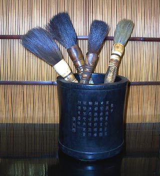
The divide between me and the Chinese on this is symbolized by the rack of writing brushes which I have purchased here in China. My rack has the brushes arranged so that they run from the biggest to the smallest, emphasizing the strict geometry of my composition. Even more important, I have kept the bristles in the point which they had when I bought them (bar a few which distressingly have fallen off the rack and had the point blunted). I find the shape of the brush, coming to a point in the bristles, quite beautiful to look at.

But for a Chinese this is meaningless. The brush is there to be used so it must have the bristles undone, flowing, possibly slightly bent from use. Mine is a sterile composition to them. They delight to keep their brushes untidily in a mug, bristle-side up, ready to be snatched up and used.

And yet … in different contexts, I have found Chinese writing quite beautiful to look at, just as a composition of abstract lines. For instance, I’m often attracted by the boards which hang over the entrance to temples with a phrase carved on them; the meaning of the phrase is of no matter to me, it’s just the composition I find striking. This is an example from South Korea.

Or I’ve sometimes seen just a character or two written on a wall which I feel “says” something to me as a composition, like in this example.

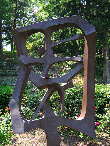
Or I have seen sculptures of characters; Chinese characters seem to lend themselves very well to being sculpted. Here are a couple of examples.

I have the same occasional attraction to Arabic, another script in which I am illiterate. Here’s a nice example I found surfing the web.

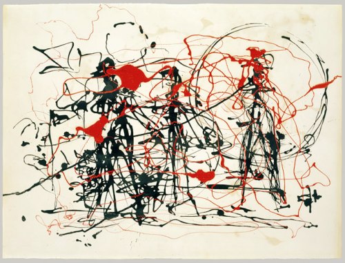
I suppose I am heir to a hundred years of abstract art, which tells me that it’s “alright” to just enjoy squiggles on a canvas as long as the overall composition has balance, a good colour scheme, and generally “works” for me. I mean, what’s a Jackson Pollock but an infinity of squiggles on a canvas? I show again here the Pollock I showed in an earlier post.

Wassily Kandinsky was also quite fond of squiggles.

Paul Klee was also into squiggles

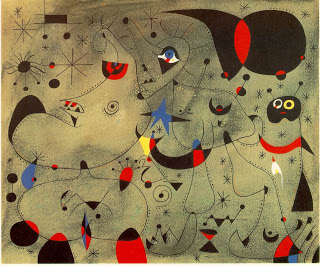
As of course was Joan Miro, who must be the squiggler-in-chief.

And I haven’t even started on the sculpture …

So with that, I will go out and seek more Chinese writing compositions that I like … but I will keep away from those dimly-lit calligraphy rooms in museums. All those scrolls hanging there one after another are just too much for me.

POSTSCRIPT

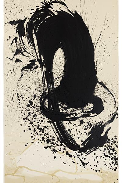
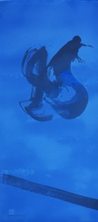
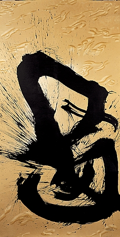
Since writing this, I have come across the Chinese artist Qin Feng. In at least one period of his life he brought together calligraphy and abstract art. Here’s a couple of his paintings from that period:

______
Pix (except for my brush rack):
Calligraphy rooms in museums: http://www.sfgate.com/art/article/Out-of-Character-Asian-Art-Museum-3936470.php
brushes in a holder: http://www.lovellhall.com/product_list.php?cat=40&start=10
plaques at temples: http://tripwow.tripadvisor.com/slideshow-photo/chinese-characters-in-korean-temples-by-travelpod-member-akrn-seoul-south-korea.html?sid=12667092&fid=tp-7
Chinese characters on walls: http://www.flickr.com/photos/35464002@N08/6124930840/
Chinese character sculptures: http://www.shho.cuhk.edu.hk, http://www.flickr.com/photos/fotofish64/7292747450/sizes/m/in/photostream/
Arabic calligraphy: http://jchristinahuh.blogspot.com/2010/08/arabic-calligraphy.html
Pollock painting: http://www.metmuseum.org/toah/works-of-art/1982.147.27
Kandinsky paintings: http://en.wikipedia.org/wiki/Wassily_Kandinsky
Klee painting: http://en.wikipedia.org/wiki/Paul_Klee
Mirò painting: http://mercoledis.blogspot.com/2010/10/joan-miro-palazzo-blu-pisa.html
Qin Feng’s paintings:

http://asimg.artsolution.net/tsmedia/GoedhuisGoephoto/goedhuis692011T1437.jpg?qlt=100&ftr=4&cell=450,480&cvt=jpeg

FLY THE FLAG – AS LONG AS IT’S BEAUTIFUL

Beijing, 14 October 2012

Those of you who have read my posts will surely have realized by now that I live cheek by jowl with many of the embassies in Beijing. One of the things that you always see when you walk by embassies is the national flags which they all proudly fly at their gates. After a while, seeing so many flags got me to look at them more closely. Flags drip with history and meaning. Their colours are not chosen by chance, nor are the shapes (the crosses, the stripes, the triangles); these all have historical roots. As for the symbols that litter many flags, they all have some deep national meaning. But that is not what interested me. What I was asking myself was, are they aesthetically appealing? Would I fly them at my gate simply because they looked good fluttering in the breeze?

So I started studying the 203 national flags (there are hundreds if not thousands of other flags, but I decided to stay with my ambassadorial starting point). And I have concluded that there are at maximum five flags which I would find beautiful enough to fly on my front lawn.  I consider the most beautiful to be the Japanese flag.

It is very simple, two colours and one shape. And the colour combination – small circle of red on a large white background – works beautifully. Yes, we know that the circle represents the rising sun and so exemplifies Japan’s name for itself: Nippon, or the Land of the Rising Sun. But who cares? It’s just a beautiful design. Bangladesh has a very similar design, except that the red circle is on a green background. I read that the green symbolizes the greenery of Bangladesh with its vitality and youthfulness, while the red circle represents the rising sun and the blood that the Bangladeshis have shed in order to gain independence. But sorry, that red and green combination doesn’t work for me. Nor does the combination on South Korea’s flag; it too is basically a circle on a white background, but the circle is fussy (it is the yin and yang symbol in blue and red) and it is surrounded by four black symbols which I discovered are trigrams representing fire, water, earth, wood, and metal. All very interesting but it simply makes for a cluttered design.

I feel moved here to write in passing about the imperial standard of Japan, another example of simple but beautiful design. My wife and I came across this standard on a visit to Windsor Castle. There, in Saint George’s chapel, hang the standards of all the member of the Knights of the Garter. The Emperor of Japan’s standard is a simple design of a golden chrysanthemum on a light red background.

It stands in stark contrast to the fussy heraldic standards hanging all around it.

But I digress. Returning to the topic in hand, after Japan I place Qatar.

The colour combination of this flag – maroon, covering two-thirds of the flag’s area, and white covering the rest – is really very handsome. But I also like it because it is only one of two national flags where the colours meet at a serrated rather than a straight edge. This adds a certain vivacity to the design. I read that the white portion of the flag symbolizes peace and the maroon represents the Kharijite Muslims of Qatar and the bloodshed in Qatar’s many wars (in case any reader is wondering if Qataris have different blood from us all, the flag’s colour was formerly red). As for the serrated edge, it represents Qatar as the ninth member of the ‘reconciled Emirates’ of the Arabian Gulf at the conclusion of the Qatari-British treaty in 1916. So what? It’s just a beautiful design. And thank God they changed the red to maroon. Bahrain has a very similar flag, but it has red rather than maroon. With red, it doesn’t work.

Next on my list is Finland’s flag.

Again, just two colours, a blue cross on a white background. The colour combination works well because, as in the case of Japan, there is only a small amount of blue so the chromatic balance remains good. I read that the blue represents the myriad lakes in Finland and the white the country’s snow. That may be so, but personally I think the flag would be more beautiful if the blue were of a paler hue, although it still works well as it is. Luckily, the cross is also somewhat off-centre. If it the cross had been fully centred (like it is, for instance, in the Swiss flag) the design would have been much more boring. But having an off-centred cross doesn’t necessarily make this design work. The Swedish flag has the same off-centre cross, but in that case – yellow cross on blue background – the overall design doesn’t convince.

Fourth place on my list goes to the flag of the small Himalayan kingdom of Bhutan.

Here again we have two main colors! What is refreshing in this case is that the flag’s field is divided diagonally between the two colours. There is only one other national flag that is so divided, that of Papua New Guinea. The colour combination – saffron yellow and orange – works very nicely (regardless of the fact that they are meant to represent, respectively, the country’s temporal and spiritual powers). Normally, I don’t like symbols on flags, but in this case I rather like the white dragon flying along the flag’s diagonal (by the way, the country’s name in the local dialect means Land of the Dragon). I’m rather fond of dragons anyway, but in this particular case the dragon breaks up what might otherwise be a rather blocky design, and the dragon’s whiteness lightens up the colour scheme (in the earliest version of the flag the dragon was bottle green and was crossing the flag’s field horizontally; the overall effect is awful).

The final flag on my list is Estonia’s.

Normally, I would reject out of hand any three-striped flag. Such flags thickly litter the landscape of national flags.  An astonishing 84 national flags are composed of three stripes, either vertical or horizontal. That’s more than two-thirds of all national flags! Some have a triangular wedge on the left, while others have various symbols sprinkled on them. These variations break up the monotony somewhat, but you really have to ask yourself about flag designers. Couldn’t they dream up something different? I suppose that’s what you get when bureaucrats or politicians become designers.

In any case, the Estonian flag, even if three-striped, works because of the colour combination: equal bars of blue, black and white. Black and white always go well together, and the blue adds a splash of difference. Botswana has the same three colours, but the blue – and a light blue at that – is much more dominant. The flag is OK but no more than that.

The recent flurry of news about a Rothko painting defaced in the Tate Modern leads me to a final thought. Why don’t governments get modern artists to design their flags? They would make wonderful flags. Here is a Rothko, Mondrian and Pollock “flag”. I think they would look gorgeous.

______
pix, in order of appearance:
http://diamondgirl55.mlblogs.com/tag/yankees/
http://www.stgeorges-windsor.org/worship-and-music/st-georges-chapel-feature/chapel-articles/international-links-at-st-georges.html
http://galmudugtv.com/?attachment_id=1075
http://footage.shutterstock.com/clip-450343-stock-footage-finland-flag-animation-with-real-time-lapse-clouds.html
http://www.flag-images.com/national_flag/download/flag_of_bhutan/
http://footage.shutterstock.com/clip-450310-stock-footage-estonia-flag-animation.html
http://www.wikipaintings.org/en/mark-rothko/no-8-1952
http://artissilentpoetry.tumblr.com/
http://www.metmuseum.org/toah/works-of-art/1982.147.27

THE SCENT OF WATER

Beijing, 12 October 2012

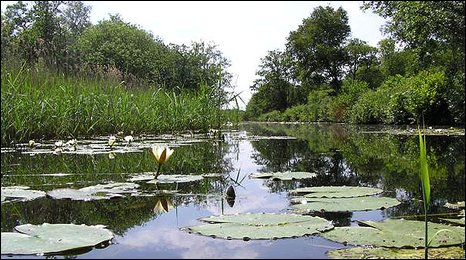
How would you describe the scent of water? This evening, as I reached the bridge which crosses my piece of canal a gentle breeze lifted the scent off the water’s surface and wafted it over to me. And I asked myself that question.

Let me take a leaf out of wine reviews and try a little of their purple prose: “I sense a hint of moss, with an undercurrent of peat, perhaps a whiff of algal respiration”. But actually what I was smelling was my childhood. Don’t you find that scents are a powerful trigger of memories? I do: a drift of scent will suddenly have me awash in memories. And so it was that as I crossed the bridge I was suddenly ten years old again, on my grandmother’s sail boat on the Norfolk Broads, moored at her buoy on Barton Broad. The sun has set, a light breeze is blowing off the water bringing me the scent of the Broad’s peaty water, and small waves are slapping quietly at the boat’s hull. A grebe calls out in the night.

I loved the Broads. My grandmother spent most of her summer on the boat, taking her numerous grandchildren in shifts of two weeks. I must have gone five years in a row. The sailing didn’t really excite me; it was kayaking among the rushes and in the little creeks on the edges of the Broads that I loved, watching the wildlife and discovering small marsh flowers at every turn.

But I grew up, and my grandmother grew old, and life moved on.  I stopped going and haven’t been back since. Yet I am sure that the Broads made me what I am today: an environmental engineer who for more than thirty years has tried to push back the tide of waste threatening to wash away the natural beauties that are around us.
__________________
pix from:
http://maalie.blogspot.com/2010/08/kayaking-on-norfolk-broads.html
http://news.bbc.co.uk/local/norfolk/hi/people_and_places/nature/newsid_8090000/8090224.stm

LAKE KHOVSGOL: A REMOTE CORNER OF A REMOTE LAND

Lake Khövsgöl, 9 October 2012

We left at 9 o’clock, with Purev driving us in a right-hand 4×4: standard fare in Mongolia, in this case imported second-hand from Japan. For two hours we drove northwards, towards Mongolia’s border with Russia. The road was tarred most of the way, although it was still being completed; there were sections where we had to career off the road and drive on the prairie alongside the road; Purev’s driving seemed more fluid and certain on these sections, he’s not in his element on tarred roads. Endless vistas of an empty land accompanied us along the way: this country, which six times bigger than the UK, is home to less than three million people, half of whom live in the capital alone.  Here and there, we would see the white ger, the traditional Mongolian tents, of herders dotting the landscape, with herds of yak or sheep browsing the dry grass.

As we drove, dark clouds started coming towards us.

“Snow”, said Purev, but it held off. Finally, we arrived at a village. Purev swerved off the road and raced up a muddy track which coasted a nearby ridge. Down the other side, the track deteriorated rapidly and we crawled along, bumping from one puddle to another, from one rock to another. But we made it in one piece to the ger camp which was our destination.

And there in front of us, lapping at the edges of the camp, was the southernmost tongue of Lake Khövsgöl, which is what had drawn us to this remote part of a remote country.

A few facts. The lake, 136 km long and 262 m deep, is the second-most voluminous freshwater lake in Asia, and holds 0.4% of all the fresh water in the world. It is one of seventeen lakes worldwide that are more than 2 million years old (nearby Lake Baikal is part of this select club, as are Lake Tahoe in the US, Lake Titicaca in Peru, and Lake Tanganyika in Africa, among others; but I digress). Lake Khövsgöl is one of the most pristine of these ancient lakes. It has very low levels of nutrients and primary productivity and so very high water clarity.

But forget the facts! Remember only that the Tuvans, a Turkic people who lived around the lake, gave it its name: Khövsgöl, “Blue Water Lake”. And startlingly blue it is indeed, the blue of the Mediterranean on a sunny day, probably because the water is so clear and the sky in Mongolia so blue.

But blue was not the only colour that greeted us. There was the smooth greyness of the pebbles on the beaches, which reminded us so much of the pebble beach of our village in Liguria, echoed in the weathered, grey tree trunks that littered the shore.

There was the white of the first snow of the year, which finally blew in with a vengeance and fell all night as we slept, huddled under the bedclothes in our ger. It greeted us under lowering clouds in the morning when we stuck our nose out.

But it was quickly melting away during the day when the clouds blew away and the sun shone in a blue, blue sky.

There was the glorious autumnal yellow, with rare light green tinges, of the Siberian larches which flowed down from the northern taiga and lapped up against the lake’s sides: golden yellow for those needles still clinging to the trees, straw yellow for those that now clothed the forest floor.

And finally, there was a droplet of violet offered by a small flower that contrary to all expectations bravely blossomed by the water’s edge.

FLYING OVER MONGOLIA

Mörön, 7 October 2012

I like turbo-props, I find the deep roar their propellors emit is much more satisfying to listen to than the whine of jet engines. So I was looking forward to this flight from Ulaanbaatar to Mörön, capital of Mongolia’s northernmost province of Khövsgöl, in a little 36-seat turbo-prop. And it was a lovely afternoon, with a blue sky, so I expected to have good views from seat 9C at the back of the aircraft.

Good views we did indeed have as we took off from UB, climbed, banked, and set off north, with the propellers settling into their deeply comforting roar. The ugly outskirts of UB dropped out of site and we were now flying over a brown landscape of late autumn. Small rocky hills jutted out of valley bottoms, many of which had small rivers flowing lazily down their middle. Never have I seen such lazy rivers! They looped back and forth, fraying, rebraiding, leaving stranded oxbows behind. Mongolian valleys must be flat as a pan.

My wife, in seat 10C, remarked that the hills looked buried in dust. So true! It must have been a trick of the light on the yellow grasses sprinkling the land, but the hills really looked as if they were emerging from thick layers of powdery brown dust.

We picked up the Siberian larches, larix sibirica, quite soon after leaving UB. These are the southernmost tassels of the vast larch forests that cloak the Siberian taiga. They were always high on the hills and clustered on the latters’ northern, colder, side. In the late afternoon light, they cast long shadows. At first there were vestiges of their summer green showing through their autumnal yellows, but as we droned ever further north autumn caught up with us and their colours became uniformly yellow.

Soon after we were dropping into the vast bowl which Mörön finds itself in, flying over the town as we came in to land. Small houses with bright red or blue roofs and surrounded by a square of wooden fences hove into view and rushed by us.

And now we were down on the tarmac, with the plane’s propellers giving their last braking roar before we trundled to a halt before the terminal.

Tomorrow, we go to Lake Khövsgöl.

THE (STEEP) STREETS OF SAN FRANCISCO

San Francisco, 6 October 2012

Readers of my generation will no doubt remember the 1968 film Bullit with the Great Immortal Steve McQueen.

I don’t suppose anyone remembers the story, it was a cops and robbers story of some kind. They only remember the car chase. What a sequence that was! It started on the steeper streets of San Francisco, with the cars suddenly racing up and down the hills and bouncing across the intersections as the baddies realized that Steve was on their tail (the sequence somehow ended on the highways but that is irrelevant to our story).

I was reminded of this car chase when on the first morning of our stay in the city my wife and I walked from our hotel to our son’s apartment. We had discovered that the two were on the same street – Taylor Street to be precise – and thought naively that it would be a nice walk. Bad mistake! There were sections of the street that were astonishingly – preposterously – steep.

At some points, I felt like we were scaling Everest or Annapurna.

And later, when we took a taxi along the same street, there was a moment, as we were going down a particularly steep section, when the taxi driver had to bend down to be able see out of the windscreen!

Town planning in San Francisco is a beautiful example of 19th and 20th Centuries human arrogance. Someone just draped a grid of straight lines over a very hilly landscape and traced the resulting streets, in complete disregard of gradient. The planners of the hill towns in Italy, Greece or Spain never did that; their streets respected the land’s morphology. They lived with their land, not against it.

Be warned. We ignore the physical limitations of our Earth at our peril.

___________
pix from:
http://en.wikipedia.org/wiki/Bullitt
http://www.flickriver.com/photos/antman67/7768689852/
http://www.flickr.com/photos/daveglass    /527678270/
http://www.travelandtournepal.com/climbing-mount-everest/
http://www.sangimignano.com/sghomei.htm
http://www.guardian.co.uk/environment/2011/jan/18/trust-climate-models