Milan, 6 November 2025
My wife and I were down in Sicily recently. Our daughter and her partner came over with the grandson and they decided to spend a week down in the very far south of the island, near one of Sicily’s three promontories, Capo Passero (if I mention this detail, it’s because it plays a role later). The house they rented gave directly onto the beach and our grandson spent many happy hours digging holes, making sandcastles, and braving the – relatively small – waves that broke onto the beach.
In between these sessions on the beach, we managed to get in brief visits to Noto and Syracuse, both UNESCO World Heritage Sites. Here’s a photo of the cathedral in Noto.

And here is one of the square in front of the cathedral in Syracuse.
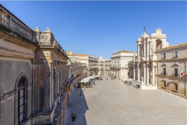
It was while I was wandering the streets of Syracuse that I noticed this flag – every public building had one.

I discovered that it is the official flag of the region of Sicily (which is why I normally saw it flying along with the Italian national flag and the EU flag).
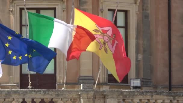
I’m a bit of a flag man – many years ago, quite soon after I started this blog, I wrote a post about what I considered to be the most elegant national flags. So of course I focused in on this flag. What really intrigued me about it was that symbol in the middle: a face from which emanate three legs bent at the knee.
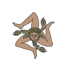
I quickly established that this symbol is called a triskeles, Greek for three-legged. It was a popular symbol on coins. The earliest numismatic representation of it (from around 465 BCE) is on coins from the Greek statelet of Pamphylia, in what is now southern Turkey.
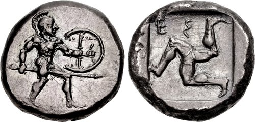
The triskeles was used in varying formats on Greek coins for several centuries thereafter, but it was most closely associated with the coins of Agathocles, Tyrant of Syracuse from 317 BCE, and self-proclaimed king of Sicily from 304 BCE, until his death in 289 BCE. On this coin, it is the main decoration on the reverse side of the coin, because Agathocles adopted it as a personal symbol of his reign.
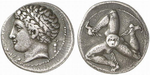
Agathocles brought an important modification to the design, placing a Gorgon’s head as the central hub from which the legs emanate. He also added wings to the feet.
On this Syracusan coin, instead, it is used as the mint mark.

It seems that Agathocles chose the triskeles as his symbol because it mirrored the (roughly) triangular shape of Sicily.

The Greek name for the island was Trinacria, which means three headlands. The three headlands in question were those at the “corners” of the island: Capo Peloro, to the north of Messina, Capo Passero, all the way down south of Syracuse (and close to where we spent our little Sicilian holiday), and Capo Lilibeo, close to Marsala. The choice by Agathocles of the triskeles as his personal symbol was no doubt meant to underline his ambition – realised in the last years of his life – to be ruler of the whole of Sicily.
None of Agathocles’s heirs who were still alive when he died managed to succeed him as king of Sicily. In fact, he was formally reviled after his death, with all statues of him throughout Sicily being destroyed. Nevertheless, his triskeles continued to be used as a symbol for the island. After the Romans had turned the island into a province of its Empire, they added three ears of wheat to the Sicilian triskeles, apparently to underline the province’s role as a granary for Rome (and took the wings off the feet).

With the collapse of the Western Roman Empire, the use of the triskeles seems to have disappeared in Sicily. But it came roaring back in 1282, when, in what has become known as the War of Sicilian Vespers, the Sicilians rebelled against their French Angevin overlords and invited the King of Aragon to take their place. The Sicilians created a flag to carry into battle.

It was made up of the red and yellow colours of Aragon (but also the colours of the communes of Palermo and Corleone, where the revolt started) with a triskeles at its centre (where the Roman ears of wheat had disappeared and the wings brought back, but this time attached to the head).
After twenty years, peace was concluded and the House of Aragon ruled Sicily for the next 400 years or so.
In 1848, some 600 years after that first burst of rebelliousness, and when the whole of Europe was being shaken by revolutionary outbursts, the Sicilians had another bout of rebellion and ousted their Bourbon overlords. The movement of course needed a flag, so the triskeles was rolled out again, but this time it was affixed to the red, white and green tricolour, itself created in 1789 by Italian revolutionaries copying their counterparts in France.
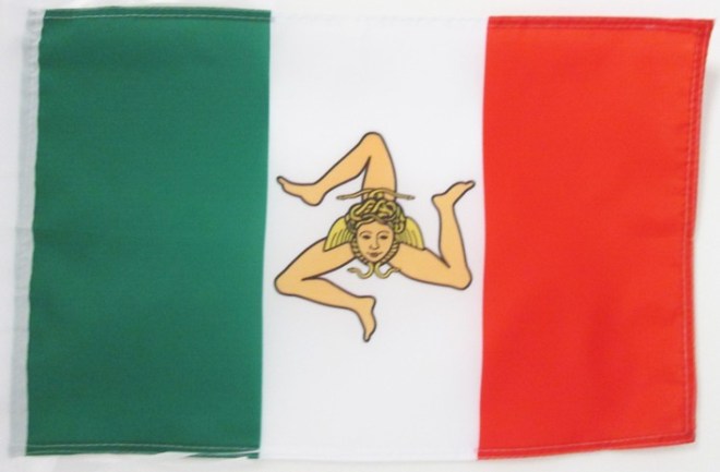
Alas, the revolt, and the flag, lasted only a year, until the Bourbons took back control of the island. But then, a mere ten years or so later, in 1860, when Garibaldi and his thousand volunteers disembarked in Sicily on his way to conquering the island and the boot of Italy, the Sicilian rebels dusted off this flag to fight behind. That rebellion was successful this time. Or maybe it wasn’t, because Sicily shucked off its Bourbon overlords but only to become part of the new Italian State, where national unity was strongly promoted and regional diversity quashed. So of course the triskeles disappeared from the tricolour flag.
Then, at the tail end of the Second World War and after 80 years as part of the new Italian State, separatism reared its head in Sicily. In the chaos created by the Allies’ invasion of Sicily and the collapse of the national government, the Movement for the Independence of Sicily was formed. Of course, it created its own flag which naturally enough sported a triskeles, a bright red one in this case. I’ve no idea why the separatists chose this colour for its triskeles, or the colour of the flag’s background – perhaps simply the red and yellow now traditionally seen as Sicily’s colours?

It was a strange movement, which pulled in people from the left and the right of the political spectrum but also had links with the mafia and the island’s traditional bandits. Indeed, the darker, criminal elements of the movement spawned an armed force, the Volunteer Army for the Independence of Sicily. It, too, created its own, triskeles-bearing, flag.
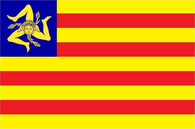
This “army” attacked Carabinieri barracks and made general mayhem but was eventually crushed. In the meantime, the national government bought off the separatists by promising Sicily a special autonomous status (as it did to other regions on the rim of the country: Sardinia, Val d’Aosta, and Trentino-Alto Adige).
In the decades after the War, Italy’s regions, which had been politically moribund since the country’s unification, slowly clawed back their political importance. Finally, in 1970, the country’s first regional elections took place, while in 2001 a constitutional amendment gave the regions greater say in policy-making.
With the regions’ increasing political importance came the desire to create their own flags, banners, armorial bearings, and so on. Sicily was no different. Its regional parliament approved a first flag in 1995.

Its design explicitly harked back to the flag created by the rebels in 1282 (although the colours of the background were switched around), but instead of the triskeles the region’s coat of arms was placed in the flag’s centre. This did include the triskeles but quartered it with the arms of the Normans, the Swabians, and the Aragonese, who had all been overlords of Sicily at some point.
Finally, in 2000 good sense prevailed and the regional parliament approved today’s flag with only the triskeles in the centre.
So there we are. An ancient symbol created back in the mists of time has managed to survive down through the centuries as a symbol of Sicily’s desire to shake off its overlords and now has been given a new lease of life as a symbol of – hopefully – a vibrant region in a more federalist national state.


