9/11 MEMORIAL, NEW YORK

Beijing, 13 January 2013

They say that those of us who were alive at the time remember where we were and what we were doing when we heard about Jack Kennedy’s assassination. That is certainly true for me; I was in bed in my dormitory at boarding school with lights out when one of the older boys burst in announcing the news. The same holds for me when it comes to the attack on the twin towers of the World Trade Center in New York. I had recently come back from lunch and was working without much enthusiasm on a document when a colleague came running down the hall shouting out the news to all of us.

Since then, every time my wife and I go back to New York, we always take a trip down to ground zero, to see how things have changed. So it was this time that on the last day of our latest stay in New York, after an earlier false start (we hadn’t understood that you need to book on-line), my wife and I managed to visit the 9/11 Memorial. After collecting the tickets, finding the entrance, threading our way through an active construction site, past numerous security checks – more numerous than at an airport – we finally arrived in the area of the memorial itself.

It is a somberly moving monument. First, there is the location of the two square fountains that make up the design. They have been inserted into the footprints of the two towers, thus serving as an eternal reminder of the latter’s disappearance.

aerial view-3

Then there is the design of the fountains. The water doesn’t spray up in noisy, joyous jets as is normally the case for fountains, but instead falls from the rims of the fountains, continuous lines of tears, into the dark pool far below

memorial 004

from where it disappears down into a central, apparently bottomless void, the hole left in the city’s and the in country’s heart.

memorial 006

And all around the fountains’ rims, from where the water-tears flow, are inscribed the names of those who died in the attack on the towers, as well as in the attack on the Pentagon and in the airplanes that were used as the weapons.

memorial 007

Truly moving indeed.

memorial 010

_______________________

Aerial view: http://i.i.com.com/cnwk.1d/i/tim/2011/09/10/rmitchell911memorial_480x360.png

other pictures: mine

A COLOURFUL MAN IMPRISONED IN A GREY MAN, WILDLY SIGNALLING TO BE LET OUT

New York, 31 December 2012

A few weeks ago, I was watching a French TV show in Beijing called Nicolas Le Floch. This is a detective series set in France in the late 1700’s. It’s really quite amusing to see the detective genre unfolding in such an incongruous setting. But actually I mention the show for an altogether different reason: as I followed the tortuous plot, I was struck en route by how colourful the men’s clothes were in that period, as this still from one of the shows attests

floch-colourful clothes

Just to make the point, I throw in a few photos of portrait paintings from the period:

17thC-1

17thC-2

17thC-3

17thC-4

And to top it all, in France at least the men wore make-up! This still is of Le Floch’s boss, the chief of police:

floch-made-up-man

Quite a change from Inspector Japp of the Poirot series …

inspector japp

This blaze of bright men’s clothing made me reflect on the dullness of my own wardrobe. All my official clothes – those I wear for work – are of subdued colouration: grey or discrete browns, greens and dark blues. The vast majority of my shirts are white, with one or two blue ones. The only way I can exhibit my love of colour in an official setting is through my ties, of which I have collected a large assortment over my career. Even the clothes I wear in my private life are modest in their colouration; I can boast of a few brightly coloured T-shirts and that’s it.

I merely reflect the sartorial conventions of our times. Today’s serious men do not wear colours, as these pictures of the powerful bear out.

The new Chinese leadership (although note the discrete dash of colour in the ties):

Politburo

A lineup of the G8:

G8: TUTTI LEADER A COPPITO, VERTICE L'AQUILA

A lineup of the EU heads of state:

EU

Why this greyness, this dullness, this soberness? I am no historian of fashion, but I am sure that the answer lies in this: serious men, the thinking goes, do not wear colours. Brightly coloured clothes denote ditziness, frivolity and general silliness. A man in brightly coloured clothes cannot possibly balance a budget or write a piece of legislation or do any of those other serious things required of him. I mean, can you imagine these men running a company or a government? Please!

red suit

light blue suit

indian colourful jacket

coloured clothes

The only time I can think of in my lifetime when men went around in clothes vaguely resembling those of the eighteenth century was the 1960s when flower power burst upon the scene:

carnaby street-1

carnaby street-2

These two suits come from the Victoria and Albert’s collections:

sixties-suit-2

sixties-suit-4

But the people who wore these clothes were completely unserious people, people who were into drugs, sex, and rock and roll, as the album covers of the time amply demonstrate:

beatles-sgt pepper album cover

beatles-yellow submarine

rolling stones

Jimi Hendrix

PinkFloyd-album-piperatthegatesofdawn

So I suppose in my lifetime, if I want to be taken seriously, which I do, I will be condemned to wearing dull coloured clothes, with only a dash of colour in my ties. I will, paraphrasing Cyril Connolly’s famous phrase, be a colourful man imprisoned in a grey man, wildly signalling to be let out.

___________________
Floch colourful clothes: http://images.allocine.fr/r_640_600/b_1_d6d6d6/medias/nmedia/18/81/96/02/19955662.JPG
18thC-1: http://i47.tinypic.com/2j4tvl0.jpg
18thC-2: http://i47.tinypic.com/mwz14n.jpg
18thC-3: http://i48.tinypic.com/atp6l2.jpg
18thC-4: http://i50.tinypic.com/e6q1d1.jpg
Floch made-up face: http://cdn.static.ovimg.com/episode/3270971.jpg
Inspector Japp: http://ic.pics.livejournal.com/phantomphan1990/11963571/118817/118817_original.gif
Politburo: http://l2.yimg.com/bt/api/res/1.2/afKIpJHhH4TpWmLewt8S6A–/YXBwaWQ9eW5ld3M7Zmk9aW5zZXQ7aD0xMDI0O3E9Nzk7dz0xNjYw/http://media.zenfs.com/en_us/News/Reuters/2012-11-15T044703Z_283609896_GM1E8BF0ZB101_RTRMADP_3_CHINA-CONGRESS.JPG
G8: http://www.google.com/imgres?q=G8+photo&hl=en&tbo=d&biw=1280&bih=683&tbm=isch&tbnid=SPoOXwx3iorBWM:&imgrefurl=http://www.g8italia2009.it/G8/Home/Media/Foto/G8-G8_Layout_locale-1199882116809_1246708086733.htm&docid=_9F5adpgS1UWjM&imgurl=http://www.g8italia2009.it/static/G8_Foto/_MB24968.jpg&w=3000&h=1870&ei=z1rgUM6-LNO40AHFtIC4Ag&zoom=1&iact=hc&vpx=161&vpy=295&dur=8059&hovh=177&hovw=284&tx=173&ty=111&sig=109352013111727269517&page=1&tbnh=141&tbnw=215&start=0&ndsp=24&ved=1t:429,r:7,s:0,i:108
EU: http://i.dailymail.co.uk/i/pix/2012/05/24/article-2149193-13413A49000005DC-413_634x252.jpg
Red suit: http://kontraplan.com/site/wp-content/uploads/2012/04/Lanvin-Mens-SS12-Collection-kontraPLAN-magazine-6.jpg
Light blue suit: http://www.thestyleking.com/wp-content/uploads/2011/07/Coloured-Suits.jpg
Indian colourful jacket: http://timesofindia.indiatimes.com/photo/10019988.cms
Coloured clothes: http://4.bp.blogspot.com/-QuyZgxyFQ70/T-xNoZ-tloI/AAAAAAABK3M/5orvLpQt_0o/s1600/Milan+Mens+Fashion+Week+Salvatore+Ferragamo+Spring:Summer+2013+Runway+Show_0143.JPG
Carnaby street-1: http://media.vam.ac.uk/media/website/uploads/images/2006BE8980_carnaby_street.jpg
Carnaby street-2: http://farm3.staticflickr.com/2082/2128638387_ae4fb5b36a_z.jpg?zz=1
Sixties suit VA-2: http://media.vam.ac.uk/media/thira/collection_images/2006AW/2006AW4489_jpg_ds.jpg
Sixties suit VA-4: http://media.vam.ac.uk/media/thira/collection_images/2006AB/2006AB6007_jpg_ds.jpg
Sgt Pepper album cover: http://greatalbumcovers.files.wordpress.com/2012/02/album-covers-bealtes-1.jpg
Yellow submarine album cover: http://3.bp.blogspot.com/-YgGhq-2XQ8E/T9kztOsJPwI/AAAAAAAAC4k/VeHN6M72Tqg/s1600/The+Beatles+-+Yellow+Submarine.jpg
Rolling stones: http://pokingsmot.net/wp-content/uploads/2012/02/The-Rolling-Stones-Their-Satanic-Majesties-Request-Album-Art-468×411.jpg
Jimi Hendrix: http://www.rockstargallery.net/wp-content/uploads/2011/12/Hendrix-AYE-Front-Cover.jpg
Pink Floyd: http://upload.wikimedia.org/wikipedia/en/3/3c/PinkFloyd-album-piperatthegatesofdawn_300.jpg

FLY THE FLAG – AS LONG AS IT’S BEAUTIFUL

Beijing, 14 October 2012

Those of you who have read my posts will surely have realized by now that I live cheek by jowl with many of the embassies in Beijing. One of the things that you always see when you walk by embassies is the national flags which they all proudly fly at their gates. After a while, seeing so many flags got me to look at them more closely. Flags drip with history and meaning. Their colours are not chosen by chance, nor are the shapes (the crosses, the stripes, the triangles); these all have historical roots. As for the symbols that litter many flags, they all have some deep national meaning. But that is not what interested me. What I was asking myself was, are they aesthetically appealing? Would I fly them at my gate simply because they looked good fluttering in the breeze?

So I started studying the 203 national flags (there are hundreds if not thousands of other flags, but I decided to stay with my ambassadorial starting point). And I have concluded that there are at maximum five flags which I would find beautiful enough to fly on my front lawn.  I consider the most beautiful to be the Japanese flag.

It is very simple, two colours and one shape. And the colour combination – small circle of red on a large white background – works beautifully. Yes, we know that the circle represents the rising sun and so exemplifies Japan’s name for itself: Nippon, or the Land of the Rising Sun. But who cares? It’s just a beautiful design. Bangladesh has a very similar design, except that the red circle is on a green background. I read that the green symbolizes the greenery of Bangladesh with its vitality and youthfulness, while the red circle represents the rising sun and the blood that the Bangladeshis have shed in order to gain independence. But sorry, that red and green combination doesn’t work for me. Nor does the combination on South Korea’s flag; it too is basically a circle on a white background, but the circle is fussy (it is the yin and yang symbol in blue and red) and it is surrounded by four black symbols which I discovered are trigrams representing fire, water, earth, wood, and metal. All very interesting but it simply makes for a cluttered design.

I feel moved here to write in passing about the imperial standard of Japan, another example of simple but beautiful design. My wife and I came across this standard on a visit to Windsor Castle. There, in Saint George’s chapel, hang the standards of all the member of the Knights of the Garter. The Emperor of Japan’s standard is a simple design of a golden chrysanthemum on a light red background.

It stands in stark contrast to the fussy heraldic standards hanging all around it.

But I digress. Returning to the topic in hand, after Japan I place Qatar.

The colour combination of this flag – maroon, covering two-thirds of the flag’s area, and white covering the rest – is really very handsome. But I also like it because it is only one of two national flags where the colours meet at a serrated rather than a straight edge. This adds a certain vivacity to the design. I read that the white portion of the flag symbolizes peace and the maroon represents the Kharijite Muslims of Qatar and the bloodshed in Qatar’s many wars (in case any reader is wondering if Qataris have different blood from us all, the flag’s colour was formerly red). As for the serrated edge, it represents Qatar as the ninth member of the ‘reconciled Emirates’ of the Arabian Gulf at the conclusion of the Qatari-British treaty in 1916. So what? It’s just a beautiful design. And thank God they changed the red to maroon. Bahrain has a very similar flag, but it has red rather than maroon. With red, it doesn’t work.

Next on my list is Finland’s flag.

Again, just two colours, a blue cross on a white background. The colour combination works well because, as in the case of Japan, there is only a small amount of blue so the chromatic balance remains good. I read that the blue represents the myriad lakes in Finland and the white the country’s snow. That may be so, but personally I think the flag would be more beautiful if the blue were of a paler hue, although it still works well as it is. Luckily, the cross is also somewhat off-centre. If it the cross had been fully centred (like it is, for instance, in the Swiss flag) the design would have been much more boring. But having an off-centred cross doesn’t necessarily make this design work. The Swedish flag has the same off-centre cross, but in that case – yellow cross on blue background – the overall design doesn’t convince.

Fourth place on my list goes to the flag of the small Himalayan kingdom of Bhutan.

Here again we have two main colors! What is refreshing in this case is that the flag’s field is divided diagonally between the two colours. There is only one other national flag that is so divided, that of Papua New Guinea. The colour combination – saffron yellow and orange – works very nicely (regardless of the fact that they are meant to represent, respectively, the country’s temporal and spiritual powers). Normally, I don’t like symbols on flags, but in this case I rather like the white dragon flying along the flag’s diagonal (by the way, the country’s name in the local dialect means Land of the Dragon). I’m rather fond of dragons anyway, but in this particular case the dragon breaks up what might otherwise be a rather blocky design, and the dragon’s whiteness lightens up the colour scheme (in the earliest version of the flag the dragon was bottle green and was crossing the flag’s field horizontally; the overall effect is awful).

The final flag on my list is Estonia’s.

Normally, I would reject out of hand any three-striped flag. Such flags thickly litter the landscape of national flags.  An astonishing 84 national flags are composed of three stripes, either vertical or horizontal. That’s more than two-thirds of all national flags! Some have a triangular wedge on the left, while others have various symbols sprinkled on them. These variations break up the monotony somewhat, but you really have to ask yourself about flag designers. Couldn’t they dream up something different? I suppose that’s what you get when bureaucrats or politicians become designers.

In any case, the Estonian flag, even if three-striped, works because of the colour combination: equal bars of blue, black and white. Black and white always go well together, and the blue adds a splash of difference. Botswana has the same three colours, but the blue – and a light blue at that – is much more dominant. The flag is OK but no more than that.

The recent flurry of news about a Rothko painting defaced in the Tate Modern leads me to a final thought. Why don’t governments get modern artists to design their flags? They would make wonderful flags. Here is a Rothko, Mondrian and Pollock “flag”. I think they would look gorgeous.

______
pix, in order of appearance:
http://diamondgirl55.mlblogs.com/tag/yankees/
http://www.stgeorges-windsor.org/worship-and-music/st-georges-chapel-feature/chapel-articles/international-links-at-st-georges.html
http://galmudugtv.com/?attachment_id=1075
http://footage.shutterstock.com/clip-450343-stock-footage-finland-flag-animation-with-real-time-lapse-clouds.html
http://www.flag-images.com/national_flag/download/flag_of_bhutan/
http://footage.shutterstock.com/clip-450310-stock-footage-estonia-flag-animation.html
http://www.wikipaintings.org/en/mark-rothko/no-8-1952
http://artissilentpoetry.tumblr.com/
http://www.metmuseum.org/toah/works-of-art/1982.147.27

PASSION FOR PORCELAIN

Beijing, 6 September 2012

Last weekend, my wife and I visited the exhibition “Passion for Porcelain” at the National Museum of China on Tiananmen Square. Through pieces from the collections of the Victoria & Albert Museum and the British Museum, the exhibition celebrates the discovery by Europe of Chinese porcelain, that wonderful moment in the seventeenth century when chinaware began pouring into Europe as ballast in the holds of the East India companies’ ships. Europeans were dazzled by what they saw, for compared to Chinese porcelain the European ceramics of the time were rough, crude articles.

Chinese potters first exported ware with purely Chinese designs

Passion-for-Porcelain 008-dragon plate

Then they started exporting wares with European designs. Some of them are hilariously bad, like this example.

Passion-for-Porcelain 006-jesus baptism plate

It takes a moment to understand that the two blobs in the plate’s centre are John baptizing Jesus. Obviously, the Chinese designer had no feel for what he was copying. Or take these two figurines, which the label insists are figurines in French court costumes.

Passion-for-Porcelain 012-french figurines

Some are simply odd when seen in a Chinese context. Plates with the armorial bearings of some English aristocrat, for instance, sound a strange note on Tiananmen Square.

Passion-for-Porcelain 013-armorial plate

But I suppose it is no stranger than Christmas decorations pouring out of a modern Chinese factory ready for shipment to the US or Europe. In all fairness, some designs have merged Chinese sensibilities exceedingly well with European-driven designs, like this plate picturing the trading hongs in Canton.

Passion-for-Porcelain 009-hongs plate

Then the Europeans started to make copies. And some of these are hilariously awful in their depiction of Chinese scenes.

Passion-for-Porcelain 015-english chinese mug

Others are technically poor copies of Chinese techniques, like these two articles which are both using the flambée technique; the European version suffers distinctly from the comparison.


Once the Europeans had mastered the technique of porcelain-making, they could cut the cord with China and make wares of purely European design.

An interesting journey indeed through Europe’s love affair with porcelain. But the exhibition’s postscript made all the previous showings “full of sound and fury signifying nothing”.  But I will deal with this in my next post.

THREE TAKES ON BROKEN CHINAWARE

Beijing, 31 August 2012

Take 1:

When I was a boy, I spent a fair amount of time with my English grandmother, on my way to and from boarding school. One of my memories of her is a set of china plates which she used for meals. The plates carried polychromatic designs of butterflies, flowers and trees on a white background, and I liked studying the designs as I ate my meat and two veg (making sure to keep my elbows well in; my grandmother was quite particular about table manners). The strange thing about these plates was that they had all been broken, often quite badly. But rather than throwing them away, my grandmother had had them carefully stapled together! By that, I mean that small pieces of metal had been fixed across the breaks. Here is the picture of such a plate.

stapled plate

I suppose my grandmother was very attached to the plates and preferred to keep them in this strange, cobbled-together form rather than not have them at all. But I won’t ever know because I never asked her the reason.

Take 2:

On our living room table, in a wide wooden bowl, my wife and I have carefully laid out some broken pieces of porcelain. I think they are from a bottle. They all have a blue pattern on a white background.

broken bits 001

They are part of our larger collection of odds and ends we’ve picked up in the streets during our three years in Beijing: broken bricks from construction sites, chunks of coal, a set of Chinese chequers. But our collection of broken porcelain has a special significance; we collected the pieces on the verge of the road outside Ai Weiwei’s house. We feel that somehow they have been bathed in his aura.

Take 3:

At the window near the entrance to the Opposite House, a chic hotel on Sanlitun, stand two wonderful sculptures. They represent an old Chinese dress and an old Chinese jacket. They have been created out of bits of broken Ming pottery, and all have blue patterns on a white background. This photo shows one of them.

China’s old Ming pottery works are littered with broken crockery from all the runs that failed. The artist collected some and has turned these failures into pieces of real beauty. A wonderful example of arte povera.

_______________________
the stapled plate: http://jwcsybaritic.blogspot.com/2011/11/stapled-porcelain.html
the porcelain jacket: https://www.pinterest.es/pin/419397784062874431/
other photo: mine

EMBROIDERED SWADDLING CLOTHES

Beijing, 23 August 2012

There is a book by a certain Edwin J. Dingle, entitled “Across China on Foot”. It was first published in 1911 and it records a trek which the author undertook in 1909-1910. The title is a little bit of a cheat. Dingle didn’t walk across the whole of China, only 1,600 miles of it, from Chongqing to China’s western border with Myanmar, tracking along Sichuan’s southern border and then across the middle of Yunnan. Before that, he traveled another 1,500 miles, but by boat up the Yangtze River, from Shanghai. He did all of the walking companionless, with only a servant and ever-changing coolies to accompany him. It’s a pretty amazing book, and I highly recommend it to you should you ever come across it.

The book is fascinating on many levels. Most of the regions Dingle walked through were very backward, even by Chinese standards, and he witnessed a China that was almost feudal; some of his descriptions of the practices he saw are eye-opening. The regions he was crossing were really remote, very rugged – in a single day Dingle could climb and descend thousands of feet – but with beautiful, untouched landscapes. His lyrical descriptions of what he was seeing around him make me despair as I look out of my window at the smoggy air of Beijing. He was walking through areas where very few white people had ever been, so he was a phenomenon wherever he went. His descriptions of how the locals reacted to him can be hilarious. And his casual racism – a sort of jokey, imperialistic view of the Chinese – can make you squirm and understand why the Chinese of today have a deep, deep resentment of how they were treated in this period of their history (but it’s not as bad as the blatant racism which Hergé recorded in Tintin’s Le Lotus Bleusee my previous post on this album).

But actually I’m writing about this book because the regions through which Dingle walked were, and still are, home to many of China’s ethnic minorities. Many of his anthropological descriptions, if I may call them that, are about the variegated ethnic groupings he came across, and they constitute a truly colourful background to Dingle’s walk, in every sense of the word: not only do the customs he describes make for a fascinating read, but the peoples he met often wore colourful costumes.

It is the colour of ethnic costumes that is my topic for today. Last weekend, my wife and I went to the National Art Museum of China to see an exhibition of ceramics. We found no such exhibition; what we stumbled into instead was ten times better. Sometimes serendipity works your way.

It was an exhibition of swaddling clothes (and some dresses), made by many of the same ethnic minorities whose territories Dingle walked across a hundred years ago – the Miao, Buyi, Dong, Shui, Yao, Yi, Gejia, and others. For those of you who have never swaddled, it is the habit of wrapping babies tightly in cloths to restrict their movement. This is neither the time nor the place to discuss swaddling and its merits or drawbacks, but in my part of the world no one has swaddled since the seventeenth century while China’s ethnic minorities were still doing it back in the 1970s. Actually, I’m not sure they were swaddling the way we did it. As I understand it, we wound strips of cloth tightly around a baby. What was on exhibit here, though, were squares of cloth about one metre by one with long belts. My guess is that they were used to make pouch-like holders into which the baby was slipped.

But let me get back to the point of the exhibition, which was not swaddling but the decoration of the swaddling cloths. And the decorations were simply lovely: bright colours, complex patterns, bold combinations. I’m not an expert on the decoration of textiles, but there was a lot of very fine embroidery, there was patchwork, there was printing, there was appliqué, and I’m sure I’ve missed a thousand things.  I shall let the photos speak for themselves. Here are a few, just to whet your appetite!

You can see many more at this site.

http://www.flickr.com/photos/abellio-apple-god/with/7838593340/#photo_7838593340

Just to complete the story, this collection was put together by two dedicated Han Chinese who lived in Guizhou. I record the names of these two wonderful people for posterity: Ma Zhengrong and Ma Li. Over a period of some twenty-thirty years, the two Ma’s “ran around” the province (as the English introduction to the exhibition charmingly put it) collecting these swaddling clothes from the province’s ethnic minorities. They chased their collection over hill and dale – or rather mountain and gorge – up in the back country. All this, while the Great Leap Forward and then the Cultural Revolution raged and burned all around. Somehow they, and their collection, survived unscathed and they have now donated it to the Museum. I salute them.

Like everywhere else these ethnic particularities are disappearing under the onslaught of modernity. Numerous groups around the world are fighting to save this hugely rich cultural heritage that we have accumulated over thousands of years. Like I said in my earlier posting on the Lacebark pine, extinction is for ever; if we lose our cultural heritage it will never, ever come back.

Having smashed everything worthy of the name culture and tried to burn every form of individualism out of their citizens during their Communist period, the Chinese elites are now going at cultural preservation with the enthusiasm of the converted. But is it better than the wanton destruction of before, I wonder? As far as I can make out, the Chinese approach to preservation is to create cultural Disneylands, as one element in their enthusiastic promotion of the tourist industry. What they want is for their ethnic minorities to sit in their prettified villages, dress up in their prettified clothes, and have pictures taken of themselves and their villages by Han Chinese. But that is not what the ethnic minorities want. They, like everyone else, want a modern life, all modcoms. And who are we to deny it to them? Surely the answer is to take their cultural heritage and update it, make it part of all our heritage. They should not embroider swaddling clothes but dresses, shirts, ties, pillows, curtains, sofas. Their beautiful art needs a new, modern context, not the embalming of a tourist village. My wife is looking for a local partner to start getting the great fashion houses of the world into ethnic art. Anyone interested, please post a comment!

THE WESTERN FRONT

Beijing, 3 August 2012

These last few evenings I’ve been sorting through the photographs we took during our summer vacation. Much of our time was taken up with doing necessary things – checking repairs to our apartment, visiting relatives, that sort of thing – but we managed to squeeze in a three-day visit to the battlefields of the Western Front. It’s something I’ve been wanting to do for at least forty years, since I first started reading the English poetry and prose of the War.

Because my knowledge of the War is primarily British, our visit ran along the line of the British sector, from the Ypres Salient – the battles of Passchendaele, Ypres, Messines Ridge – to the battlefields of Neuve-Chapelle, Loos, Vimy Ridge, and finally to the battlefields of the Somme.

I’m not a military historian; I’m not interested in the lay of the land, nor do I want to know which regiment swept over this hill to take that objective, or what weapons they used to do it. In any event, as you gaze across today’s peaceful countryside it’s hard to imagine the scenes of a hundred years ago. Even at Vimy Ridge, or Delville Wood, or the Newfoundland Memorial, where the land has been left as it was at the end of hostilities, the ground does not speak to you.

No, what really drew me to this strip of land is the iconography of death. How did the belligerents deal with the enormity of their military dead after the guns fell silent? 2 million dead in Germany, 1.4 million in France, 1.1 million in the British Empire.

Wilfred Owen wrote:

What passing-bells for these who die as cattle?
Only the monstrous anger of the guns
Only the stuttering rifles’ rapid rattle
Can patter out their hasty orisons.
No mockeries now for them; no prayers nor bells;
Nor any voice of mourning save the choirs, –
The shrill, demented choirs of wailing shells;
And bugles calling for them from sad shires.

But each country made sure that there would be memorials for their dead. Indeed, the length of the Western Front is thickly dotted with memorials and cemeteries. We visited only a handful of the bigger ones, mostly British Empire but also a few French and German. As we drove, signs to many, many others beckoned: Le Trou Aid Post Cemetery, Post Office Rifles Cemetery, Crump Trench British Cemetery, L’Homme Mort British Cemetery, Dud Corner Cemetery, Happy Valley British Cemetery … “so many, I had not thought death had undone so many”.

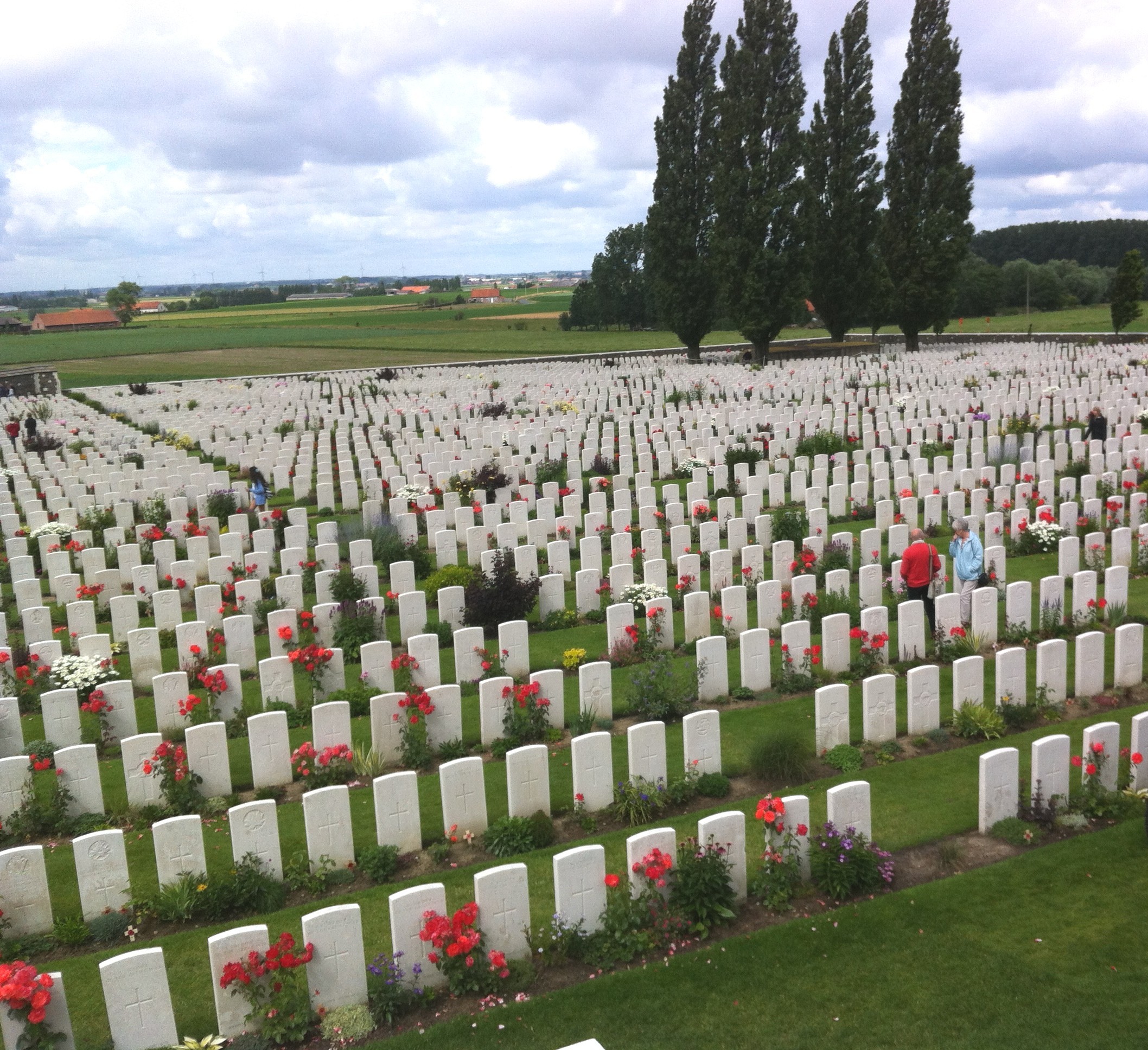
How did Governments choose to present these dead millions to their citizens? As I flip through my photos, in the British Empire cemeteries I see a predominance of white and green: white stone and green grass, leavened by splashes of colour from the roses and other flowers planted at the base of each gravestone. I see few trees.

07 Tyne Cot memorial-cropped

The buildings echo those of that other, Roman, Empire that the British so aspired to emulate: columns, rounded arches, cupolas, brick mixed with stone.

Thiepval_Memorial-3

And I see grand phrases written on the walls, commemorating victory, heroic sacrifice, eternal remembrance, and the gratitude of a nation. But I also see scrolling on and on, from one wall to another, the names of the missing, those with no known grave, whose macerated flesh disappeared into the mud of the Western Front. And I see the ages of those who died – so young most of them, my children’s age.

Menin_Gate_names

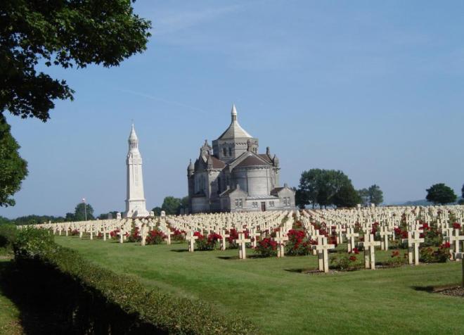
The colours white and green are echoed in the French memorials. But here the Christian motifs are stronger: white crosses for the buried (or white gravestones for the non-Christians) and churches or church-like structures for the memorials. Here too grass dominates the green – trees are rare. And here too the grass’s green is splashed with colour from flowers at the base of the crosses. And here too grand rhetoric is carved into the walls.

notre_dame_de_lorette

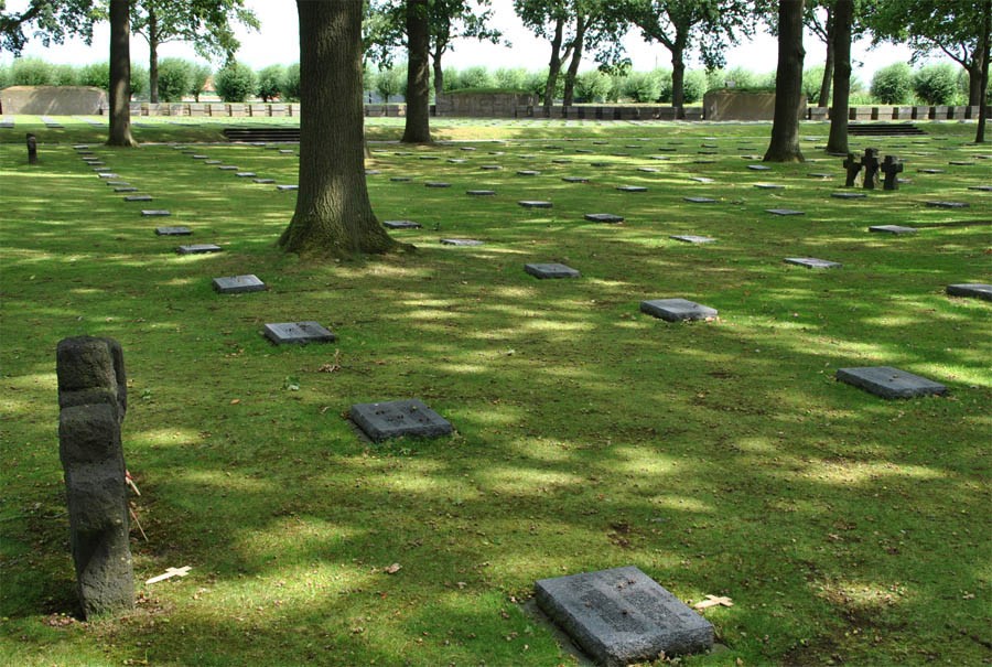
German cemeteries differ radically. Everything about them is much more sombre. Black, not white, is the dominant colour of crosses, gravestones and buildings. Although as elsewhere green is ever present, it is a darker green, for trees grow throughout the cemeteries. Their leaves, their bark, their shadows darken hues throughout the enclosures. And there are no flowers to brighten the scene, no triumphant language on the walls.

Langemark_German_cemetery

I suppose the sombre tone of the German cemeteries reflects their defeat. The British and the French could at least claim that their dead were justified by their victory. But the Germans had nothing to show for their dead. Yet to me, the Germans show the better sensibility. For are the deaths of so many young people ever justifiable? They represent a terrible loss for us all, echoing down through the decades. And despite all the protestations to the contrary, they will be forgotten. Already now, how many of the soldiers lying in the soil of northern France and Belgium are remembered by family members or friends? They are just becoming names on a wall or gravestone, and even those names will one day erode away.  The poet Carl Sandburg caught the idea well in his poem “Grass”:

Pile the bodies high at Austerlitz and Waterloo,
Shovel them under and let me work –
I am the grass; I cover all.

And pile them high at Gettysburg
And pile them high at Ypres and Verdun.
Shovel them under and let me work.
Two years, ten years, and passengers ask the conductor:
What place is this?
Where are we now?

I am the grass.
Let me work.

77 Neuville St Vaast cemetery

__________________
Pictures:
Tyne cot memorial: mine
Thiepval memorial: http://www.euro-t-guide.com/See_Photo/France/NW_Amiens/Thiepval_Memorial_2011_16.jpg
Menin Gate names: http://upload.wikimedia.org/wikipedia/en/e/ee/Menin_Gate_names.jpeg
Notre dame de Lorette: http://arras-france.com/wp-content/uploads/2008/05/notre_dame_de_lorette.JPG
Langemark:  http://www.euro-t-guide.com/See_Photo/Belgium/NW_Ypres/Langemark_German_War_Graves_2011_08.jpg
Neuville St. Vaast: mine

THE OLYMPIC FLAME

Beijing, 29 July 2012

My wife and I managed to crawl out of bed at around 4 am to watch the opening ceremony of the Olympic Games. It had already started, and by the time we joined the billion or so people watching, the show was celebrating the NHS. We missed the Green and Pleasant Land, the Dark Satanic Mills, the Forging of the Olympic Rings, and – worst of all! – the Queen and James Bond parachuting. No matter, we watched the rest, letting ourselves ride along with the slightly manic fun of it all (I don’t know what non-Brits made of it; I’m British but I’ve been out of the country for nigh on 40 years and found a good number of the references quite baffling). We patiently watched as all the country teams filed into the stadium, commenting on costumes and trying to guess which would be the next country, listened politely to the various speeches and Olympic oaths, until we finally got to the lighting of the Olympic flame, or should I say Olympic cauldron.

We had vaguely followed the discussions on who might be the person honoured to light the flame, but I must say I was deeply touched by the – very Olympic – decision  to go for inclusion, to have the honour shared between seven athletes. And not just shared, but shared by young, promising athletes each chosen by a respected past Olympian.  It gave real meaning to the Games’s slightly cheesy motto Inspire a Generation. And that cauldron! That is truly a beautiful piece of design. It was breathtaking to watch those seven initial flames spread and spread in ever smaller circles until all 204 flames were lit. But I’m always stirred by design with a deeper meaning, and I loved this idea of 204 separate flames, each representing a nation competing in the Games, once lit slowly coming together as one flame: we compete individually, but we are one world.

Olympic-Cauldron-1

Olympic-Cauldron-2

Olympic-Cauldron-3

Olympic-Cauldron-4

Olympic-Cauldron-5

P.S. For those of you interested in design, Thomas Heatherwick, the designer of the Olympic cauldron, also designed the UK Pavilion at the 2010 Shanghai Expo, the so-called Seed Cathedral. I had to visit the Expo as part of my work. Much of it I found dreary and superficial. The UK pavilion was one of the few that made the experience worthwhile.

uk-pavillon-expo-shanghai

_____________
pix come from:
Olympic cauldron:
http://www.doubleglazingblogger.com/2012/07/the-olympic-opening-ceremony-proud-to-be-british/
http://www.interaksyon.com/interaktv/seven-teenagers-light-olympic-cauldron
http://www.designboom.com/weblog/cat/8/view/22698/heatherwick-studio-2012-london-olympics-cauldron.html
UK pavilion:
http://architecture.mapolismagazin.com/heatherwick-studio-uk-pavillon-expo-shanghai-2010-shanghai