Bangkok, 9 September 2015
Fairly often, I walk past the Bangkok office of FAO (the Food and Agricultural Organization, not the Schwartz of the toys), and with time the logo of the Organization, which is placed on the gate of the building, has seeped into my consciousness.
![]()
As it’s seeped into my consciousness, I’ve begun to look at it more closely. Let me give you a more formal view of the logo so that we can study it together.
![]()
It’s a simple design, as all good designs should be.
And it’s profoundly colonialist, or at the very least extremely euro-centric.
Let me explain.
What we have here is a stylized head of wheat with a motto in Latin, “Fiat Panis”, “Let There Be Bread”. OK, you may say, so what’s the big deal? FAO is there to eliminate hunger, bread is perhaps the most fundamental of foods (remember Marie-Antoinette’s comment “let them eat cake” when told that the peasants had no bread), and wheat makes bread.
Oh really? The Thais eat bread? And the other South-East Asians? How about the Chinese? The Koreans? The Japanese? Rice reigns supreme here. And while the people of the Indian sub-continent consume bread (naan and roti come to mind), they also consume huge amounts of rice, as well as substantial amounts of sorghum, millet, and maize. Talking of maize, in its birthplace, Mexico, and in much of Central America, it is still the major cereal consumed (think tortillas), while the Spaniards and the Portuguese carried it off to all corners of the globe, so that not only the Indians but the Chinese and many other Asians now also eat large amounts of maize. The same is true of Sub-Sahara Africa – it’s the most consumed cereal in that part of the world, along with millet (many of whose species originated in Africa), sorghum (also originally from Africa), as well as lesser-known grains like teff in the Ethiopian highlands, fonio in the savannah areas of Western Africa, and Africa’s own variety of rice along the rivers of Western Africa. And although the Europeanss who colonized the Americas brought with them the habit of consuming wheat, not only maize but other grains, like qinoa, or its close relative kañiwa, or even amaranth, have hung on.
But FAO, created in the aftermath of World War II, was very much a creation of Europeans and neo-Europeans (the countries in the Americas and Australasia which were colonized by Europeans and whose elites probably ate bread and not tortillas or the local equivalent). Of the 37 original countries who signed up to the FAO when it was created in October 1945, 29 were Europeans or neo-Europeans. Of the remainder, 4 came from the Arab region, also wheat eating. Of the three Asian signatories, India (as we have seen) eats quite a bit of wheat, especially its northern regions where the-then Hindi political elite came from (I’m a bit puzzled that India signed up, though; it was still a British colony). That leaves the Philippines, who no doubt just followed the US lead, and China, represented by the Nationalists who were anxious to keep their friends in the West during their fight to the death with the Communists and so who weren’t going to make a fuss over anything so trivial as a logo (maybe they didn’t even notice it). As for Liberia, the one lone African signatory (the others all being colonies and therefore not counting as countries), given its history it also no doubt followed the U.S.’s lead.
So wheat it was on the FAO logo. But did they really have to add the Latin motto? Such a super European thing to do! Have something in front of you which looks like a heraldic shield, and slap a Latin motto onto it (it was put there by FAO’s first Director-General, by the way, a Brit; why am I not surprised?). I mean, as a European who had Latin as part of my education (very unwillingly, I should add), I like the motto. It gives an apparent nobility, a timelessness, to a simple message: let me eat. It also reminds me subliminally of my (European) Christian upbringing – I’m old enough to remember Sunday masses in Latin, where of course bread is central to the liturgy. It also reminds me of a line in the New Testament (I wonder if the British Director-General had this in mind when he chose the motto), when Jesus is being tempted in the desert by the devil. At one point, the devil says to him (in the Latin Vulgate version) “Si Filius Dei es, dic lapidi huic ut panis fiat”, “If you are the Son of God, tell this stone to become bread.” Turning stones into bread: a nice description of farming. But all this is very, very elitist, holding meaning to a tiny percentage of the world’s population. It means nothing to the Chinese or Indian farmer, or the campesino in Latin America, or the African subsistence farmer eking out an existence on the edges of life. Yet they are the clients of FAO, not me, white, educated, and urbanite.
So I think we need to redesign FAO’s logo. I’m open to all and any suggestions, but here are my thoughts. First, throw out the motto; let’s keep to the one universal language that we all have, images. Just as an example to encourage us, UNICEF, which has its office next to FAO’s, also has its logo on the gate.
![]()
No words, just an image, and of course an absolutely universal image of mother and child. This is what we should aspire to.
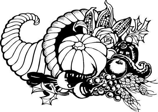
My first thought is that the logo should recognize that we all eat lots of different foods all over the world. We can’t have all of them on the logo, but we could have those most eaten. For example, I read that the ten most eaten staple foods in the world are maize, rice, wheat, potatoes, cassava, soybeans, sweet potatoes, yams, sorghum, and plantain. So why not shove all of of them into a cornucopia like this one, so dear to Americans around Thanksgiving and put it on FAO’s logo?![]() After an initial burst of enthusiasm, I hesitate. First of all, I am committing exactly the same sin which I am accusing the original designers of, cultural imperialism. Who, outside of the European and neo-European countries, has ever heard of cornucopias? This was a Roman invention, attributed to several Gods and Goddesses having to do with food and agriculture. Of these, I prefer the Goddess Abundantia, for no other reason than it’s a pretty cool name.
After an initial burst of enthusiasm, I hesitate. First of all, I am committing exactly the same sin which I am accusing the original designers of, cultural imperialism. Who, outside of the European and neo-European countries, has ever heard of cornucopias? This was a Roman invention, attributed to several Gods and Goddesses having to do with food and agriculture. Of these, I prefer the Goddess Abundantia, for no other reason than it’s a pretty cool name.

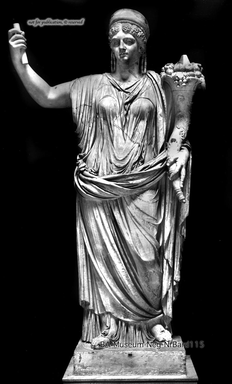
As you can see, she is nestling a cornucopia along her left arm.
Abundantia’s name also happens to show the second big problem with cornucopias. Her name gave us our word “abundance”, and that is indeed the purpose of the cornucopia, to show the overflowing fruits of the earth – that’s why it pops up at Thanksgiving, when everyone is gorging themselves. But abundance is not what 90% of FAO’s clients have. I think it would be rather a slap in their face to flaunt so much abundance.
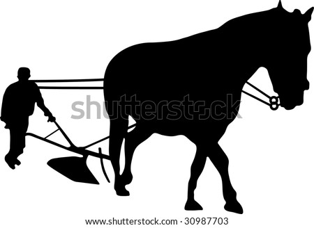
Why not move away from the fruits of farming to the act of farming itself? And here I’m thinking of the act of ploughing – not completely universal, I grant you, since herdsmen don’t plough, but still pretty symbolic of farming from time immemorial.

Some sort of simplified picture like this could do the trick
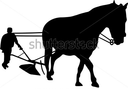
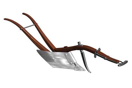
although obviously this particular picture carries a lot of European cultural baggage: the horse, the way the man is dressed. But I’m sure a professional designer could come up with something less fixed to a certain time and place. Of course, fitting all of that in a readable form onto a logo might be a challenge. Perhaps the picture should be just the plough itself, something like this. Again, after an initial moment of enthusiasm, I hesitate. I could be accused of wanting farmers to stay in the Stone Age. Why not have a modernist, aspirational logo like a tractor, which no doubt every farmer, sweating away as he ploughs his field with his ox or horse or other beast of burden, would devoutly wish for? Something like this:
![]()
But frankly I don’t like tractors much; I have a rather contrasted relationship with this piece of agricultural machinery. So I’ll nix that idea.
After some thought, I suggest we should go for something much simpler, something much more fundamental, something much more basic: this
 After all, once you strip out all the technology, all the sophistication, all those damned tractors, isn’t that what farming is essentially about, nurturing a plant to grow?
_______________________
FAO logo: https://upload.wikimedia.org/wikipedia/commons/thumb/d/db/FAO_logo.svg/2000px-FAO_logo.svg.png (in https://en.wikipedia.org/wiki/Food_and_Agriculture_Organization_of_the_United_Nations)
UNICEF logo: http://www.somalicurrent.com/wp-content/uploads/2014/12/UNicef.png (in http://www.zwallpix.com/unicef-logo.html)
Cornucopia icon: http://www.clker.com/cliparts/1/8/a/5/128509193232136462thanksgiving-cornucopia-large.jpg (in http://www.clker.com/clipart-71521.html)
Statue of Abundantia: http://arachne.uni-koeln.de/images/Abbildungen/FADatenbankabb0488/BA-Museum-Neg-NrBard115_2211,05.jpg (in http://arachne.uni-koeln.de/browser/clarac_index.php?view%5Blayout%5D=clarac_page&clarac%5Bsearch%5D%5BPS_WebseiteID%5D=3125)
Egyptian ploughing: https://upload.wikimedia.org/wikipedia/commons/thumb/9/91/Maler_der_Grabkammer_des_Sennudem_001.jpg/1280px-Maler_der_Grabkammer_des_Sennudem_001.jpg (in https://commons.wikimedia.org/wiki/File:Maler_der_Grabkammer_des_Sennudem_001.jpg)
Hand ploughing: http://image.shutterstock.com/display_pic_with_logo/300715/300715,1243435606,4/stock-photo-farmer-and-horse-drawn-plough-30987703.jpg (in http://www.shutterstock.com/pic-30987703/stock-photo-farmer-and-horse-drawn-plough.html)
Hand plough: http://img.index.hu/imgfrm/4/5/6/4/BIG_0007494564.jpg (in http://forum.index.hu/Article/showArticle?go=99788228&t=9201739)
Tractor logo: Hand ploughing: https://s-media-cache-ak0.pinimg.com/736x/ed/04/8b/ed048bb8cfea5f269418c1476160f152.jpg (in http://janesbrickroad.blogspot.com/2010/07/jacobs-creek.html)
Planting: http://thumb9.shutterstock.com/display_pic_with_logo/2857603/257887916/stock-vector-hand-holding-a-leafy-plant-symbol-for-download-vector-icons-for-video-mobile-apps-web-sites-and-257887916.jpg (in http://www.shutterstock.com/s/planting+seeds/search.html)
