Vienna, 13 September 2022
As my wife and I go places – bars, restaurants, museums, stores, and general walks around town – given the state of our respective bladders (old age creeping up …) we quite often need to use the toilets of these establishments. On my part, this has led me to study – and in some cases photograph – the signs used on the doors to signal to the desperate which door to open. After several years of taking photos, I think it is time to unveil my collection.
Readers may find this a bizarre preoccupation – I’m sure my wife does, although she’s always been too nice to say it – but actually it’s a very interesting little design challenge: how should one design the symbols used to distinguish the female toilets from the male toilets? I can’t say I’ve seen a huge number of signs which are interesting enough to take a photo of. So in writing this post, I had a quick look around the net to see what other signs I could use to bulk up the post. And of course I have discovered that I am not the only one to have an interest in toilet signs (if there’s one thing the Internet does, it’s to reinforce my melancholic conclusion that none of us are unique). There’s one site in particular that contains a treasure trove of photos of toilet signs, from which I have lifted a good number of the examples I show here. But even a general search through Google Images has thrown up all sorts of interesting examples. Many of the designs I’ve seen are pretty bog-standard (although perhaps this is not the right place to use this very British expression). This example will suffice to stand in for all these.

Sometimes, there are attempts at humour, which is better than nothing I suppose. I photographed this sign some 7-8 years ago now in Bangkok. It’s quite a popular sign, I have since observed. I find it quite amusing – or at least I did when I first noticed it, although the amusement has now palled since it describes only too well my ever more frequent anguish at not finding a loo handy.

Much of the humour is more of the toilet humour type (as it were). For instance, in one type of toilet signs phalluses and lack thereof figure prominently as the distinguishing feature between genders (I will slide over for the moment the current arguments about there not being binary genders, but rather a spectrum; we’ll pick up this (very) hot potato in a minute).


The next one is a more subtle example of the phallus and lack thereof theme. I will let my readers figure it out – although it does require a basic understanding of vulgar names in English for phalluses and lack-thereofs.
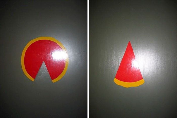
Another grouping of toilet-humour signs cluster around the basic difference in urine delivery system between genders, as these examples show.
This one is rather obvious.

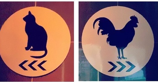
These are rather more subtle

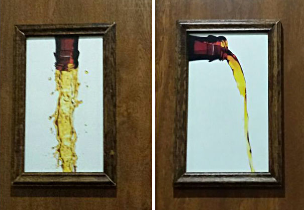
And this one is even more subtle and really rather good.

Other signs are more cerebral, using various scientific symbols to distinguish the genders.


I suppose there are no gender-related biases baked into these types of signs, although a lot of people might not find them easily understandable. That includes me. If I’m to be honest, the last one would be hard for me; I can never remember who is XX and who is XY.
Others take the route of children’s drawings.

Perhaps establishments which use this type of sign think that toilet users will get a warm feeling when they see these signs and forget the quarrels over gender biases which toilet signs can underscore. But this is actually a minefield; much ink has been spilled about the unconscious gender biases which are inculcated in small children: why should girls wear skirts and boys no? why should girls have ribbons in their hair and boys not? and so on and so on.
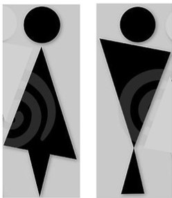
As for me, I’ve been more interested in symbols which, with an economy of shape and line, elegantly but clearly signal the two genders. If I’m to be honest, I’ve not seen a huge number of signs that meet my exacting standards of good design. Here’s what I have in my collection.

Same set of elements make up the designs, but by just flipping one of the elements the gender distinction is made.

Again, same set of elements, but a switch of position conveys the gender distinction.

A few deft strokes of difference immediately distinguishes the genders.

Again, just the addition of a few strokes and the repositioning of others, and the gender difference is made.
I can add to this one other sign I found on the internet designed in the same vein. It’s actually a variant on the first in this series which I’ve given above: same set of shapes, some just flipped.
And now to tackle the very thorny question of gender identity! As anyone reading the papers will know, there are places in the world hotly debating into which toilet people who reject gender binarism should go. I will carefully avoid entering this minefield, and will simply show here a few photos that I’ve collected which apparently tackle this topic.
The first is from the station in Como, the starting point of many of our hikes around the lake. These are toilets which we often use, and I have had the chance of inspecting the signs many times. Looking at the layout of the two toilets – no urinals – I can only think that the symbol to the right in each case is inviting non-binary persons to enter the toilet which they feel most comfortable with.

The next example is one of several I have collected over the years.

I actually wonder if this type of sign is not simply signaling unisex toilets, which, if you think about it, is the simplest way of avoiding the gender wars – again, as long as you don’t have urinals. That being said, there are people up in arms about these toilets. I have to say this rather befuddles me, because as far as I can make out that’s what most of us have in our homes. I think the only question really is, do women feel safe in unisex toilets? If they do, then I don’t see where the problem lies – and just so long as we men aim properly.

