Yesterday, by sheer happenstance, my wife and I took in an exhibition entitled “Soul of a Nation: Art in the Age of Black Power 1963-1983)” at the Broad museum in Los Angeles. In one section, this was written on the wall: “During this period, centering the Black figure – historically marginalized in Western painting – was radical. Many artists created powerful images of Black Americans, including portraits of writers, artists, and everyday people.” It is true that the non-whites in almost all the paintings I showed in the last two posts are not centre-stage. So as a follow-up to my last two posts, I have decided to do some centering of my own, extracting the portraits of non-whites which are to be found in Art UK’s database. Here is the result: not quite all the ones I found; I chose the best.
Interesting fellow, Ira Frederick Aldridge, whose portrait this almost certainly is. An African American, he found himself constantly discriminated against as an actor in New York and so came to the UK in 1825. Thereafter, he had a very successful acting career, both in the UK as well as in the rest of Europe. There was of course a dearth of black characters in plays, so occasionally he took on roles as white European characters, for which he would be appropriately made up with greasepaint and wig. I love the idea: blackface in reverse …
After this, we have a number of portraits of anonymous people who sat as models.
Portrait of an African (c. 1861), by George Harrison (1840-1910). Photo credit: Royal Cambrian Academy of Art
Even though the model’s face is hidden in this next portrait, I thought of including it because it is the first portrait of a woman.
Female Figure Seated (1898), by Evelyn Cheston (1875-1929). Photo credit: UCL Art MuseumNegro in White (c. 1922), by Francis Campbell Boileau Cadell (1887-1937). Photo credit: Dundee Art Galleries and Museums Collection (Dundee City Council)
The next portrait is the first I found of a South Asian.
Intriguing woman, Bapsybanoo Pavry. She was born in Bombay, daughter of a Parsi Zoroastrian “Head Priest”. She came to the UK at a young age, determined to use her great beauty (and presumably great riches) to break into high society. She was about 30 when Augustus John painted her portrait. 20 years later, aged 51, she managed what she thought was a great coup: she married the Marquess of Winchester. Admittedly, he was marrying for the third time, was 90 years old, impotent, and bankrupt. But he was la crème de la crème of British aristocracy. Alas! Within weeks of marrying her, he eloped with his former fiancée Eve Fleming, mother of Ian Fleming (of James Bond fame), first to Monte Carlo and then to the Bahamas. Bapsybanoo followed them there, but was reduced to pacing up and down in front of their house and shaking her fist at them. Of course, she became a figure of ridicule in British high society, who no doubt felt that this Indian parvenue had got what she deserved. She eventually returned to India and died in 1995.
The artist who painted this last picture, Glyn Philpot, spent most of his career in the UK as a pretty conventional Edwardian portrait painter. Then in his last five years or so, he moved to Paris, his palette lightened and his style became more modern. He painted numerous paintings of people of African origin in this period, a good number of which are in Art UK’s database. This painting is of a young Jamaican, Henry Thomas, who was his lover.
I include the next painting, of Nurse Brown, to remind ourselves of the huge role non-whites played, and continue to play, in the UK’s health service. Although the painting is undated, I’m guessing it is from the immediate post-World War II period.
I include the next two paintings because they intrigue me. They are both set in what we could consider an iconic UK context, Trafalgar Square. One shows three Indian women and the other Caribbean family in the square, with white families forming a background. I wonder what the artist was trying to tell us? That non-whites were now a part of the UK landscape?
It’s in this period that we see the first non-white councillor, the first step on the political ladder. It is David Pitt, who was councillor, the first non-white councillor ever, and later chairman of the Greater London Council. He was later made a member of the House of Lords, the pinnacle, one might say, of the British political establishment.
David Pitt tried twice to be elected as an MP. It seems that the British population was not ready for that. More or less overt racism seems to have been behind his loss both times.
As we enter the 1980s, the pace picks up, and non-white artists begin to make an appearance.
This next portrait is the first in this series to celebrate a sportsman, in this case the boxer Randy Turpin. Interestingly enough, it was painted some 40 years after his triumphs and 30 years after his death: British Middleweight champion 1950-54, World Middleweight champion 1951 and 1953. Why did it take so long to get around to painting his portrait, I wonder? I rather suspect that Warwick Town Council rather tardily remembered one of its more famous local sons.
This next painting certainly brings back memories for me, of the corner shops that were suddenly being run by South Asians. But we’re talking of the 1970s, while this portrait was only painted in 2000.
And here we arrive at the pinnacle the British political elites. Paul Boateng was able to be elected MP, he became the first non-white member of the Cabinet, and after a spell as High Commissioner to South Africa he became a member of the House of Lords.
There is another elite, the military elite, which we have not had examples of yet. As of 2016, there wasn’t a single non-white in the British army’s top 133 positions. Perhaps it’s improved slightly since then although I doubt it. But there is also an elite of courage. Here, we have Johnson Beharry, who I believe is the first black British recipient of the Victoria Cross, the UK’s highest award for gallantry in the face of the enemy. He won it during the Iraq war (there have been a good number of non-white recipients of the Victoria Cross, but they have all been Commonwealth troops).
In this post, I’ll continue looking at how non-white people were represented in British art, covering the period from the early 1800s, which more or less coincides with the formal abolition of slavery throughout the British Empire, to the present day. I want to focus on group paintings, that is, paintings where a number of people are present, because I feel that these more than anything else tell us how much non-white people were “visible” in society; if the paintings show them, it means that the painters – presumably as a reflection of those who commissioned the paintings – noticed that non-white people were present in British society. These types of paintings also show the “power relationships” between the people in the paintings. In the previous post, for example, I showed mostly group paintings, where the non-white participants – young black pages for the most part – were clearly in a subsidiary position to the whites in the painting. When do the paintings in Art UK’s database show that these power relations change, and how do they change?
In the previous post, the last of the group paintings with a non-white person in it was from 1794. There is then a big gap in the Art UK database; the next group painting in which I identified some non-whites was from 1875, some 80 years later. They were in what I would call a society painting entitled “Hush!”.
Hush! (1875), by James Tissot (1836-1902). Photo credit: Manchester Art Gallery. Distributed under a CC BY-NC-ND 4.0 licence
The sharp-eyed reader will notice two Indians sitting on the sofa to the right. From their dress (and the fact that they were even at this type of high-society gathering), they must have been high-class Indians, Maharajahs or such-like. Like the little black pages of the previous post, they were no doubt an exotic addition to the gathering, but their presence in the UK also suggests that they were presumably part of the British elite’s attempts, throughout the Empire, of co-opting the traditional ruling classes of the colonised countries and turning them into philo-Britishers. There is a similar painting in Art UK’s database, from some forty years later – similar in the sense of celebrating a high-society occasion and including a sprinkling of ethnic exotica. It is a painting celebrating a formal luncheon in London’s Guildhall in honour of King George V’s coronation.
Straining a bit, readers can see a group of Indian grandees, dressed in their colourful ethnic costumes, to the left and towards the back (of course). I presume they are there to remind readers that ever since Queen Victoria British monarchs had appropriated to themselves the title of Emperors of India; the Indian grandees were there, then, to celebrate “their” Emperor.
What about group paintings of normal people? Well, the very first I could find after the “black page period” is this one, from 1880 – once again, some 80 to 90 years after the “black page period” petered out.
This is actually a very intriguing painting, since it positively bursts with ethnic pluralism. Three of the main figures – the old man, the man with an injured arm, and the boy – are white, but the young man on whom the old man is leaning is Middle Eastern, while immediately behind the injured man are an East Asian man and an African, there is another African on the second flight of stairs on the top left, while some of the other characters at the back could also be of Middle Eastern or South Asian origin. Of course, the artist is stressing the Christmas angel’s message of “On earth, peace and goodwill to all men” but I cannot believe that he merely invented this ethnic diversity. I have to think that this Old Sailors’ Home in Greenwich really did look after sailors with very diverse ethnic backgrounds. As I highlighted in the previous post, life on the high seas seems to have been a place where ethnic diversity was common.
Thereafter, there is another gap of 90 years in Art UK’s database until I find the next group painting with a non-white person in it. This painting is from 1971. By this time, the immigration of non-whites into the UK to fill low-class jobs that white British people didn’t want to take anymore or to fill gaps in the growing labour market had been going on for some 20 years. The West Indians first started to arrive in the 1950s, followed by the South Asians (Indians and Pakistanis) in the 1960s and ’70s. This particular painting is not very flattering, as it turns out.
It seems sad that the first group painting with non-whites in it that I could find in the modern, post-War, post British Empire era should be about prostitution. But perhaps it is an apt if somewhat harsh descriptor of the position in British society of non-whites at the time. And perhaps it continues to reflect the old idea of non-whites as exotic: the exotic is a popular selling point in the sex trade.
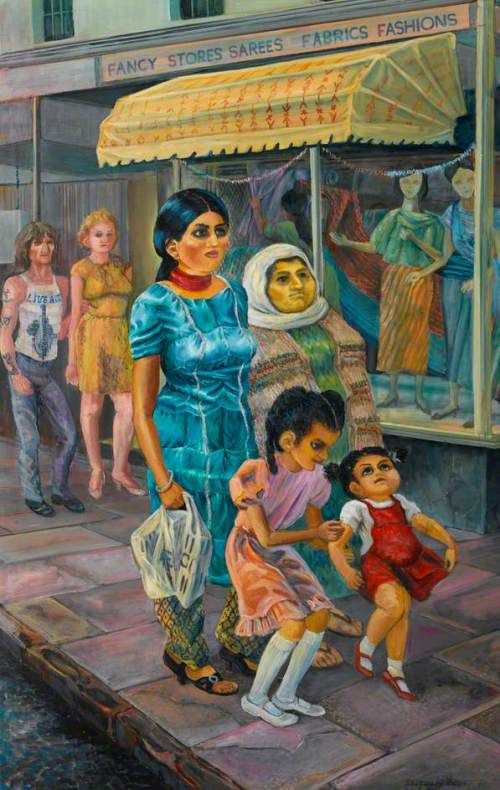
Thereafter, things get more normal. In 1985, for instance, we have this painting of a South Asian family walking down a road, with a white couple behind them.
It is a scene showing equality among the painting’s participants – although perhaps the artist, in having the adults in the South Asian family wearing traditional dress and the children in “British” dress, is making a point about integration? I certainly see integration as the issue in this next, undated, painting by the same artist.
White children are using the slide. The South Asian children are looking on. Do they want to go on the slide? Is the little fair-haired girl at the bottom of the slide inviting the smaller South Asian girl to join in? What about the mother? Is she urging her children to get on the slide?
As we get into the 1990s, the presence of different ethnicities in the UK becomes more recognized in Art UK’s database. For instance, we have this painting from 1990 shows the mix of ethnicities in football.
This next two paintings show the presence of different ethnicities in the political process. This painting, from 1993-94, shows what we might call the politics of the street.
I suppose this last painting represents a key moment in the integration of non-whites into British society. I started this series of posts with paintings from the mid 1600s to the early 1800s where non-whites were clearly in a subordinate – actually, a subjugated – position. This painting shows that by the 1990s non-whites were entering the British elites. It is not enough to have racial integration “on the street”, as this next painting from 2001 would suggest.
Only when non-whites are consistently present at the elite levels, as suggested by this 2008 painting, can one say that racial integration is truly occurring.
It has certainly been a long journey from subjugation to equality for non-whites in the UK. After a presence as slave-servants in the mid-1600s to early 1800s, non-whites disappear from British art, apart from brief appearances as upper-class exotica, until the 1970s. Thereafter, their presence becomes more felt and a steady progression up the social ladder is apparent. The process is not yet complete; it would be nice, for instance, in the last painting to have more non-whites in the front rows rather than finding them all in the back rows. But it is happening, which is heartening.
Several weeks ago, I read about an exhibition opening at the Musée d’Orsay in Paris. Titled “Black Models: From Géricault to Matisse”, its purpose is, according to the Guardian where I read the article, to “tackle the depiction of black and mixed-race people in French art from the country’s final abolition of slavery in 1848 until the 1950s.” One of the paintings in the exhibition, for instance, is Manet’s “Olympia”, showing the said Olympia, a courtesan (or high-end prostitute in today’s parlance), naked on her bed and being attended by a black servant.
The painting has been renamed “Laure” for the exhibition, after the name of the black model who posed for the servant in the background. The exhibition renames several other paintings where the curators managed to discover the name of the black person in the painting. Once more from the Guardian article: “the influence of people of colour has been eclipsed from art history by racism and stereotyping, Murrell [one of the exhibition’s curators] said. Instead their identities were hidden behind “unnecessary racial references” such as negress or mixed-race “mulatresse” – which comes from the French word for mule.” For any readers who are interested in this exhibition, here is the link.
After reading the article, it occurred to me that I could use the data base of Art UK, which I used for a different purpose several posts ago, to carry out the same sort of study: see how non-white folk have been represented in British art over the centuries. Just a quick explanation to those readers who are not familiar with Art UK: it is a pictorial data base of all the pieces of art held by the UK’s public bodies. For those interested in perusing it, this is the link. I would imagine that it is probably a statistically valid sample of the art which has been created in the UK ever since painting started in the country.
Just as I did in my previous foray into Art UK’s data base, I will spread my results over several posts, each with a somewhat different subject. This post will cover the period from the very first representations of non-white people in British paintings until the end of the 18th century, beginning of the 19th. I choose to end it there because in 1772 there was a famous case in England, Somerset vs. Stewart, which in effect concluded that slavery was not allowed under law in England, while in 1833 Parliament passed a law banning slavery throughout the British Empire.
The earliest British painting I found with a non-white person in it is this one. It depicts a certain Lady Tollemache being served by a young black page.
If one was rich, it must have been quite the thing to have a little black page in one’s household to show off to one’s friends. A number of such paintings are to be found in the Art UK data base, stretching from 1651 to 1740. I don’t think those dates are a coincidence. 1651 is about when there was a large increase in the transatlantic slave trade to feed the sugar plantations in the Caribbean. Many English landowners had important economic interests in these plantations, while English ships – in which, again, landowners had interests – began to dominate the slave trade. It would therefore have been increasingly normal for rich and important families to be involved with black slaves. It is but a small step from this to start thinking that it would be cute to have a black child as your slave-servant. At the other end of this period, 1740 marks the time when abolitionists were becoming increasingly vocal and when it became “not done” to be so visibly seen as involved with black slaves.
The next painting of this type is from about 1660 and is of a certain Elizabeth Risby and her son, being served by both a black page and a maidservant who also looks non-white.
Quite what the ethnicity of the maidservant is, is not clear. I wonder if she was not the companion to the manservant in this next painting, also of Elizabeth Risby but this time with her daughter.
Given the date of the painting and the manservant’s hair style, I wonder if he, and therefore she, were not Native Americans, signaling perhaps that either Elizabeth or her husband had lands (and slaves) both in the Caribbean and in the American colonies.
From some 40 years later, 1695, we have this painting of the 3rd Earl of Chesterfield and his family, being served once again by a black page.
It is interesting to see in this last painting the presence of some exotic bird (a parrot? a cockatoo?), something which you also see in the second of the two paintings of Elizabeth Risby and see again in the painting below of Lady Grace Carteret. I wonder if that puts black pages into the category of exotica, with the families using these paintings to show off all the exotic things they owned?
The next painting, from 1711, is a portrait of Sir John Chardin, a Frenchman. He travelled to Persia and the Near East and wrote learned tomes about these places. He was also a Protestant, who emigrated to the UK because of the persecution of Protestants in France. That experience of persecution didn’t stop him from taking part in the persecution of enslaved Africans, though.
Sir John Chardin (1711), British School. Photo credit: The Ashmolean Museum of Art and Archaeology
This next painting of Lady Grace Carteret, from 1740, is the last I could find of this type.
Apparently, it wasn’t just the aristocracy and the landed gentry who had young black slave-servants. I found one painting of a doctor who is letting the blood from a patient’s arm and whose assistant is a young black boy.
For the sake of completeness, I should say that it wasn’t just black children who were taken on as servants. I’ve already shown one example in the second of the two paintings of Elizabeth Risby. In the Art UK database, there are two other examples of children of other ethnicities being taken on as servants. One is of a certain Colonel Blair and his family. Colonel Blair worked for the East India Company and commanded a brigade at one of the early battles through which the UK eventually took over India.
The painting’s title suggests that the little Indian girl in the painting is an ayah, a maid or nursemaid. She looks too young to be either; perhaps she played the same role as the black pages, a cute little addition to the family belongings which also allowed the Blairs to signal to the viewer their connection with India.
The other is of a Lady Staunton and her son George, with a Chinese servant lurking in the background.
This picture was painted a year after her 12 year old son George had come back from China. George had accompanied his father, who was Secretary on Lord Macartney’s mission to the Chinese imperial court. Macartney’s instructions were to wrest trade concessions from the Emperor, which he signally failed to achieve (I’ve mentioned the diplomatic spat about whether or not Lord Macartney should kowtow to the Emperor in an earlier post). Presumably, George’s father, Sir George Staunton, got himself a young Chinese servant while in China and had him inserted into the painting to show off his connection with that country.
Coming back to the black pages, assuming that the idea of having one was that it was cute, like having a parrot, what happened to these black pages when they grew up and lost their cuteness?
From what I can gather from the painterly record in Art UK’s database, it seems that some of them at least continued on as servants of one kind or another to the rich folk. We have, for instance, this painting by William Hogarth of an aristocratic captain in the Navy, who has, among other appurtenances, a black servant ringing what looks like a dinner gong – or is he giving the beat to the fellow singing?
We have this painting by Jacopo Amigoni, an Italian painter who spent some ten years in London, of three gentlemen whose precise relationship to each other is not clear to me. In any event, the painting-within-the painting of one of the three is being held up by a black adult servant.
We have a painting of Baron Nagell’s running footman. The Baron was the Dutch Ambassador to England, while according to Art UK’s entry on this painting “a running footman could be expected to serve as a messenger and to accompany his employer’s coach”. I presume the poor man had to run alongside the coach.
Servants to the rich does not seem to have been the only niche that Black slaves or ex-slaves filled. Art UK’s database throws up a few other examples. This next painting suggests that Blacks worked in taverns or inns or maybe even brothels (given that he is trying to attract a soldier), presumably as servants to their owners.
Wallis, George; The Fall of Napoleon (1836), by George Wallis (1811-1891). Photo credit: Wolverhampton Arts and Heritage
The sea also seems to have been a home for Black people. A recent article in the Guardian suggests that already in Tudor times (so 200 or so years before the period we are considering here), foreigners – specifically, North Africans – were present among the sailors in the English fleet. This sympathetic drawing of a Black sailor – the first of our subjects whose name we know: Thomas Williams – suggests that Black men found a profession at sea. Probably, the British Navy, always short of men (we remember stories of the press gangs roaming the countryside and kidnapping men for the Navy), was quite happy to take on Black men in their crews.
I suspect the next one tells us that some Black sailors, like all sailors, were mutilated at sea, either by cannon fire or in some other way.
The Negro Boat Builder (c. 1850), by William Parrot (1813-after 1891). Photo credit: Brighton and Hove Museums and Art Galleries
It seems appropriate at this point to insert what is thought to be the portrait of Ignatius Sancho, the second black person in all these paintings for whom we have a name.
Ignatius Sancho was well known in his time. I think it instructive to cite a somewhat shortened version of his biography in Wikipedia:
“Charles Ignatius Sancho was born [in about 1729] on a slave ship crossing the Atlantic Ocean. His mother died not long after in the Spanish colony of New Granada. His father reportedly killed himself rather than live as a slave. Sancho’s owner took the young orphan, barely two years old, to England and gave him to three unmarried sisters in Greenwich, where he lived from ca. 1731 to 1749. John, Duke of Montagu, impressed by Sancho’s intellect, frankness, and his amiability, not only encouraged him to read, but also lent him books from his personal library. Sancho’s informal education made his lack of freedom in Greenwich unbearable, and he ran away to the Montagus in 1749. For two years until her death in 1751, Sancho worked as the butler for Mary, Duchess of Montagu, where he flourished by immersing himself in music, poetry, reading, and writing. At her death in 1751 he received an annuity of £30 and a year’s salary, which he quickly squandered.
During the 1760s Sancho married a West Indian woman, Ann Osborne. He became a devoted husband and father. They had seven children. Around the time of the birth of their third child, Sancho became a valet to George, Duke of Montagu, son-in-law of his earlier patron. He remained there until 1773.
In 1766, at the height of the debate about slavery, Sancho wrote to Laurence Sterne encouraging the famous writer to use his pen to lobby for the abolition of the slave trade. Laurence Sterne’s widely publicised response to Sancho’s letter became an integral part of 18th-century abolitionist literature. Following the publication of the Sancho-Sterne letters, Sancho became widely known as a man of letters.
In 1774 with help from Montagu, Sancho opened a greengrocers shop, offering merchandise such as tobacco, sugar and tea. These were goods then mostly produced by slaves. As shopkeeper Sancho enjoyed more time to socialise, correspond with his many friends, share his enjoyment of literature, and he attracted many people to his shop. He wrote and published a Theory of Music and two plays. As a financially independent male householder living in Westminster, he qualified to vote in the parliamentary elections of 1774 and 1780; he was the first person of African origin known to have voted in Britain. At this time he also wrote letters and in newspapers, under his own name and under the pseudonym “Africanus”. He supported the monarchy and British forces in the American Revolutionary War.
Ignatius Sancho died from the effects of gout in 1780. He was the first person of African descent known to be given an obituary in the British press. He gained fame in his time as “the extraordinary Negro”, and to eighteenth-century British abolitionists he became a symbol of the humanity of Africans and immorality of the slave trade. The Letters of the Late Ignatius Sancho, an African, edited and published two years after his death, is one of the earliest accounts of African slavery written in English by a former slave.
Sancho noted that despite being in Britain since the age of two he felt he was “only a lodger, and hardly that.” In other writings he describes: “Went by water – had a coach home – were gazed at – followed, etc. etc. – but not much abused.” On another occasion, he writes: “They stopped us in the town and most generously insulted us.””
His life encapsulates what a Black person could expect his or her life to be at this time in the UK. Although Sancho was unquestionably a man of great intellectual ability, he rose no higher than a greengrocer. Of course, in those times this was not the fate of Black people alone, it was generally true of any poor person: the top 1% controlled every important position. But what I find really chilling is his commentary on how Black persons were treated back then, almost as animals in a zoo. And of course, there was overt racism.
The debates that Sancho was involved in to abolish slavery were intensifying from the 1760s onward and no doubt were putting moral pressure on slave owners in the UK itself. This probably explains why the kinds of paintings I have shown up to now disappeared. It was “not done” anymore to own little black pages – or at least not to be painted with one at one’s side. They were replaced by paintings such as these criticizing slavery and the slave trade.
In the next post, I’ll trace the presence of non-whites in UK art after slavery was formally abolished throughout the British Empire up until the present day.
Many, many years ago – it must have been the Easter of 1976 – I visited my wife-to-be in Milan during the Spring holidays. After the dark, cold Scottish winter we had just endured in Edinburgh, the tepid spring temperatures in Milan were a godsend. On my first day there, my wife(-to-be) took me on a walk around the district. We rounded a corner and I found myself confronted with this: It was even more striking closer up: a froth of tender green partially masking the ruddy red of brick in the walls of a venerable-looking church topped off with a very fine dome. I took these two pictures from the same spots a week or so ago. Nothing much seems to have changed in the intervening 40+ years.
It was a vision – after that cold, dark winter – of the coming of spring that has remained with me ever since. I put my eventual decision to “pivot” away from grey, rainy, cold UK towards sunny, warm Italy down to that first spring visit to Milan and in particular to this vision of tender green on brick red.
A walk around the back of the church through a little park made the church look even more interesting. I have always been very fond of this seemingly higgledy-piggledy pile of venerable-looking buildings, all in that warm red brick so common in this part of the world. Over the intervening 40-odd years, whenever I’ve been in Milan I have always tried to find a moment to come back to this spot to admire the view.
The church is just as interesting on the front side. There, the first thing that meets the eye is a row of very worn Roman columns. They enclose one side of the piazza in front of the church, a piazza which is as orderly as the back of the church is disorderly. Facing the columns, the church’s facade rises up to the church’s imposing dome, adopting the clean lines of classical-looking architecture. The canon houses on the other two sides of the piazza continue this projection of orderliness, balance, and harmony. As a finishing touch, in the centre of the piazza stands a statue of a Roman emperor, calmly gazing down on passing visitors. Meanwhile, in the near distance those same visitors can make out one of Milan’s few remaining gates in its Medieval walls, the Porta Ticinese. This church is the Basilica of San Lorenzo. It is a very ancient church; the latest archaeological digs put its foundation at the end of the 4th-beginning of the 5th Centuries. Its history is not nearly as orderly as the piazza in front would have us believe; the disorderliness of the back is a better metaphor for its passage through the centuries.
Like many ancient churches in the lands of the old Roman Empire, the church was built atop a Roman temple. This aerial view of what Roman Milan probably looked like has been put together by some clever fellow. San Lorenzo was built over that square grey temple close to the amphitheatre which readers can see in the bottom left corner. This is a close-up of what the clever fellow thinks that temple might have looked like. My guess is that the columns now standing guard over the piazza in front of the church were reused from this temple. But it’s just a guess; no-one seems to know for sure where they came from. What is sure is that stones from the nearby amphitheatre were dragged over for use in the foundations of the church.
That reuse of stone and columns strongly suggests that this was an imperial basilica – you needed imperial permission to mine old public buildings for their stone. It’s further believed that the basilica was built close to an imperial palace – at this time Milan was the imperial capital of the Western Roman Empire – as a counterweight to the four basilicas which St. Ambrose, the powerful bishop of Milan, had been busily building in Milan (and which still exist today, although in much modified form).
We don’t know for sure what the first church looked like, although archaeological excavations and the sparse written records have helped the experts form an opinion. Based on this, some other clever fellow has come up with this cut-away drawing of what the first church might have looked like. Very little remains of this complex today: the four towers (two are visible in this drawing), the two octagonal side chapels, and the recycled Roman columns at the front. What also remains is the ghostly outline of the central part of the church, a very striking space composed of a large square with each side having a shallow apse, and with a wide circular deambulatory corridor around that central space. Anyone who visits many churches, either for religious reasons or – like me – to admire their art and architecture, cannot but be struck by the uniqueness of this space. Very few old Christian churches have this kind of floor plan.
The drawing above doesn’t give any indication of the decoration of the church, but if this was indeed an imperial basilica then the interior would have been richly decorated with mosaics. If we had been lucky, if San Lorenzo had passed through the centuries relatively unscathed, we might have been able to admire something as glorious as the church of Sant’Apollinare in Classe in Ravenna. But it was not to be. Almost all of San Lorenzo’s mosaics are gone, swept away by water leakage, poor maintenance, rebuilding after fires or structural failures, and changing tastes. What little is left is tucked away in one of the old octagonal side chapels, the chapel of St. Aquilinus. The best conserved mosaic is this one, depicting Christ among the Philosophers. A much more damaged mosaic is tucked away in another corner of the chapel. Experts believe this to have shown the Christ-Sun in his chariot (presumably borrowing from the classical representation of Apollo in his chariot moving the sun through the sky) – one can still see the horses’ legs against a golden background. Two fires and an earthquake did it for the first church of San Lorenzo, with the central dome probably collapsing. Major rebuilding programmes took place in the 12th and 13th Centuries to rebuild the dome in “modern” style. While the basic plan of the church was left untouched, various other things were added: a few more side chapels and no doubt other things here and there. No-one seems to have committed to paint or paper this newer version of the church. The best we have is some miniatures painted by Cristoforo de Predis in a book of 1476, Leggendario libro della fine del mondo. They show Milan as background to scenes drawn from the New Testament. This one in particular, which depicts Jesus returning to Nazareth where he is presented with a paralyzed man, has Milan standing in for Nazareth. The paralyzed man is being brought out of the Porta Ticinese, which has the old medieval walls attached to it as well as the defensive moat in front of it (now a busy ring road), while in the background we see the church of San Lorenzo with its fine new dome. The interior decorations were of course also renovated, this time in the “modern” fresco style. Again, if we had been lucky, we might have found ourselves today gazing on something as glorious as the interior of the Collegiata in San Gimignano: But no. As time went by, these frescoes were also attacked by their enemies: water, fumes from candles, neglect, structural damage, and changes in taste. In the final indignity, someone decided to whitewash over what was left of them to make nice white walls. In the last fifty years or so, modern conservationists have scraped away the whitewash and have revealed some scraps of the frescoes that adorned the church:
Of the first generation of frescoes, we have a Descent from the Cross St. Helena, holding that same Cross, which she is purported to have found in Jerusalem The Virgin and the Christ child, enthroned Later frescoes were added, or substituted the earlier ones, like this Last Supper from the early 16th Century. Things were definitely not helped by the dome collapsing again in 1573. Once more it was rebuilt, and that is the dome which I admired 40 odd years ago and which we still admire today. But one can imagine that the collapse of the dome brought down a lot of the interior decoration with it and putting it back up again put paid to a good deal more.
Meanwhile, things were changing around the church. At the beginning, the church had been outside the city, but when the city expanded its walls in the Middle Ages, it had been brought within the city boundaries. With the greater protection this afforded, people had decided to build houses all around San Lorenzo. These pressed right up to the church’s walls. In fact, in the front of the church, houses had invaded the space between the church’s front doors and the old Roman columns so that these were now completely isolated from the church, as this painting from about 1815 shows.An exception was the back of the church. There, the ground was marshy, being low-lying and the point where several streams and canals met. As a result, an open no-man’s land was left there, which during normal times was used by the city’s tanners. As anyone knows who has been anywhere near a tannery, the smell in the neighbourhood must have been overpowering, so it was not a place that the good folk would have wanted to live. Tanning was still going on here in the 1830s, as this painting from 1833 attests – note the skins stretched out to dry in the foreground. To make matters worse, it was on this no-man’s land that until the mid 1800s the city’s authorities carried out their executions, and of course executions included all the hideous tortures that the poor bastards were subjected to before being allowed to die. This print shows vividly what could await those being executed in this space – San Lorenzo stands as a mute witness in the background. Definitely not an area for the good folk to have their houses! And so the area behind the church was what we might politely call a lower-class neighbourhood, or impolitely call a slum. In the late 1800s, the city authorities decided it was time to spruce up the area. So the no-man’s land was upgraded to a piazza, piazza Vetra, houses were built along its edges and buildings were built in the piazza to house weekly markets. This one, for instance, was built in 1866 for the weekly market in dairy products. We see behind San Lorenzo looking on benignly. In the first three decades of the 1900s, the city authorities cleaned up the area further. In 1911, as this postcard shows, there were still houses located between the old Roman columns and the front door of the church. In the 1920s, the city fathers decided to give San Lorenzo back its piazza, and by the 1930s the houses were all gone. In keeping with the period’s desire to stress Italy’s glorious Roman past, a copy of a bronze Roman statue of the Emperor Constantine was placed in the re-formed piazza; no doubt Constantine was chosen because he was the co-author of the Edict of Milan which proclaimed religious toleration throughout the Roman Empire and which led to Christianity becoming the official religion of the Empire.
The city authorities were also busy behind the church clearing the slums but what really did it for that area were the Anglo-American bombings of Milan in 1943 and 1944. The church itself was unscathed but whole swathes of housing were destroyed. The damage was so extensive that the authorities decided to simply clear away the rubble and create a park. This is what the complex looked like by 1960. Nothing has really changed since except that the tram lines have been shifted to the other side of the columns.
What of the interior? Did grand paintings and sculptures take the place of the frescoes which disappeared? I’m afraid not. Walking around the church, one rather gets the feeling of being in the church’s attic: various pieces plopped down here and there, many of dubious artistic value. Here are some pictures to show what I mean, from the good (a Pietà in polychrome terracotta from the late 18th Century) (a baptism of Christ; the author is not given, nor is the date, but from the style I would guess late 16th Century)
to the bad (I don’t know why so many Catholic churches insist on having these horribly sucrose statues of the Virgin Mary; the church has a few more statues of this type dotted around)
to the downright ugly (it took me a few minutes to figure out that this carved wooden statue was meant to be Pope John XXIII).
I must confess to a certain melancholy when I walk around the interior of San Lorenzo. What splendours we could have had, if only the church could have slipped through the ages unscathed! I console myself with not quite a splendour but at least something lively and fun to look at, murals that have been recently painted on the walls surrounding one of the canon houses. I’m not really sure what the artist is trying to tell us, but they bring a smile to my lips whenever I see them.
Let me start this final post on the topic of UK industry in art by throwing in photos of a couple of paintings which didn’t make it into my previous posts but which really are worth being seen.
And now, with that out of the way, let me meditate for a minute on where things stand for UK industry and what its future might look like.
Through sheer coincidence I have been publishing these posts just when the British Parliament is going through what will probably be the last moments of a contorted, acrimonious process which will take the UK out of the EU, a process that was kicked off by the Referendum results of 23 June 2016. It is the leave vote that interests me here. There were many reasons why people voted to leave, many of them I’m sure having nothing – or relatively little – to do with the EU per se. Consider the following map, which gives a regional distribution of the vote.
The first thing that strikes one is the very clear difference in voting patterns between England and Scotland, and to a lesser degree Northern Ireland. That explains some of the Parliamentary shenanigans we have been witnessing these last two years. Putting that aside, the other major thing that strikes one is that, just from a territorial point of view, the vast majority of England and Wales voted to leave! (although the vote was admittedly close in many places) If the overall vote ended up such a close balance between leave and remain, it is because the bigger cities, which have big populations squeezed into small territories, voted strongly for remain. The following population-adjusted map shows this effect: London and its heavily populated surrounding swells, Scotland and Wales with their small populations shrink.
This divergence in the Referendum results between the large cities and the rest of the country has been interpreted as a protest vote on the part of those who live in the smaller towns. The Referendum was, so the thinking goes, a way they could figuratively stick a finger in the eye of the big-city elites. Since the EU is seen in the heartlands to be very much an elite project, a vote against the EU in the Referendum was very often a vote against the big-city slickers. The people who live in England’s and Wales’s small towns feel left behind, abandoned by the big cities. This must be especially true of towns which were once heavily industrialized whose citizens have seen their proud towns founder and collapse while the big cities seemingly have continued to grow and be ever more prosperous. One of the things that struck me as I prepared the last six posts is how many of the small towns in the paintings I was looking at were once busy, prosperous industrial towns and are now, because of deindustrialization, shells – ghosts – of what they once were. Looking at where the towns in the paintings I chose are on those voting maps, I can understand how the bitterness which has accumulated over the last forty years in these small industrial towns could have spilled over into a vote against the EU – especially since the UK’s membership in the EU started a mere decade before the UK’s deindustrialization started in earnest.
It’s so tragic really, because it looks like many leave voters actually stuck a finger in their own eye. As we have seen over the last few months, manufacturing, which although much diminished still mainly takes place in the old industrial towns, has taken a hit because of Brexit, with one multinational company after another closing down or downsizing their British operations. It will continue taking a hit: in the long term, it has been predicted that Brexit will cause more harm to those who voted to leave than to those who voted to remain. I fear that the divide between England’s big cities and the rest of the country will only deepen once – as I think is now inevitable – the UK leaves the EU. In turn, this will increase the social tensions which already exist and I see no obvious way of defusing them outside the EU. I must confess to being quite gloomy about the UK’s future prospects.
In the late 1980s, globalization really took hold and industry massively began to move out of developed countries and into developing countries. The UK suffered especially heavy losses of its manufacturing capacity. Whole communities not only lost their jobs but their whole raison-d’être. Their ancestors had been forced off the land to work in the factories, the towns they lived in had been created to house the factories, now there was no reason anymore for these towns to exist. People my age remember that time, especially the miners’ strikes, which was their last-ditch attempt to save an industry that was doomed by global market forces. Artists memorialized those terrible moments in the UK’s recent history.
What of industry’s environmental impacts, the topic of my professional interests? Well, there was all that black smoke belching out of factories’ chimneys. Painters readily included these smoking chimneys in their paintings of industry: black smoke meant industrial activity, it meant economic progress, it meant wealth! But as we now know, all that black smoke must have also played havoc with people’s lungs, especially poor people’s lungs – they couldn’t escape to comfortable suburbs far away from all that factory smoke – and especially poor children’s lungs. As industry developed, especially the chemical industry, chimney stacks began emitting different coloured smoke, something which artists picked up.
Artists seem to have been less interested in painting the black rivers – or even sometimes highly coloured rivers if textile factories were involved – which were another by-product of industrialization. As usual, L.S. Lowry seems to have been the only painter who turned his unflinching gaze on this watery ugliness.
Of course, when industries closed or went away, this air and water pollution disappeared (only to reappear, though, in the developing countries where the industries relocated). Not so with industry’s solid wastes. In the early days, there was always a useful hole somewhere behind the factories where wastes could be conveniently dumped and forgotten about.
Industries may have closed down and moved away, but these noisome deposits stayed. How many of them have I dug up over my career! A poisoned present from past industries left for current and future generations to clean up.
And of course the mining operations – coal mines, tin mines, slate mines, … – have left indelible scars on the UK’s landscape, with their tips of mining waste looming up behind the mining villages.
In my next and final post, I’ll slip in some paintings which didn’t fit my narrative but which deserve to be seen by a wider audience. I’ll also meditate on what has been the deeper impact of this story on the UK.
The rural poor may have been chased off the land and dragooned into factories, but at least they went on to create vibrant, closely-knit communities. Artists celebrated this throng of humanity in the shadow of the factories.
In the bigger cities, these communities began to be ripped apart in the late 1950s, early 1960s by well-meaning attempts to upgrade people’s living conditions, but it meant that the centres of industrial cities were laid to waste as factories were moved out into industrial estates and the people were moved into high-rise blocks of flats.
Far greater wreckage was to occur a few decades later when the UK started deindustrializing under Thatcher as globalization shifted factories into the developing countries and left many old industrial towns and cities with no future. This topic will be covered in my next post.
The industrial revolution could only take off because the rural poor were chased off the land, herded into towns, and put to work in the burgeoning factories. These foot soldiers of the industrial revolution were immediately of interest to painters, who caught on right away to the military, drill-like quality of the work for many.
It is striking indeed that most of these pictures have women workers, but this might be more a reflection of the fact that many of the pictures were painted during the two World Wars, when women were drafted into the workplace to replace the men; when the wars were over they were expected to go home. (It is also striking that in the pictures in yesterday’s post, which were all from “heavy industries”, there were NO women.)
The harsh working conditions, the tendency of the factory owners to pay their workers as little as possible, the lack of job security, all led to worker agitation and the creation of the Trades Union movement as well as of left-wing political parties. Artists captured these political trends early.
Artists were also interested in capturing the flow of workers into and out of the factories, at the beginning and end of their day or their shift. Miners’ shift changes got pride of place.
Right from the start of the industrial revolution, artists were fascinated by the factories which glowed red in the night or sent flames leaping up into the night sky – William Blake’s dark satanic mills. Here is a series of paintings on this theme.
While the molten metal went on to further working, the slag from the foundries was thrown onto heaps where, still incredibly hot, it glowed sullenly until it had cooled sufficiently.
The new structures created by the industrial revolution were immediately of interest to artists, who memorialized these new activities
A Pit Head (1775-1825) by the British School. Photo credit: Walker Art Gallery
as well as the buildings that sprang up to house them.
Mill Landscape (1800-1830) by the British (English) School. Photo credit: The Whitaker
No doubt the owners of these new activities – the “capitalists” – were proud to have them memorialized, much as in previous centuries landowners had been proud to have their country seats memorialized.
From the 1960s onward, artists who painted industry seem to have focused almost exclusively on recording the passing of the coal industry, which had underpinned the whole industrial revolution in the UK and was now entering its death spiral.
By 2007, the date of the last painting I show here, the British coal industry was effectively dead, along with much of the manufacturing industry which had powered itself with that coal.
A line from William Blake’s poem Jerusalem has given me the title of both this post and the previous one. Blake asks if Jesus ever walked over England’s green and pleasant land. When Blake wrote that poem, England mostly was still a green and pleasant land, a rural land. It was only slightly pockmarked by the “dark satanic mills” of industry which he mentions in that poem (“And was Jerusalem builded here / Among these dark Satanic Mills?”). Blake died in 1827, before – as the paintings in these two posts show – the blighting ugliness of industrial development had really started disfiguring the land. In my next post, I will explore artists’ fascination with the most satanic of those industrial mills.


