TRISKELES

Milan, 6 November 2025

My wife and I were down in Sicily recently. Our daughter and her partner came over with the grandson and they decided to spend a week down in the very far south of the island, near one of Sicily’s three promontories, Capo Passero (if I mention this detail, it’s because it plays a role later). The house they rented gave directly onto the beach and our grandson spent many happy hours digging holes, making sandcastles, and braving the – relatively small – waves that broke onto the beach.

In between these sessions on the beach, we managed to get in brief visits to Noto and Syracuse, both UNESCO World Heritage Sites. Here’s a photo of the cathedral in Noto.

Source

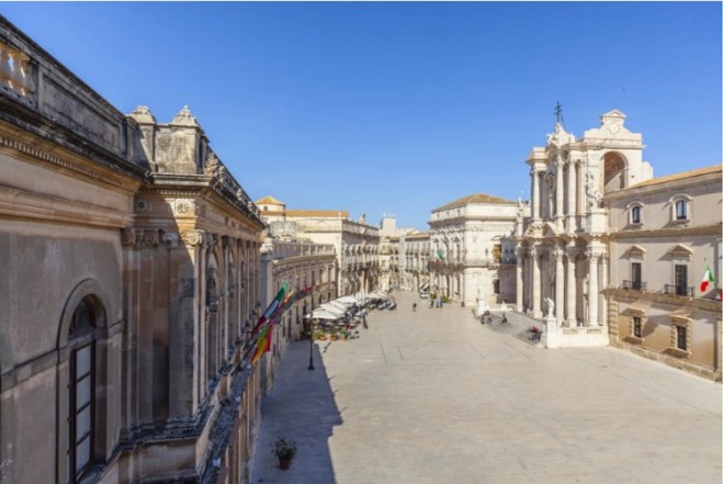
And here is one of the square in front of the cathedral in Syracuse.

Source

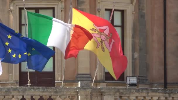
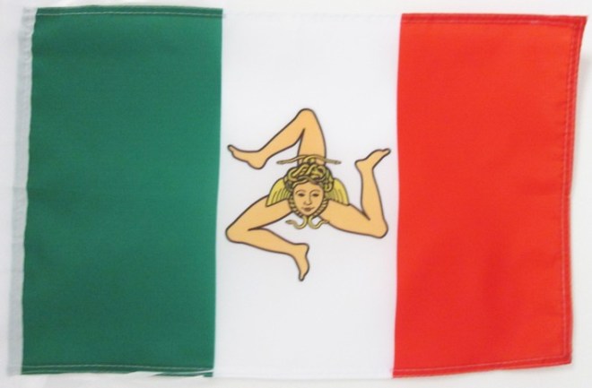
It was while I was wandering the streets of Syracuse that I noticed this flag – every public building had one.

Source

I discovered that it is the official flag of the region of Sicily (which is why I normally saw it flying along with the Italian national flag and the EU flag).

Source

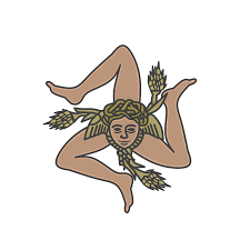
I’m a bit of a flag man – many years ago, quite soon after I started this blog, I wrote a post about what I considered to be the most elegant national flags. So of course I focused in on this flag. What really intrigued me about it was that symbol in the middle: a face from which emanate three legs bent at the knee.

Source

I quickly established that this symbol is called a triskeles, Greek for three-legged. It was a popular symbol on coins. The earliest numismatic representation of it (from around 465 BCE) is on coins from the Greek statelet of Pamphylia, in what is now southern Turkey.

Source

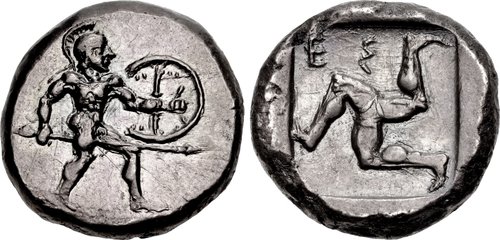
The triskeles was used in varying formats on Greek coins for several centuries thereafter, but it was most closely associated with the coins of Agathocles, Tyrant of Syracuse from 317 BCE, and self-proclaimed king of Sicily from 304 BCE, until his death in 289 BCE. On this coin, it is the main decoration on the reverse side of the coin, because Agathocles adopted it as a personal symbol of his reign.

Source

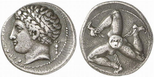
Agathocles brought an important modification to the design, placing a Gorgon’s head as the central hub from which the legs emanate. He also added wings to the feet.

On this Syracusan coin, instead, it is used as the mint mark.

Source


It seems that Agathocles chose the triskeles as his symbol because it mirrored the (roughly) triangular shape of Sicily.

Source

The Greek name for the island was Trinacria, which means three headlands. The three headlands in question were those at the “corners” of the island: Capo Peloro, to the north of Messina, Capo Passero, all the way down south of Syracuse (and close to where we spent our little Sicilian holiday), and Capo Lilibeo, close to Marsala. The choice by Agathocles of the triskeles as his personal symbol was no doubt meant to underline his ambition – realised in the last years of his life – to be ruler of the whole of Sicily.

None of Agathocles’s heirs who were still alive when he died managed to succeed him as king of Sicily. In fact, he was formally reviled after his death, with all statues of him throughout Sicily being destroyed. Nevertheless, his triskeles continued to be used as a symbol for the island. After the Romans had turned the island into a province of its Empire, they added three ears of wheat to the Sicilian triskeles, apparently to underline the province’s role as a granary for Rome (and took the wings off the feet).

Source

With the collapse of the Western Roman Empire, the use of the triskeles seems to have disappeared in Sicily. But it came roaring back in 1282, when, in what has become known as the War of Sicilian Vespers, the Sicilians rebelled against their French Angevin overlords and invited the King of Aragon to take their place. The Sicilians created a flag to carry into battle.

Source

It was made up of the red and yellow colours of Aragon (but also the colours of the communes of Palermo and Corleone, where the revolt started) with a triskeles at its centre (where the Roman ears of wheat had disappeared and the wings brought back, but this time attached to the head).

After twenty years, peace was concluded and the House of Aragon ruled Sicily for the next 400 years or so.

In 1848, some 600 years after that first burst of rebelliousness, and when the whole of Europe was being shaken by revolutionary outbursts, the Sicilians had another bout of rebellion and ousted their Bourbon overlords. The movement of course needed a flag, so the triskeles was rolled out again, but this time it was affixed to the red, white and green tricolour, itself created in 1789 by Italian revolutionaries copying their counterparts in France.

Source

Alas, the revolt, and the flag, lasted only a year, until the Bourbons took back control of the island. But then, a mere ten years or so later, in 1860, when Garibaldi and his thousand volunteers disembarked in Sicily on his way to conquering the island and the boot of Italy, the Sicilian rebels dusted off this flag to fight behind. That rebellion was successful this time. Or maybe it wasn’t, because Sicily shucked off its Bourbon overlords but only to become part of the new Italian State, where national unity was strongly promoted and regional diversity quashed. So of course the triskeles disappeared from the tricolour flag.

Then, at the tail end of the Second World War and after 80 years as part of the new Italian State, separatism reared its head in Sicily. In the chaos created by the Allies’ invasion of Sicily and the collapse of the national government, the Movement for the Independence of Sicily was formed. Of course, it created its own flag which naturally enough sported a triskeles, a bright red one in this case. I’ve no idea why the separatists chose this colour for its triskeles, or the colour of the flag’s background – perhaps simply the red and yellow now traditionally seen as Sicily’s colours?

Source

It was a strange movement, which pulled in people from the left and the right of the political spectrum but also had links with the mafia and the island’s traditional bandits. Indeed, the darker, criminal elements of the movement spawned an armed force, the Volunteer Army for the Independence of Sicily. It, too, created its own, triskeles-bearing, flag.

Source

This “army” attacked Carabinieri barracks and made general mayhem but was eventually crushed. In the meantime, the national government bought off the separatists by promising Sicily a special autonomous status (as it did to other regions on the rim of the country: Sardinia, Val d’Aosta, and Trentino-Alto Adige).

In the decades after the War, Italy’s regions, which had been politically moribund since the country’s unification, slowly clawed back their political importance. Finally, in 1970, the country’s first regional elections took place, while in 2001 a constitutional amendment gave the regions greater say in policy-making.

With the regions’ increasing political importance came the desire to create their own flags, banners, armorial bearings, and so on. Sicily was no different. Its regional parliament approved a first flag in 1995.

Source

Its design explicitly harked back to the flag created by the rebels in 1282 (although the colours of the background were switched around), but instead of the triskeles the region’s coat of arms was placed in the flag’s centre. This did include the triskeles but quartered it with the arms of the Normans, the Swabians, and the Aragonese, who had all been overlords of Sicily at some point.

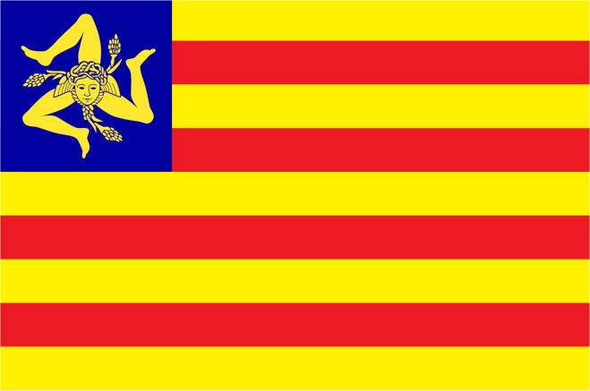
Finally, in 2000 good sense prevailed and the regional parliament approved today’s flag with only the triskeles in the centre.

So there we are. An ancient symbol created back in the mists of time has managed to survive down through the centuries as a symbol of Sicily’s desire to shake off its overlords and now has been given a new lease of life as a symbol of – hopefully – a vibrant region in a more federalist national state.

A GLOCKENSTUHL ON MY ROOF

Vienna, 7 September 2025

My wife and I went to Schladming in Styria recently, for a few days of hiking. We did some lovely hikes on the mountains behind Schladming as well as along some of the valleys wedged in between those mountains. It was on one of the latter hikes that I began to notice some eye-catching structures standing on the roofs of the farmhouses we were passing. Here are two that I managed to photograph.

My photo
My photo

They really are handsome, I told my wife, but what are they? Once we were back in Vienna, I did some research and discovered that they are called Glockenstuhl, literally bell stool although it is normally translated as bell frame or bell tower. This next photo shows more clearly the bell that should sit beneath the little roof and which gives the frame its name.

Source

I don’t think either of the Glockenstuhl I photographed have this bell, although the second photo shows a ring of little bells around the rim of the roof – a fanciful modern addition, I believe. One can also see the weather vane on the very top, in this case a cock (in my two photos, the Glockenstuhl sports a cow in the first case and a cock in the second).

Of course, these Glockenstuhl primarily had a functional purpose. The bell was used by the farmer’s wife to call the farmer and his hands back to the farmhouse when lunch or dinner were ready. And the bell was also rung in case of an alarm. A nice touch: the bell of each farmhouse had a different tone so that the farmer and his workers would be sure that it was their farm and not another that was ringing its bell.

But of course, this primarily utilitarian object gave local people an excuse to make something that was, yes, useful but also beautiful.

The Glockenstuhl’s original use has made me think of paintings by the Austrian painter Albin Egger-Lienz. I first got to know him through his paintings of the First World War. These are remarkable paintings, and I would strongly recommend my readers to see them if they ever come to Austria (I doubt if museums in any other country has any). But he also depicted many scenes of rural life in his native Tyrol. In this case, I’m thinking in particular of his paintings of farm workers out in the fields, who would have heard the bell from their farmhouse’s Glockenstuhl and known it was time to come back to the farmhouse to eat. Here are two of his paintings. In the first, the farm hands are scything the hay, in the second a farm hand is sowing seed.

Source
Source

And in this painting, farm workers are gathered around the table to eat.

Source

Here, too, I would strongly recommend that readers see Egger-Lienz’s paintings and drawings of peasant life.

Still today, there are a few artisans making Glockenstuhl, but they are now just beautiful pieces of handicraft. There’s no need for the bell, the farmer’s wife no doubt calls the farmer on his mobile phone when lunch is ready, if she’s not herself out in the fields (and the farm hands disappeared long ago into the factories in the cities). You can have one made for you for a mere € 2,000 or so. But please, don’t use it, as some people apparently do, as a bird stand in your garden! Put it on your roof where passers-by like me and my wife can admire them as we walk by.

PHOTO ALBUM OF A HIKE

Vienna, 8 June 2025

My wife and I recently completed a four-day hike around the Danube, in the reaches of the river some 20 km upstream from Linz. We started in the village of Ottensheim, made our way to Eferding and then to Aschach, ending the hike in the village of Sankt Martin. I can’t resist inserting here a composite photo I’ve created of the hike.

My composite

As readers can see, we wandered rather drunkenly along the Danube.

The wonderful thing about hiking is that you move slowly across the landscape, which allows you to notice things which you probably wouldn’t notice on a bike, let alone a car. I give my readers here a taste of what my wife and I came across – quite serendipitously – as we slowly crossed this Danubian landscape.

Thursday

We arrive in Ottensheim, which sits on the Danube river, in the early afternoon. We take advantage of our early arrival to go for a walk on the high lands behind the town. Here is the view of the Danube which greets us at the top. You can see the hydroelectric dam spanning the river. We’ll be passing that dam tomorrow.

My photo

We have pizza at the place we’re staying the night, down by the river’s bank. We chat with the staff, all Neapolitans, who all left Naples because of a lack of opportunities there. A story we’ve heard so many times. Such a tragedy for Naples, this steady draining away of their youth.

Friday

We’re greeted at the exit of the hotel by this strange painting on the wall of a house.

My photo

Not sure what happened to the mermaid’s nose …

We’re waiting to board the ferry, which will carry us over to the other bank.

My photo

While waiting, we spy a statue of St. Johann Nepomuk, protector of those who cross streams and rivers, so common in this part of the world. This statue is coloured, though, which is rare.

My photo

The view from the ferry’s deck, looking upstream. The hydroelectric dam is in the far distance.

My photo

We can also see a peek of Ottensheim’s local castle in that last photo. We get a better view as we start walking along the river’s bank.

My photo

Its recent history has been quite eventful. Owned by a British family in the 1930s, it was confiscated by the Nazis at the beginning of the war. They used it as a forestry office for the Wermacht. After the war, the Soviets, who occupied that side of the Danube, used it as a barracks. After they left in 1955, when Austria got back its independence, the castle reverted to its pre-war owners. By then it was in a pretty sad state, but its owners didn’t have the money to restore it. It was only in 1988, when the castle was sold to a group of families with deeper pockets, that the castle could be restored. It is still in private hands.

Yellow irises blooming along the water’s edge, the first of many wildflowers we will be seeing on this hike.

My photo

Close by, a memorial on the side of the path.

My photo

It commemorates the nearly 30,000 people murdered through poisoning with carbon monoxide by the Nazi regime in nearby Hartheim castle, between May 1940 and December 1944. Once their bodies had been cremated the ashes were brought to this spot and dumped into the Danube. Until September 1941, it was a “euthanasia” centre, where 8,000 physically and mentally handicapped people, almost all from Bavaria and Austria, were murdered. After Hitler closed down the Nazis’ euthanasia programme (because of protests from the Roman Catholic Church in Germany), the centre quickly “pivoted” to become a centre for the killing of inmates from nearby concentrations camps, primarily Mauthausen or its satellite camps, who were too sick or injured to work any longer. By December 1944, they had murdered a further 12,000 people, most of them Soviet Prisoners of War.

Wildflowers by the side of the path

My photo

Outside a fire station, an intriguing monument to firemen and women, as well as to officers of the Austrian river authority.

My photo

An old farmhouse on the edge of the road.

My photo

Eferding, the end point of today’s hike, with the parish church’s bell tower dominating the town.

My photo

A photo of Eferding’s castle, taken by slipping my iPhone through the big gates that barred entry.

My photo

The castle is still owned by the Starhemberg family, who inherited it and the lands that came with it in 1559. Interesting family. They’ve been involved in Austrian politics for the last 1,000 years or so. The latest (in)famous member of the family was Ernst Rüdiger Prince von Stahremberg, who was born in 1899 in the castle and died in 1956 in Voralberg. He was a right-wing politician with great admiration for Mussolini’s fascism. He served in Austria’s right-wing governments from 1930 until 1936. Although fascistic, he really disliked the Nazis and made his dislike very public, so after the Anschluss of 1938 he fled to Switzerland to avoid vengeful retaliation by the Nazis (and perhaps also to protect his wife, who was Jewish). At the beginning of World War II, he served in some capacity in the British and Free French Air Forces, but he resigned in disgust after the UK and the US allied themselves with the Soviet Union in 1941 – he viewed communism and Nazism as equally evil. Thereafter, he and his wife left for Argentina; not unnaturally, he felt a great affinity with the politics of Juan Peron. In 1956, after Peron had been ousted by the army, he travelled to Austria for an extended visit, no doubt to explore the possibility of coming back. He was staying at a spa in Schruns (the bell tower of whose parish church I had so admired last year). During a walk, he was photographed by a journalist who worked at a communist newspaper. In a rage, he attacked the journalist with his walking stick, but this triggered a cardiac arrest and he died there on the pavement.

Turning my back on the Stahremberg castle, a view of Eferding’s main square

My photo

with its maypole still standing

My photo

and a magnificent copper beach at the far end.

My photo

Eferding’s parish church

Source

with its beautifully carved pulpit (although not as beautiful as the one my wife and I saw in Traunkirchen several years ago)

Source

and the tombstone of some long dead knight.

My photo

A Lichtenstein-like mural on the wall of a ruined house

My photo

An amusing ad for a shop offering orthopaedic services.

My photo

And so to dinner and bed.

Saturday

We start the day by walking over the rich farmland around Eferding. We pass these multicoloured rows of lettuces.

My photo

We go past a garden whose owner must be an amateur sculptor with a fondness for using scrap metal.

My photos

Nearby, beauty among the garbage.

My photo

We begin to climb a steep ridge. We pass a shrine on the side of the road.

My photo

Shrines are common throughout Austria, but I notice that in this region shrines – like this one – have an eye painted on them. I suppose it represents God, the “All-Seeing Eye”. But I find it rather unnerving: “You can’t hide from me, I can see everything that you do” – just like Big Brother in George Orwell’s “Nineteen Eighty-Four”.

A chapel at the top of the ridge.

My photo

A spray of daisies on the side of the road.

My photo

We plunge into the woods.

My photo
My photo

A view over the plain around Eferding.

My photo

We come down the ridge and pass the small airfield – literally, in this case – of a gliding club.

My photo

We have been watching the gliders soaring over us all morning; my iPhone, alas, cannot capture their ethereal beauty.

We look back at the ridge we walked along, with a castle ruin sitting on it.

My photo

We stop for lunch in the village of Pupping, finding a bench in the parish church’s garden to sit on. I, of course, cannot pass up the opportunity of visiting the church after lunch. I find a mix of old and new.

A statue of St. Wolfgang, who, it is said, died at the altar of the (original) church in 994 CE.

My photo

A statue of St. Christopher, looking less than pleased with having to carry the Child Jesus.

My photo

Four carved door lintels, displaying the symbols of the four Evangelists: clockwise from the top left, the lion of St. Mark (you have to look hard to see the lion’s face), the ox of St. Luke, the angel of St. Matthew, and the eagle of St. John.

My photos

It takes me a while to understand that Luke’s angel is represented by an eye – the eye again …

Rather pleasant stained-glass windows.

My photo

We continue the hike towards our end point today, Aschach, on the Danube. Quite by chance, our route takes us past a war cemetery.

It has the look and feel of the German war cemeteries which my wife and I had visited on the Western Front: tall oak trees, shading a lawn, in which are planted stone crosses.

My photo
My photo
My photo

But actually, although the cemetery is looked after by the German association for war graves (hence the look), none of the soldiers buried there are Austrian or German. And none of the dead who are commemorated fell on the frontline; they were all prisoners of war who died in a POW camp which the Austro-Hungarians built close by for use during the First World War. They were mainly Italians

My photo

with their memorial

My photo

and Serbians

My photo

with theirs.

My photo

After the Second World War, the Soviets put up a memorial to their POWs who had been murdered in Mauthausen and other nearby concentration camps.

My photo

Of course, the thousands of murdered Soviet POWs didn’t get an individual grave, their names were not even inscribed on a monument. But some Russian family had come and attached a photo of one Soviet prisoner to a stone cross, with the epitaph “We remember, we love, we grieve. The grandchildren”.

My photo

We walk on to Aschach.

Sunday

We start the day by once again crossing the Danube, but this time using a bridge rather than on a ferry.

My photo

Some purple irises catch my eye as we walked along the river bank.

My photo

We climb up to the high lands overlooking the river, past fields of wheat studded with corn flowers and daisies.

My photo

We enter the woods.

My photo

The path eventually leads us off the high lands and down to a stream at the bottom of a valley. We start following the stream towards its source. At first, the stream cheerfully burbles along.

My wife’s photo

But soon the stream bed becomes rough as stones from above have tumbled down, and the water jumps around.

My photo
My photo

The path mimics the roughness of the stream.

My wife’s photo

Once we reach the high lands, the stream quietens down, the path likewise.

My photo

We pass meadows along the stream’s banks. Some have been turned into lawns.

My photo

Here, another anonymous sculptor has turned a tree trunk into a whimsical totem pole.

My photo

One of the meadows is carpeted in pink flowers.

My photo

Finally, we leave the stream and climb up onto a ridge. An alpine pasture falls away to our right. It is impossibly green.

My photo

We pass through Sankt Martin and start walking along a main road. This is the only way to our hotel. We pass a building site, where a riot of poppies grow: beauty clothing the ugliness.

My photo

We reach the hotel. Our hike is finished.

QUIRKY CARS

Vienna, 29 August 2024
updated Sori, 10 March 2025

My wife and I were walking along some street a few weeks ago when I spotted a gorgeous red FIAT 500 driving past. Of course, I didn’t have the gumption to take a photo, so this one which I’ve lifted from the web will have to do.

Source

I have a doubt, though. Was it a FIAT 500, or was it a FIAT 600? I must confess to never having been able to distinguish very well between the two. So just in case, I also throw in a photo of a red 600.

Source

Just to help readers understand why I get confused between the two, I throw in a composite photo of a FIAT 500 and FIAT 600 nose-to-nose.

Source                                                                           Source

I think readers will agree that they really are very similar, with the 600 being slightly longer to allow passengers to (more or less) sit comfortably in the back seat.

I’ve always had a fondness for quirky little cars. The VW Beetle comes to mind.

Source

So does the Citroën’s Deux-Chevaux (2CV).

Source

My childish side moves me to also include here a photo of two of the deux-chevaux’s equally quirky drivers, Dupont and Dupond from Tintin.

Source

My excuse for doing so is that my mother had as friends two old ladies who were twins, and they would always come and visit us in a deux-chevaux. While they didn’t drive quite as badly as Dupont and Dupond, their arrival was always accompanied by a mini-drama when they were parking.

I think I can go so far as to add the Morris Mini-Minor to the list of quirky cars, although, while having a fairly high quirkiness coefficient, it is not, in my humble opinion, as quirky as the other cars I’ve mentioned.

Source

That being said, it did have a pretty cool part to play in the original 1969 film “The Italian Job”, with Michael Caine.

Source

In my youth, I would also see bubble cars like this one.

Source

In my opinion, though, they’re not quirky, they’re just weird, like Trump.

I might be fond of quirky cars, but I’ve never actually owned one. The closest I’ve ever been to quirky-car ownership is through my wife, when she co-owned a white FIAT 600 with her flatmate while doing her graduate studies in Bologna. It must have been twenty-fifth hand, that car. We took it on a long road trip over a Christmas holiday to Puglia. My mother-in-law accompanied us; the saintly woman spent the whole trip wedged in the back. Being rather old, the car had a problem of leakage from the radiator. Every 100 km or so, we had to stop and top up the water. At these moments, my mother-in-law would ask out loud if we would ever make it to our destination. To capture a little of that drive to Puglia, I throw in a photo of a FIAT 600 rockin’ down the highway, as the Doobie Brothers sang way back in 1972.

Source

That one trip is the only time I’ve ever driven one of these quirky cars. I once accompanied a University flat mate of mine on a long, long trip from London to her mother’s place in Austria (I mentioned this trip in my last post). She was driving a Dyane, not quite as quirky as the original deux-chevaux but close enough.

Source

I didn’t drive because I didn’t have my license yet (I’m not sure she would have let me drive anyway; she was very possessive of her Dyane). Apart from the length of the trip, the only notable thing that happened is that a Frenchman wearing a beret (I kid you not) drove into my side of the Dyane about half an hour after we had left Dunkirk. Classic British-French misunderstanding. My friend thought she had priority because she was on a large main road and the bereted Frenchman was coming in from a small road on the right. He, on the other hand, was strictly applying that quirky French rule of the road “Priorité à droite”, regardless of relative road sizes.

Source

At least my friend wasn’t driving on the left-hand side of the road … This is a cartoon from way back in 1966 by the famous British cartoonist Giles.

Source

In contrast, a FIAT 500 (or maybe FIAT 600) was part of a scene of Italian-British cultural exchange earlier in my life. The one and only cruise I’ve ever been on (it is the subject of an an earlier post) stopped off in Brindisi on the way back to Venice. It was 1968 or ’69. A group of us youngsters on the ship went for a stroll through town. We were of course noticed by the local population, especially since one of us was a very pretty blue-eyed, blonde-haired teenager. Within minutes of us beginning our walk, this white 500 (or maybe 600) came careening around the corner on two wheels and came screeching to a halt next to us. The car’s driver and passengers all hopped out and after much hand waving and some words we managed to understand that they were inviting us to a café for a drink. Since none of us spoke Italian and none of them spoke English, the conversation was exceedingly limited. Nevertheless, a good time was had by all. Eventually, we went our separate ways, they in the 500 (or 600?), which careened away around the corner on two wheels. To celebrate this moment of entente cordiale in Italy, I throw in a photo of a bar in Brindisi from perhaps 10 years earlier, with what definitely looks like a FIAT 600 parked outside it.

Source

These quirky cars are of course collectibles now. One fellow who I worked with – the one who once spent more time getting local salted capers than doing the work, as I’ve mentioned in an earlier post – recounted to me in excruciating detail his efforts to do up an old 500 he had bought. Maybe it looked something like this when he bought it; this particular FIAT 500 has been quietly mouldering away for at least ten years now in a parking space down the road from our apartment at the seaside.

My photo

He told me that all he needed to find was the original of one small part (some sort of knob) and he was done. The car would be worth millions! (of liras) I never did find out if he managed to lay his hands on that small part …

Of course, it comes with my age to say that they don’t make things the way they used to anymore. But in the case of quirky cars, it’s really true. Modern cars are so boring, no character, just boxes on wheels. Even the modern cars whose manufacturers exploit the mythic status of the old quirky cars by giving them the same name are but pale imitations of the originals – if they look like the original at all.

The new FIAT 500 EV looks quite like the old 500, just pumped up, as if it has been attending a body-builders’ gym.

Source

The new FIAT 600, on the other hand, bears absolutely no resemblance to the old FIAT 600.

Source

For its part, the new Mini Cooper looks a teeny-weeny bit like the old Mini-Minor.

Source

As for the deux-chevaux and the Volkswagen beetle, no-one has (yet) dared come out with a modern imitation of them.

The only exception I would make to my damning judgement of modern cars is the Smart Fortwo car.

Source

Now that is a car with character! You can see in the photo one of its quirky characteristics, that it can be parked head onto the pavement.

My wife and I once stayed at a hotel which offered a free drive in a Smart. No idea why, but we said “what the hell, why not?” and we took it for a spin. A most delightful experience! If I had to own a car, which I most definitely do not, I would try to persuade my wife to buy a Smart. Actually, instead of buying why not join a car sharing scheme? Car2go offers Smarts.

Source

What new quirky cars might I see before I pop my clogs? Surely the new era of EVs will throw up a quirky car or two. I wait with bated breath.

LIME TREES TO SHOE POLISH

Milan, 11 June 2024

What is the matter with me?!

Over the last few days, we’ve been passing down alleys of lime trees.

My photo

The trees are all in flower – this one was covered with them.

My photo

The flowers fill the air with their scent, I breathe it in … and I am reminded of shoe polish.

Source

No-one under the age of 40 will remember a world where most of the shoes we wore were made of leather. As I look around the subway carriage where I’m writing this, I can only see one pair of leather shoes among perhaps 70 pairs of feet. I, on the other hand, being well over the age of 40, still remember a time when we mostly wore leather shoes – and remember the concomitant joys and anguish of shoe polishing. At my boarding primary school (prep school in British parlance), a specific period of every week was set aside for shoe polishing. We all had to go to a room dedicated to this task, where we picked up a cloth – to spread the polish – and a brush – to put a high gloss on our shoes – before getting to work. As I picked up the tin, there was that ineffable smell of the polish. That was the joy – or at least the pleasant sensation. No doubt it was caused by the solvent which the manufacturers used to keep their polish pasty. After the spreading of the polish on my shoes came the vigorous polishing. That was the agony, as my arm very soon began to ache. But I couldn’t slow down, there was always a master on hand to bark at me to put my back into it. And then came again the joy, as I admired my well-polished shoes glowing on my feet. Of course, I have no photo of this weekly exercise. I did find this photo, though, which will give readers a sense of what it was like – although the boy in question looks to be enjoying it far too much.

Source

After the passage of so many decades, I can’t remember the brand of polish we used. I’m guessing it was Kiwi; that was certainly the brand that my English grandmother used, and it seems to have been the most popular brand in the UK.

Source

In passing, I should say that I learned to my surprise that Kiwi was originally an Australian brand (and was given its name by the owner to honour his wife who hailed from New Zealand). Merely another example of my unconscious Euro-centric biases …

Old brands of consumer products always have me searching for the posters they used in their advertising campaigns. I find these old posters a fascinating sub-genre of popular art. In another life I would have been an avid collector of old posters. In this case, though, I didn’t find any really scintillating Kiwi posters online. The best I found was this one.

Source

Not so in the case of a now extinct brand of Italian shoe polish called Taos, manufactured by the now also extinct company Edoardo Pessi. Look at this lovely poster! It’s a riff on the fact that the biggest purchaser of Pessi’s shoe polish was the Italian army.

Source

In a rush of enthusiasm, I throw in photos of a few more posters for Taos and other Italian shoe polishes.

Source
Source
Source

At this point, I have to admit to having played a very small part in Edoardo Pessi’s demise. It was early on in my career as an environmental consultant. My company was hired by the multinational corporation Sara Lee (now also extinct) to carry out an environmental assessment of the Pessi factory. Sara Lee was in negotiations to purchase Edoardo Pessi, and the idea was to figure out what environmental liabilities Sara Lee might also be buying and bring down the purchase price by a corresponding amount. This is the factory where I carried out my assessment.

Source

I don’t think I’m giving away any trade secrets when I say that there were some problems with underground tanks leaking solvents (out in the back yard there, next to that sliver of lawn; I remember it well). I guess a couple of 100,000 dollars were knocked off the purchase price because of that.

In any event, the purchase by Sara Lee went through. But it was really just an exercise in asset stripping. Quite quickly after the purchase, Sara Lee concluded that this factory had no future – which made a lot of sense; I mean, look at it, hemmed in as it is on all sides by houses. So they closed the factory down. But they didn’t shift operations to an industrial site on the outskirts of town as they could have done. Instead, the packed all the equipment off to their other factories, they laid off the workers, and sold the land to a developer, who proceeded to raze the factory to the ground and put up some swanky apartment buildings in its place. Sara Lee even stopped making the Taos shoe polish – who polishes their shoes anymore? (and they already owned Kiwi; one shoe polish brand was more than enough).

Well, all of this, although  an enjoyable little trip down Memory Lane, still doesn’t explain why, when I breathe in the scent of lime tree flowers, I think shoe polish. The  mysteries of olfactory chemistry …

WEAVERS FROM GHANA

Milan, 21 April 2024

It’s the Salone del Mobile this week in Milan, the annual furniture and furnishings fair that the city hosts. As proud citizens of Milan (well, adopted citizen in my case) my wife and I take part in the fair – but only marginally, because there’s a huge amount of events all over town, and outside of town as we shall see, and hordes of people visiting each event. In fact, this year we have only visited one exhibition, which is taking place in Varedo, a small town on the outskirts of Milan. Varedo is best known for a huge factory it once hosted which made artificial textile fibres until it folded in 1999. It was part of the SNIA Viscosa group, which itself went belly-up in 2010 after a long agony. All that is left of the Varedo factory are mouldering industrial buildings: a sad reminder of the deindustrialisation of Europe.

Source
Source

The exhibition was taking place at the other end of the town, in the villa Bagatti Valsecchi, which 100 years ago had been the country house of one of the elite families of Milan, the Bagatti Valsecchi.

Source

It didn’t look too bad from the outside, but that statue gives a premonition of what the inside looked like: it too was a mouldering mess, although at least the floors were still in place.

Source
Source

I haven’t managed to find out what happened exactly to the villa, but I assume it’s the same as what happened to many country houses in the UK: it simply became too expensive for the Bagatti Valsecchi family to maintain it. They “generously” donated the house and property to the municipal government, but I suspect this was a poisoned gift. The municipality certainly has done very little if anything to maintain it.

Of course, it’s edgily chic, is it not, to showcase new, shiny, cutting-edge design in mouldering rooms. Here’s the thing, though. The furniture and furnishings my wife and I were confronted with as we wandered from room to room might have been newly minted, straight from the designers’ workshops, but to my mind the design ideas behind them were as mouldering as the rooms they sat in. Nothing new, just the same old ideas we’ve been seeing for 30 years or more recycled, endlessly recycled.

The one fresh design we came across was down in the basement, in a dark, dank room. Which was OK, since the product in question was lighting. Here is what we found ourselves in front of.

My wife’s photo

Some words of explanation are required here. The design group behind this is Spanish, going by the name Fernando Diaz de Mendoza 9, or FDdM9 for short. This particular design idea came about through the merging of the need to find ways to cleverly recycle PET bottles, on the one hand, and the desire to support traditional weaving skills still in existence in various parts of the world, on the other. The result was a project which the group calls PET Lamps.

The project started by making lampshades for single ceiling lights. The clever thing was that they were using PET bottles as the lampshades’ basic infrastructure: a component that is now free pretty much everywhere in the world since we are drowning in waste PET bottles. The mouth and shoulders of the PET bottles play the role of the fitting at the top of a traditional lampshade. Through it runs the wire and light bulb socket. What’s more interesting is what happens to the rest of the bottle. It is sliced into thin strips, and then the strips are used as the initial warp for weaving the weft across. What type of weft gets used depends on the weavers with whom the group is working.

The group started by working with weavers from the Eperara-Siapidara indigenous community in Colombia, who use the stripped down leaves of the Paja Tetara palm tree dyed with natural pigments and adopted traditional motifs.

Source

They also worked with a community which weaved with wicker, a plant imported by the Spaniards.

Source

They worked, too, with other communities in Colombia and Chile, but I’ll jump to Ethiopia, where FDdM9 collaborated with weavers of traditional coiled baskets from the city of Harar, to make lampshades like this.

Source

Here’s an example of a cluster of these lamps being used in a restaurant.

Source

I’ll skip the lampshade designs which the group collaborated on with weavers in Japan and Thailand; readers who are interested can go to the Pet Lamp website. I’ll go on to the designs they created with the Gurunsi people who live in the far north of Ghana. Together with them, they came up with a modern take on their basket weaving designs to create “wavy” lampshades. Here are the weavers at work (the weft in this case is elephant grass, by the way).

Source

And here is an example of the final product.

Source

While here we have a cluster of these lamps being used over a table.

Source

Before going on with Ghana, I want to jump to Australia, where to my mind things started to get really interesting. There, FDdM9 started collaborating with weavers in Arnhem Land, in the far north of the country (I mentioned other Australian weavers in a previous post). The weavers started by making individual lampshades with designs based on their traditional mats.

Source

But then one of the weavers began linking two lampshades together, which led the weavers to link all their lampshades together, in a way that reflected their kinship relations.

Source
Source

It gave this as a final product.

Source

This is what it looks like when it is put up.

Source

Which brings me back to Ghana. Several years after their initial collaboration with the Gurunsi people, FDdM9 went back to create large-scale “lamp tapestries” (I can’t think what else to call them) similar to those they had helped to create in Australia. Whereas the design of the tapestries in Australia were based on kinship relationships between the weavers, the designs in Ghana were based on aerial views of the houses where the weavers lived (which is actually also a representation of kinship relations if you think about it, since children built their houses next to their parents’).

Source

Here we have the weavers at work.

Source

And here we have a final product.

Source

I suppose FDdM9 would expect these lamp-tapestries to be used like this.

Source

But that’s not the way my wife and I would like to use them. We would prefer to eliminate the lamps and use the tapestry as a wall hanging, as we saw in that damp, dank cellar in Villa Bagatti Valsecchi. And we have just the wall where we could put it! Of course, the price might be an issue: one of these lamp tapestries would set us back a cool €17,800. But you have to suffer for great art! (still, though, €17,800 …)

ORCHIL DYES

Milan, 19 February 2024

My wife and I were recently hiking in the Vienna woods, which at one point required crossing a large open field. We were halfway across it when I was startled to see an emerald green tree on its edge. It was certainly not leaves which were making it green at this time of year. And what was strange was that all the branches were emerald green. Luckily for my sanity, the path we were taking passed close by it, so I was able to inspect the tree more closely. It turned out that all the branches of the tree were thickly covered with a bright green lichen. Foolishly, I didn’t take a photo of the tree, so I’m afraid this photo will have to do.

Source

This vision got me thinking about lichen. They’re very modest beings for the most part, clinging closely to their rock or branch, so I’ve never given them much thought. They give us some gentle splashes of colour on our winter hikes, when all the trees are bare, wildflowers are still asleep, and the skies are grey.

my photo
my photo
My photo
My photo

Lichens might be modest beings but they are fascinating. I’m bursting with desire to tell my readers all about them, but I already see my wife shifting around in her seat at the thought of hearing all sorts of biological details that she never wanted to hear about. So, since vibrant colour is what started this post, I’ll just focus on lichens’ connection to dyeing. Which, as readers will see in a minute, will also lead me to write about trade, a topic which I’ve written about many times in these posts.

Let me start by saying that I am really filled with admiration for our remote ancestors. They looked around their ecosystems and tried to find a use for everything that Nature offered them. I, a pampered product of an oversupplied culture, who can get anything I want from anywhere in the world with a mere click of my mouse, would never, ever dream of trying to use lichens as a dye. But our ancestors did, particularly those who lived in ecosystems which did not support a huge amount of biodiversity and so didn’t have that many plants or animals to exploit.

Most of them used lichens as dye sources in the easiest way. They collected them, simmered them in boiling water, waited a while for the lichen to leach out the colour, then added the yarns, simmered, and waited some more (I simplify, but not by much). Modern artisanal dye masters have replicated the processes, with which you can get some quite nice colourings. These photos show some of the lichens used as well as the yarns they have coloured.

Source
Source
Source
Source

But pride of place in lichen dyeing goes to the various species which give us orchil dyes. These are dyes in the red-mauve to dark purple spectrum – this photo shows the range of colours which modern artisanal masters have managed to tease out of these lichens.

Source

Since they are the source of these lovely colours, I feel I should honour the main species of lichen from which orchil dyes are extracted.
Lasallia pustulata

Source

Ochrolechia tartarea

Source

Evernia prunastri

Source

Roccella tinctoria

Source

Unless some of my readers are passionate lichenologists, I think we can all agree that these lichens are not terribly, terribly beautiful. But by the wonders of biochemistry, they can deliver us lovely dyes. Beauty out of the beasts, as it were.

Anyway, the process to extract orchil dyes is much more complex than the simple boil-it-up-and-dunk-the-yarn-in-it process which I just described. One has to crush the lichen in a solution of ammonia and keep the mix well oxygenated for several weeks. The ammonia slowly reacts with chemicals in the lichens, with the product of these reactions being the purple dye. This effect of ammonia was discovered a long, long time ago, at least in Roman times and very probably before. And in those days the source of the ammonia was … stale urine. Yes, the lichen was steeped in stale urine.

Again, I’m just filled with amazement. How on earth did our ancestors figure this one out? I try imagining scenarios of how someone stumbled across this urine effect by accident – because it had to be by accident. The only thing I can think of is this. Did readers know that in the olden days people used stale urine to “dry clean” their clothes? – ammonia, it seems, is a good stain remover. I came across this … err … interesting procedure when I randomly found myself reading an article about a house which had been excavated in Pompeii. It was a fullery, owned by a fellow called Stephanus. Since the photos of the ruins themselves are not very interesting, I throw in here a reconstruction which some enterprising soul has made.

Source

Readers with good eyes can see the various baths where cloth was fulled. In addition to fulling cloth, Stephanus (or rather his slaves) was dry-cleaning clothes with urine. Given my childish sense of humour (I already see my wife rolling her eyes at this point), I was delighted to read that Stephanus had vases placed in the lane on which the fullery abutted, into which (presumably male) passers-by were invited to pee; I wonder if they ever demanded a payment for their liquid contribution to Stephanus’s business? As for the cleaning itself, this was carried out by some poor bastards whom Stephanus had bought in Pompeii’s slave market. They had to stomp on the urine-soaked clothes for hours. For some reason, another fuller in Pompeii, Veranius Hypsaeus, thought that this operation was a good subject for a fresco in his workshop.

Source

I can’t think of a worse job (well, if I thought hard enough about it, I probably could). But some sources I read brightly informed me that the urine was good for the skin of the feet – a small consolation … And just in case any readers are asking themselves, after the stomping session the clothes were washed in water, to rid them of the smell of urine.

Anyway, my theory is that one day, somewhere, someone used a urine-dry-clean on some clothes which had been dyed with orchil-creating lichens in the traditional way (boil-yarn-and-lichen-and-water-together). For some reason, they left the clothes stewing in the urine for a while – perhaps they were called off to some emergency somewhere and didn’t come back for a week or two – and saw to their astonishment that the clothes had turned purple. It’s a wild guess but it satisfies my fervid imagination.

Orchil really delivers quite a lovely colour. But even more important, that colour is purple. At the time, the best purple dye on the market was Tyrian purple. It was extracted from the gland of a number of shellfish, and it took a huge number of molluscs to extract modest amounts of dye. So readers can understand that it was a very expensive dye. Which meant that only the upper crust could afford it, and eventually in the period of the Roman Empire it was decreed that only the Emperor and his family could wear clothes dyed with Tyrian purple. Unfortunately, the statues we have of Roman Emperors have all lost the colouring they used to have. Luckily, though, we have a coloured picture of one Emperor, Justinian, in the mosaics of the church of San Vitale in Ravenna. As readers can see, his cloak (and even maybe his shoes?) do indeed seem to be purple.

Source

Note, too, the two fellows to Justinian’s right. They were high-level courtiers and were generously allowed to have a broad purple stripe in their cloak. Ah, the complexities of sumptuary regulations …

In this world of strict social hierarchies, orchil allowed society’s wannabes to swan around in purple clothes, aping the manners of their social superiors (it also allowed dyers to use orchil as an initial, or “bottom”, dye, and then use much smaller amounts of the eye-wateringly expensive Tyrian purple to finish the job – and no doubt sell the cloth as 100% dyed with Tyrian purple).

With the collapse of the Roman Empire in the West, the use of orchil dyes, along with the knowledge of how to make them, pretty much disappeared in Europe. One place where that was not the case was Florence. In the Middle Ages, the city was a major textiles manufacturing centre. Raw wool, and later raw silk, came into the city from all over Europe and beyond, it was processed into cloth – which meant among other things dyeing the yarn – and then the finished cloth was exported all over Europe and beyond. Here we have a photo of Florentine dyers at work.

Source

Florence’s famous banking system, created by the Medici and other families, was basically created to finance this international trade in textiles. Here we have Florentine bankers working at their banco.

Source

In the 1100s, one of the men working in Florence’s textile industry, a certain Alemanno, rediscovered the techniques of making and using orchil dyes. Quite how he did this is a matter of speculation; business trips to the Levant are invoked, or to the Balearic Islands. Or maybe the techniques hadn’t actually disappeared completely in Italy; he just knew a good business opportunity when he saw one and exploited it effectively. However he did it, Alemanno built a fortune on the purple cloth he made, and his descendants, the Rucellai, became Florentine grandees in the succeeding generations. The family name reflected the original source of their wealth; it is thought to be derived from oricello, the Italian name for the dye (which might in turn be derived from the Italian name for urine, orina). By the 1300s, their wealth and status got them a side chapel in the basilica di Santa Maria Novella. The original frescoes are sadly deteriorated, but there is a rather nice statue of a Madonna with Child by Nino Pisani on the altar.

Source

That Madonna and Child is so charming that I am moved to show a close-up.

Source

By the time the 1400s rolled around, Giovanni Rucellai was the head of the family. While he continued to make money hand over fist from the textile business, like all good Florentines of this golden age he was also a patron of the arts. He paid for the completion of the façade of the Basilica di Santa Maria Novella.

Source

He commissioned the family palazzo in via della Vigna Nuova.

Source

And finally he commissioned his tomb, a small-scale copy of the so-called edicule in the church of the Holy Sepulchre in Jerusalem (any reader interested in comparing the two can do no worse than go to this link).

Source and source

As befits a Great Man, someone – his heirs, no doubt – commissioned a posthumous portrait of him (note the façade of the Basilica di Santa Maria Novella and his tomb in the background).

Source

All of this great – and expensive – art paid for by urine …

This woodcut shows Florence about ten years after Giovanni died, in 1481.

Source

By then, the world was about to change for the worse for Florence and the Mediterranean world in general. A few years after Giovanni’s death, the Portuguese finally reached the Cape of Good Hope, and then a few years after that they crossed the Indian Ocean and reached India, while Christopher Columbus, in an effort to beat the Portuguese to the Indies, crossed the Atlantic Ocean and stumbled across the Americas. Trade patterns were to change profoundly, with the trade and use of orchil-producing lichens being one modest part of those changes.

Already things were changing when Giovanni was born, in 1403. The year before, a Frenchman by the name of Jean de Béthencourt was conquering the Canary Islands in the name of the King of Spain.

Source

Like all conquistadors, he might have been in it for the glory but he was definitely in it for his own personal gain. One of the things he made his money with was orchil-producing lichens, creating a monopoly, controlled by him of course, in the lichen harvesting business. It was not easy harvesting the lichens. They grew close to the sea, and once the easy bunches had been picked the only source left was lichens growing on the sea cliffs. This photo shows a bunch of Rocella tinctoria hanging over a cliff edge.

Source

To get to these lichen, harvesters had to dangle precariously on ropes over cliff edges, hoping no doubt that sudden strong gusts of wind wouldn’t blow them off, and trying not to look into the abyss below.

Source

As readers can imagine, it was only slaves or other poor sods who did this work.

Jean had the harvested lichen shipped back to his domains in Normandy, where there happened to be a village which specialised in textile manufacturing. With the Canarian lichen, the village’s manufacturers were now able to dye their cloth purple; clearly, the secret – if it ever really was a secret – of using urine to make orchil dye was out. The village grew into a prosperous little town on the back of the dye (and let’s not forget the urine), in recognition of which it is now called Grainville-la-Tinturière, or Grainville-the-Dyer (the village is also twinned with two towns in the Canary Islands in recognition of its historic ties to these islands). As far as I can make out, there seems to be absolutely nothing left of the textile industry in the town, so I shall just throw in a photo of an old postcard of  the place.

Source

About 50 years later, in 1456, as the Portuguese crept down the coast of western Africa, they discovered and took over the islands of Cabo Verde. There, too, the same orchil-producing lichens clung to sea cliffs, and there, too, poor bastards hung precariously over the cliff edges to harvest them. In this case, the lichens were shipped back to Lisbon, for onward export to Antwerp and other places. I throw in photos of  Lisbon and Antwerp, respectively, in this general period.

Source
Source

As the Portuguese kept creeping down the coast of western Africa, they discovered another source of orchil-producing lichens in Angola, although there – luckily for the harvesters – the lichens grew on trees and were easier to harvest. This photo is from a completely different part of the world, but it gives a good idea of what Angolan harvesters were faced with.

Source

All this meant that for several centuries large quantities of orchil-producing lichens poured into Europe from European colonies. In the meantime, as the science of chemistry progressed, there were improvements to the manufacturing process which led to the production of better dyes. All was going swimmingly until a young English chemist called Henry Perkin kick-started the artificial dye industry by serendipitously creating a completely new dye, which he called mauveine, from coal tar residues. I’ve covered this story in my post on Indigo dye and insert again here the photo I used of this beautiful dye.
That discovery was the death knell of the natural dye industry: artificial dyes were more colour fast, light fast and cheaper. And so making orchil from lichen, and dyeing with lichens more generally, pretty much disappeared. Which actually is probably a good thing. Lichens grow very slowly, so the dye business was decimating them. I never thought I would say this, but for once I’m grateful to chemicals made from fossil fuels. Without them, who knows what would have been the status of lichens today? As it is, they are under threat. Lichens are very sensitive to pollution (one of their modern uses is as indicators of pollution levels), and a good number of species are on the IUCN’s list of endangered species.

So, – ooh, this is hard for me to say – three cheers for the organic chemicals industry!

WHERE ARE THE TOILETS, PLEASE?

Vienna, 13 September 2022

As my wife and I go places – bars, restaurants, museums, stores, and general walks around town – given the state of our respective bladders (old age creeping up …) we quite often need to use the toilets of these establishments. On my part, this has led me to study – and in some cases photograph – the signs used on the doors to signal to the desperate which door to open. After several years of taking photos, I think it is time to unveil my collection.

Readers may find this a bizarre preoccupation – I’m sure my wife does, although she’s always been too nice to say it – but actually it’s a very interesting little design challenge: how should one design the symbols used to distinguish the female toilets from the male toilets? I can’t say I’ve seen a huge number of signs which are interesting enough to take a photo of. So in writing this post, I had a quick look around the net to see what other signs I could use to bulk up the post. And of course I have discovered that I am not the only one to have an interest in toilet signs (if there’s one thing the Internet does, it’s to reinforce my melancholic conclusion that none of us are unique). There’s one site in particular that contains a treasure trove of photos of toilet signs, from which I have lifted a good number of the examples I show here. But even a general search through Google Images has thrown up all sorts of interesting examples. Many of the designs I’ve seen are pretty bog-standard (although perhaps this is not the right place to use this very British expression). This example will suffice to stand in for all these.

Source

Sometimes, there are attempts at humour, which is better than nothing I suppose. I photographed this sign some 7-8 years ago now in Bangkok. It’s quite a popular sign, I have since observed. I find it quite amusing – or at least I did when I first noticed it, although the amusement has now palled since it describes only too well my ever more frequent anguish at not finding a loo handy.

my photos

Much of the humour is more of the toilet humour type (as it were). For instance, in one type of toilet signs phalluses and lack thereof figure prominently as the distinguishing feature between genders (I will slide over for the moment the current arguments about there not being binary genders, but rather a spectrum; we’ll pick up this (very) hot potato in a minute).

Source
In a hot dog shop. Source
In a pizza parlour. Source
Source

The next one is a more subtle example of the phallus and lack thereof theme. I will let my readers figure it out – although it does require a basic understanding of vulgar names in English for phalluses and lack-thereofs.

Source

Another grouping of toilet-humour signs cluster around the basic difference in urine delivery system between genders, as these examples show.

This one is rather obvious.

Source

These are rather more subtle

Source
Source

And this one is even more subtle and really rather good.

Source

Other signs are more cerebral, using various scientific symbols to distinguish the genders.

Source
Source

I suppose there are no gender-related biases baked into these types of signs, although a lot of people might not find them easily understandable. That includes me. If I’m to be honest, the last one would be hard for me; I can never remember who is XX and who is XY.

Others take the route of children’s drawings.

Source

Perhaps establishments which use this type of sign think that toilet users will get a warm feeling when they see these signs and forget the quarrels over gender biases which toilet signs can underscore. But this is actually a minefield; much ink has been spilled about the unconscious gender biases which are inculcated in small children: why should girls wear skirts and boys no? why should girls have ribbons in their hair and boys not? and so on and so on.

As for me, I’ve been more interested in symbols which, with an economy of shape and line, elegantly but clearly signal the two genders. If I’m to be honest, I’ve not seen a huge number of signs that meet my exacting standards of good design. Here’s what I have in my collection.

My photo

Same set of elements make up the designs, but by just flipping one of the elements the gender distinction is made.

My photo

Again, same set of elements, but a switch of position conveys the gender distinction.

My photos

A few deft strokes of difference immediately distinguishes the genders.

My photo

Again, just the addition of a few strokes and the repositioning of others, and the gender difference is made.

I can add to this one other sign I found on the internet designed in the same vein. It’s actually a variant on the first in this series which I’ve given above: same set of shapes, some just flipped.

Source

And now to tackle the very thorny question of gender identity! As anyone reading the papers will know, there are places in the world hotly debating into which toilet people who reject gender binarism should go. I will carefully avoid entering this minefield, and will simply show here a few photos that I’ve collected which apparently tackle this topic.

The first is from the station in Como, the starting point of many of our hikes around the lake. These are toilets which we often use, and I have had the chance of inspecting the signs many times. Looking at the layout of the two toilets – no urinals – I can only think that the symbol to the right in each case is inviting non-binary persons to enter the toilet which they feel most comfortable with.

My photos

The next example is one of several I have collected over the years.

My photo

I actually wonder if this type of sign is not simply signaling unisex toilets, which, if you think about it, is the simplest way of avoiding the gender wars – again, as long as you don’t have urinals. That being said, there are people up in arms about these toilets. I have to say this rather befuddles me, because as far as I can make out that’s what most of us have in our homes. I think the only question really is, do women feel safe in unisex toilets? If they do, then I don’t see where the problem lies – and just so long as we men aim properly.

Source

APEROL SPRITZ

Los Angeles, 26 December 2021

A Chinese reader very kindly sent me a comment recently on a post I had written about tomato ketchup. After reading his comment, and re-reading the post in question (I must confess to have forgotten much of what I’d written in that post), I started thinking fondly of the five years my wife and I spent in China (where, incidentally, I started this blog). And as my mind wandered over the Good Old Days, it alighted – in that odd way which wandering minds do – on a bar on the edges of Sanlitun in Beijing where we would go from time to time to have an Aperol Spritz. Yes, I know, it’s odd for a mind meandering through Chinese recollections to land on Aperol Spritz, but there you go, that’s globalization for you.

The thing is, once my mind had alighted on Aperol Spritz I had to investigate: What is this Aperol? What are its origins? And where did this Aperol Spritz thing come from? etc., etc.. What to do, for better or for worse that’s the way my mind works. In any event, I am now ready to report back on the results of my investigations.

I will start my story in Paris, towards the end of the 19th Century. After Baron Haussmann had brutally driven his wide, straight boulevards through the city’s hodgepodge of medieval streets, a thriving café culture sprung up along them, with people of all classes loitering at the tables to sip a drink and natter with friends. We have here a painting by Manet depicting the café scene.

Source

This happy lady appears to be drinking a traditional beer, but a new drink also made its appearance at this time: the apéritif . This apéritif was actually a retooling of a drink originally invented in the Middle Ages as a medicinal product, something to open your body up and let the bad vapours and whatnot escape (aperire being the Latin for “to open”). It was made by steeping and macerating various herbs and roots in wine (first) and alcohol (later). By the time the café culture along Paris’s boulevards came along, the apéritif had lost its medicinal connotations and was promoted instead as something to take before a meal to “open up” your appetite. We have a painting here by Degas of this new custom.

Source

Important for our story is the fact that the French quickly shortened the rather formal word apéritif into apéro, as in “Hey Jean, see you this afternoon at the Café du Peuple on the Boulevard de la Paix for an apéro”.

We now turn our attention to the town of Padova in northern Italy; for reasons which will become apparent in a second, I throw in a photo of the Basilica Sant’Antonio which is located in the city.

Source

There, in 1880, a certain Giuseppe Barbieri set up a liquor business, making and selling various alcoholic concoctions. One of his more popular offerings was Liquore Sant’Antonio, a liqueur made by steeping various herbs and roots in alcohol (“a sugar cube soaked in Liquore Sant’Antonio is an excellent sedative to take before going to bed” used to proclaim the label).

Source

In 1912, Giuseppe handed over the reins of the business to his two sons, Silvio and Luigi. We have a photo of them here in later life.

Source

The two brothers spent the next seven years developing a new drink to add to the company’s line-up. Following the company’s experience with products like Liquore Sant’Antonio, it was to be a concoction of herbs and roots steeped and macerated in alcohol. But Silvio, who had spent many years in France where he had got to know the culture of the apéritif, persuaded Luigi that they should be developing an aperitif-like drink, not too alcoholic, to be taken before a meal to “open up” the appetite. After much tinkering, they came up in 1919 with a bright orange drink which, in honour of its connection to the French apéro culture, was baptized Aperol.

Source

What, readers might well ask, is in Aperol? The label only admits to the presence of alcohol (well, duhh!), water (ditto), sugar, and “flavourings”, which of course come from all those herbs and roots which are left to steep and macerate in the alcohol. Of these, the label only identifies quinine, although various internet sites add gentian, rhubarb, and cinchona, as well the rind of both sweet and sour oranges. One site also claims that a drop or two of absinthe is added to counteract the slightly bitter taste which all these ingredients would otherwise leave. All the other ingredients are, as usual, a tightly held secret (my eyes roll at this point; as I have intimated in earlier posts, I’m no fan of secrecy when it comes to ingredients).

None of these ingredients explain Aperol’s main visual characteristic, its bright orange colour. That no doubt comes from two food colourants which the label confesses to be present in the brew: the yellow E110 and the red E124. Now, it’s claimed that Aperol’s recipe has remained unchanged since its birth in 1919, but the Barbieri brothers cannot possibly have used these two modern, synthetic, colourants. My guess is that for their yellow colouring they used curcumin, extracted from turmeric, and for red they used cochineal.

Whatever gave Aperol its taste, it was an instant hit with the good citizens of Padova, where it was drunk either pure or mixed with a shot of soda water. Its fame spread quickly to other parts of northern Italy, and the serious money started rolling in. Thereafter, the trajectory followed by the Barbieri brothers was very similar to that taken by Davide Campari for his eponymous drink, a story which I have told in an earlier post.

First, like Davide Campari, the brothers abandoned their father’s artisanal approach and built a modern factory to make their Aperol on an industrial scale.

Source

Second, again like Campari, recognizing that they were selling a product based on desire and not on need, Silvio and Luigi invested heavily in the black arts of enticement – or, if we are to be more polite, in what was then the new art form of advertising. Here are a few examples of the posters which the company created in the interwar years.

Source
Source
Source

If I’m to be honest, I think Campari did a better job in its advertising. I think readers would agree with this if they go to my post on Campari and look at the examples I give there of the advertising posters which Campari commissioned. The last one at least has the advantage of admitting publicly to three of Aperol’s ingredients.

The Second World War was not kind to the Barbieri brothers. Apart from the fact that sales must have been down, the Barbieri lost their factory to a bombing raid (the Campari family was luckier; they managed to keep their original factory, now a museum dedicated to the Campari story). Luckily for us, the Barbieri were undeterred and rebuilt after the War.

Which brings us – finally – to the Aperol Spritz, the drinking of which all those years ago in Beijing set me off on this post. The story of Aperol Spritz starts in the 1950s. But actually, we first need go back a little further. Originally, a spritz – a common drink in the Veneto region (of which Padova is part) – consisted of a glass of white wine into which sparkling water had been splashed (spritzen in Austrian German; Veneto was part of the Austro-Hungarian Empire at the time). Then, in the 1950s, and specifically in the province of Padova, bars began adding a shot of bitters to the traditional spritz. One of these bitters – but only one – was Aperol. Depending on the barman’s or drinker’s inclinations and on what was available behind the bar, the bitter added could be Cynar, Select, Campari, China Martini, maybe some locally-made bitter, as well as Aperol. In fact, it is still possible to find barmen in the Veneto region who will serve you a spritz with one of these other bitters. In any event, this new take on the spritz went well with the dolce vita which took hold of Italy in the fifties and sixties, captured so well in Fellini’s film of the same name.

Source
Source
Source

By dint of persistent advertising, especially in the new medium of television, Aperol became a national brand. There was an incredibly famous (for Italians) TV show called Carosello which ran pretty much every day of the year for all of the 1960s and much of the 1970s. The show was basically a way for the Italian Television monopoly RAI to get around the strict rules on advertising. Carosello was made up of a series of skits which each ended with an advert for some product or other. Aperol was a regular contributor. My wife used to religiously watch the show every evening and speaks very fondly of it. Even today, nearly fifty years after last seeing it, she can quote some of the more famous advertising tag lines. I’m sure she remembers Aperol’s, which had the presenter smack his forehead and exclaim “Ah! Aperol!” Here we have him doing it with a bunch of young people who of course were now the intended target audience for Aperol.

Source

In parallel, the Barbieri (by now, the next generation had taken over) aggressively pushed Aperol as the bitter of choice for the new-type spritz. Here are some examples of the advertising posters they used to promote the Aperol Spritz.

Source
Source
Source

As we can see, the ads began to appeal to a hipper, cooler, more chilled set. This was typified by a famous (to Italians) TV ad from the late 1980s, featuring a pretty woman in Miami hitching up her miniskirt provocatively before getting on her motorbike and setting out to meet her cool, chilled friends for an Aperol Spritz.

Watch the video here

In the meantime, the Barbieri got caught up in the Great Game of brand purchases by Corporate behemoths, which I have bemoaned in previous posts. In 1991, the family sold Aperol and a few other brands to the Irish company Cantrell & Cochrane, itself part of the multinational Allied Lions. The new owners began to internationalize Aperol and Aperol Spritz. The German world was an early market (where the Aperol Spritz was germanized to Aperol Gespritz), and then the US market opened its arms to the orange concoction.

In 2003, the Great Game of brand buying and selling saw Cantrell & Cochrane sell Aperol to Campari (which explains why I have sneakily been making comparisons to Campari as I went along). Campari put heavyweight advertising behind Aperol and the Spritz, which turbocharged Aperol’s global diffusion. Thus, hopping from one bar to another, the Aperol Spritz eventually made its way to that bar in Sanlitun where my wife and I would go from time to time to sample an Aperol Spritz, sitting at the bar’s terrace, watching the world go by. Since we are neither hip, nor cool, nor chilled, by this time (we are talking 2010 or thereabouts) Aperol Spritz had clearly gone mainstream.

I have since discovered that we had joined a Global Movement! On 29 June 2012, some 2,600 Aperol fans descended on Piazza San Marco in Venice to attempt a Guinness World Record for the “Largest Aperol Spritz Toast”. Here we have the joyous crowd clinking their glasses (I like the T-shirt! Wonder where I can get one?)

Source
Source

And so we come to 2019, the centenary of Aperol. To celebrate this earth-shaking event, Campari commissioned a series of designs for centenary labels.

Source
Source

So, dear readers, buy yourselves a bottle of Aperol! Go ahead and make yourselves an Aperol Spritz this evening! Bring in the New Year with an Aperol Spritz! FYI, in case you’ve never made one yourselves, the International Bartender Association’s recipe for the Aperol Spritz has you mixing 9 cl of prosecco with 6 cl of Aperol and as much as soda water or seltzer as necessary.

Cheers!

Source

PRETTY INDUSTRIAL CHIMNEYS

Milan, 12 December 2021

If there’s one thing that will always depress me when I see them, it’s those tall industrial chimneys belching out white clouds of steam (sometimes tinged a faint orange by the oxides of nitrogen they can contain, depending on which way the sun is shining). Here’s a typical example of the genre, this one a frequent sight on our hikes upstream of Vienna – it belongs to a power plant.

Source

It’s all that grey concrete that does it, often topped with garish red and white stripes to keep planes from flying into them. Just so ugly! And so damned tall that you can’t ignore them!! So in your face!!! They just drain any brightness and colour out of the surrounding landscape.
I almost think that the older designs of brick chimneys were nicer on the eye. They were less high for one thing, and – at least in some models – took the form of long thin cones, which are considerably more elegant than mere cylinders. But that black smoke which they routinely belched out! Like in this British painting from about 1830.

View of Rotherham, South Yorkshire (c. 1830) by William Cowen (1791-1864). Photo credit: Rotherham Heritage Services

The fact that someone actually painted all that black muck shows how our sensitivities have changed in the last fifty years or so. When the artist painted this, black smoke was a thing to be celebrated, it meant the economy was growing. Now, we think instead that the company’s top managers should be in jail for allowing it to happen.

But back to today’s industrial chimneys. Among all the gloom they have brought to my life, there have been two bright shafts of light over the years, caused by chimneys which I’ve actually enjoyed looking at. The first of these is a chimney in Vienna which belongs to a waste incinerator.

Source

Wonderful piece of work! The design, both of the chimney as well as the rest of the facility, is due to an Austrian artist by the name of Friedensreich Hundertwasser. His normal output looks like this.

Source

I’m sure readers can see the relation between this type of work and his chimney design.

The incinerator has been originally built in the late 1960s, but needed extensive repairs after a fire broke out in 1987. I was told that the mayor of Vienna brought Hundertwasser in to redesign the facades of the facility as well as the chimney, because the local community was up in arms about the city fathers’ plan to continue having a working incinerator in their neighbourhood. Hundertwasser, who was quite an environmentalist, was only persuaded to accept the commission when he was promised that the most up-to-date emissions abatement technology would be installed – and in fact the chimney hardly ever gives off anything. I must say I’m quite glad Hundertwasser accepted the commission, because he created what must be the jauntiest waste incinerator in the world. It makes you almost want to work there (almost …)

It was the second sighting, that of the chimney of another waste incinerator on the outskirts of Milan, which moved me to write this post, although it has taken me nearly nine months to get around to it. Last April, after the success of the hike my wife and I did from Milan to Monza, I decided to do a similar hike in another direction. I chose the direction pretty much at random, which meant, among other things, that there was one stretch where we had to walk along a very busy road with trucks thundering by and no space on the edge of the road for us to walk on. My wife regularly reminds me of this walk whenever I suggest doing a hike sight unseen around the edges of Milan … In any event, it was on this grim stretch of road that we stumbled across the waste incinerator. Its chimney immediately caught my attention. It had been painted a most extraordinary colour, a sort of shimmering, silvery grey blue, merging, but not quite, with the surrounding sky. It was really lovely to look at. I took several photos of it between the thundering trucks. I’m not sure any of them do justice to the chimney’s colour but I throw in the best one.

my photo

By one of those extraordinary coincidences that make one believe that there is some order after all in the chaos of the universe, this chimney happens to have been painted by another Austrian artist! Jorrit Tornquist is his name; his Wikipedia entry informs me that he is a color theorist and color consultant (no doubt it was in this latter role that he was called in by Milan’s waste management company to paint the chimney). As an artist, he does works like this.

Source

Again, readers can surely see the relation between this type of work and the chimney.

As I say, these are the only two industrial chimneys which have ever brought some happiness into my life. But writing this post has moved me to search the Internet to see what other painted industrial chimneys await me and my wife on hikes we might one day do around the world. Here’s what I found, in no particular order.

Source

A couple of chimneys in the Paris suburb of Bagnolet, being finished up in classic trompe l’oeil style.

Source

A chimney at the sewage works in Milwaukee, where the art is actually part of the city’s water management system. The chimney is normally blue-coloured but turns red when heavy rain is forecast, warning people to reduce their water use so that the city’s drains are not overwhelmed.

Source

An old chimney in Mount Vernon, Virginia, now hosting two graceful tulips.

I finish with a chimney which happens to be in Milan! It’s the chimney of the old factory where the Italian amaro, or bitter, Fernet Branca used to be produced.

Source

For those of my readers who might not be too familiar with this drink, this is what a bottle of Fernet Branca looks like.

Source

This particular bitter was first formulated in 1845 in Milan. It is made by steeping 27 herbs and other ingredients in alcohol. Which herbs and ingredients are used is of course a tightly-held secret, a pesky problem I have already come across for these kinds of drinks. But apparently at least some of the herbs are pictured on the chimney, so perhaps a close reading of the chimney will lead me to figure out what herbs are used in this drink.

As readers have no doubt understood, I am planning to view this chimney. It can be the object of one of the urban walks my wife and I will take this winter. I’ve already checked on Google Maps to see how to get there, and I’m happy to report that we will not need to walk along busy roads with trucks thundering by. I’m going to have to wait for the right moment in which to casually suggest to my wife that we go for this walk, without spilling the beans about what we are going to see – and of course I will have to reassure her about the absence of busy roads with thundering trucks.