It was our last hike in Austria this year. We hiked across the hills between Sankt Veit an der Gölsen (another Sankt Veit) and Wiesenfeld, in the pre-Alps behind St. Pölten. During the final walk into Wiesendorf, I spotted this flowering bush on the roadside.
My photo
I’d seen the plant before, but this time I decided to identify it. I did my usual trick of using my iPhone’s plant identifier programme, but it was a complete failure. It first suggested “hawthorne”, which even I knew was wrong, and then, on two other try’s, it simply suggested “plant”, which was really not very helpful. So I turned to the internet. And there I got my answer: I was looking at a Euonymus europaeus, the European or common spindle tree (or bush to some people – it seems to fall between being a small tree and a big bush).
The plant has a rather lovely fruit, which is why I’d spotted the plant in the first place. I throw in a close-up of the fruit.
It is a lovely pink, and then, as the photo shows, when it ripens it splits open to reveal a bright orange seed (actually, what you see is an orange aril, a “fleshy” material in which the seed is buried; the edible aril attracts birds and other animals, which helps in seed dispersal).
To my eye, this combination of pink and orange is a bit jarring, but hey! that’s the colour combination the plant “chose” (is there some scientific reason behind the colours you find on plants? A question for another day).
The fruit’s pink colour, and the fact that it is four-lobed, has led to one of the plant’s French names: bonnet d’évêque, bishop’s cap. I don’t know if bishops wear them anymore, but the hat they wore in the past was four-sided and pink.
All very nice, but as I said in my previous post, while our ancestors might have admired the colours of nature, they were highly utilitarian in their approach to plants: how can I use them? Well, the fruits of the spindle tree are toxic – indeed, every part of the plant is toxic – so there was no nutrition to be had from this particular plant. But our ancestors did manage to eke various uses out of it. Two stand out for me.
As the plant’s English name indicates, the plant’s wood was used to make spindles. Women (for the most part) used spindles to spin wool or flax fibres into yarn or thread. In this picture, the spindle is in the woman’s right hand (and the distaff in her left).
Spindles are a very ancient technology. The oldest evidence of their use goes back 12,000 years. But at least in the developed countries, they were eliminated by the Industrial Revolution, when automation destroyed the cottage industry of spinning. Their use lingered on here and there; this photo, for instance, from 1901, shows a peasant woman in Greece still spinning by hand.
And I still remember watching a housewife in Eritrea, where I was born, sitting at the door of her house spinning with a distaff and spindle. This would have been in the late 1950s.
One of the plant’s French names – fusain – indicates the second of the plant’s intriguing uses. Fusain is a charcoal made from the wood of the spindle tree, which is used in drawing. It’s much appreciated by artists for its exceptional strength and density. This is a good excuse for me to throw in a few charcoal drawings by famous artists, although I will start with an artist I personally have never heard of, François Bovin, simply because the subject of his drawing connects us back to what I was just writing about, spinning.
It is the 50th anniversary of Pablo Picasso‘s death this year and the art world is overflowing with Picasso exhibitions. My wife and I recently visited one at the Albertina in Vienna (just before the minor operation which has kept me “indisposed” for a while). Meanwhile, one of my sisters announced the other day in our WhatsApp group that she and her husband had just visited the newly refurbished Musée Picasso in Paris, to which another of my sisters replied that she and her husband had just visited the Picasso museum in Malaga, Picasso’s birthplace. No doubt there will be more announcements along these lines throughout the year. However, in this post I do not propose to follow the tide and celebrate Picasso’s artistry. Rather, I want to celebrate his dress sense, and in particular his fondness for wearing, in his later years, a long-sleeved cotton shirt with blue and white horizontal stripes, what the French call la marinière.
If I give it its French name, it’s because it was the French who turned this originally humble shirt into something that cultural movers and shakers like Picasso wore and eventually into an item of high fashion.
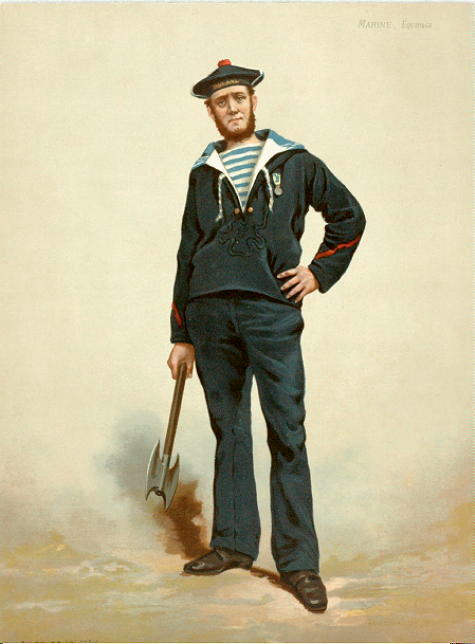
I will skip the history of stripes in clothes – or rather the lack of them – in Europe’s earlier history, fascinating though that is, and will cut straight to the chase, in this case an Ordinance emitted in 1858 by the French Ministry of the Navy. This Ordinance decreed that from now on not just Navy officers but also the more humble petty officers and ordinary seamen would wear a uniform, and described in good bureaucratese what this uniform should look like. Here we have a French sailor from a few decades after the Ordinance’s publication.
The 1858 Ordinance of course also dictated the precise design of this uniform. As far as the marinière was concerned, it was to be made of a fabric knitted in the “jersey” style, and have, front and back, 21 white stripes, each 20 mm wide, interspersed with 21 indigo-blue stripes half as wide, while 14 white and blue stripes of the same widths should run on the sleeves. Why this number of stripes? Lord knows. In the case of the 21 stripes, it has been suggested that they stand for the 21 battles which Napoleon won, although I don’t see how that can be since by my count he won more like 30 battles (and anyway, this is the Navy; why should they memorialise land battles?). In the old days, the blue of the stripes (and probably the blue of the jacket and trousers) came from using my old friend indigo as the dye, but I suppose modern dyes are used today.
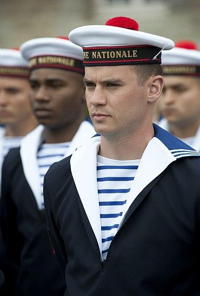
It seems that pretty much every Navy has adopted this type of uniform for its seamen. As a result, for the last one hundred and seventy years or so it has become typical in towns near Navy bases to see off-duty seamen in their dashing uniforms lounging about ogling the girls and being ogled back.
But now to the marinière’s upgrade into a fashion item. It seems that Coco Chanel was the first fashionista to take this humble piece of clothing and turn it into a fashion statement. The story goes that during the First World War Chanel would often leave Paris to go and spend time on the Normandy coast; she had a second shop in Deauville, a seaside resort which was the hang-out of the rich and famous. This is a poster for Deauville from the 1920s, when it was once again the place for the rich to go and have fun.
It being wartime when Chanel was going, Deauville must have looked much more sober than in this poster, and I suppose that since the locals were sea folk many of the men would have been called up to the Navy and would have been seen walking around the town in their uniform. Chanel was much struck by the marinière and added her version of it to her collections for women from 1916 onwards. This was quite audacious of her, since she was taking an article of clothing for men, and working men at that, and using it as a fashion item for respectable bourgeois ladies. Initially, she also made her marinières out of jersey fabric; this scandalised people because at the time this was a fabric strictly associated with underwear. She argued that the war made it difficult to source more upscale fabrics – and perhaps it was unpatriotic to use such fabrics at a time when many people were suffering great privation. After the war, she quietly moved to using posher fabrics, especially silk. Here, we have her wearing one of her marinières, along with a pair of trousers, no doubt another cause of scandal (when I was young it was still thought that proper young women did not wear trousers, and certainly not in the workplace).
Of course, Picasso and Chanel knew each other; the artsy world is a small one, everywhere. Jean Cocteau was a firm friend of Picasso’s; he was one of the witnesses to Picasso’s marriage with his first wife, Olga Khokhlova. He was also a firm friend of Chanel’s, so naturally he introduced the two to each other … It so happened that Olga was a devoted client of Chanel’s, and Chanel regularly visited the couple after they were married … Some of Chanel’s creations were inspired by Picasso’s cubism … Chanel and Picasso collaborated with Cocteau in his 1922 adaptation of Sophocles’s Antigone: Chanel designed the costumes, Picasso designed the sets and masks; here we have the costume for Antigone …
She was Sara Murphy, he Gerald Murphy, both from wealthy American families, who in the 1920s decided to escape from their disapproving parents and live on the French Riviera for a while. They hosted a fashionable bohemian set at their home there: Picasso, of course, was a guest, but so was the painter Fernand Léger, despite his communist sympathies; as readers can guess, Cocteau also turned up (he happened to own a villa in the same general area); Cole Porter – an intimate friend of Gerald’s – was a frequent visitor; a bevvy of American poets and writers travelling through Europe dropped by: F. Scott Fitzgerald and his wife Zelda, Ernest Hemingway, John Dos Passos, Archibald MacLeish, John O’Hara, Dorothy Parker, Robert Benchley; and on and on. Chanel could well have also been a guest – she, too, owned a villa on the French Riviera – but I’ve found no trace of her being on the guest list.
The story goes that on a shopping trip to Marseilles – a port city, let’s remember – Gerald was charmed by the marinières that he saw all around him. So he bought a bunch of them and distributed them to his guests, thereby transforming the humble marinière into chic leisurewear. We have here a photo of Gerald wearing a marinière, with his wife on the beach.
I should say in passing that the Murphys are credited with getting the smart set to visit the French Riviera during the summer and not just the winter, as had been the case until then. Prior to their arrival, lying on a beach to enjoy the sun was not done. Occasionally, someone went swimming, but the joys of hanging out on a beach just to soak up the sun were still unknown. It was the Murphys who introduced this as a fashionable activity. We have here Gerald and Picasso on the beach at Antibes.
And here, to complement the photo above of the poster advertising the charms of Deauville, we have a photo of a UK poster from the late 1920s advertising the – warm – charms of the French Riviera.
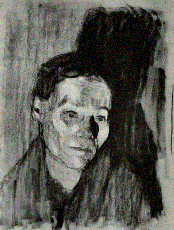
Even though Gerald may have given Picasso a marinière to wear back in the 1920s, we don’t have a photo of him wearing one then – or at least I haven’t found such a photo. The photos with him in a marinière, like the one I started this post with, are from the 1950s and later. Perhaps it was only when Picasso moved down to the Riviera after World War II that he started wearing one regularly.
In fact, the marinière only seems to have become a common fashion statement in France in the 1950s, and from what I can gather we mainly have Brigitte Bardot to thank for this. She turned up at a Cannes Film Festival – and was photographed – in a marinière. Here, we have a few of these photos.
But it was Jean-Paul Gaultier who really put the marinière on the high fashion map from the late 1970s onwards. He went crazy for it after seeing Rainer Werner Fassbinder’s film “Querelle de Brest”, a film which plays to another side, the homoerotic side, of the Navy uniform.
There are lots more of Gaultier’s takes on this once humble piece of clothing. Any reader who is interested in dreaming about what flash piece of Gaultier marinière-themed wear they could look for in their local vintage clothes shop can do no worse than surf this site. And there are lots of other high fashion dudes who’ve had a go at the marinière: Karl Lagerfeld for Chanel (unsurprisingly), Kenzo Takada, Sonia Rykiel, Prada, Dolce & Gabbana, Michael Kors, and on and on. I shall let readers explore.
Meanwhile, although I said at the beginning that I didn’t want to celebrate Picasso’s artistry in this post, it seems to me appropriate to finish up with a couple of his works in which he celebrated the marinière.
Here, we have a man in a marinière smoking a cigarette.
This is the second posting where I write with wistful envy about a person who was rich enough to build up an art collection and who had enough taste to build up a great art collection. The first posting was about Ms. Kröller-Müller, whose museum we will visit in a few weeks’ time when we go to the Netherlands. This second posting is about Ms. Heidi Horten, a selection of whose collection my wife and I recently visited at Vienna’s Leopold Museum. (In passing, Mr and Mrs Leopold are another couple who used their riches to build up a ravishing collection now housed in this same museum.)
A few words about Ms Horten. As a 19 year-old, this Austrian girl married the much older Mr Helmut Horten, a German who had made his fortune after the war with a chain of department stores (I will skitter delicately over the fact that the start of his business empire was his purchase – I would assume on the cheap – of a department store owned by two Jewish partners who were forced to give it up in the wake of the Nazis’ antisemitic policies and prior to their emigration to the US). Here, we have the Horten couple.
As a couple, they did some collecting but nothing major. The serious collecting only really started when Mr Horten went the way of all flesh in 1987 and Ms Horten inherited the bulk of his fortune – some $ 1 billion, it is reported. Here is a photo of her in those years: quite a glamorous lady, I would say.
And what a collection Ms Horten has amassed! Like Ms Kröller-Müller and the Leopolds, she has focused her purchases on modern and contemporary art. I presume that the exhibition at the Leopold Museum is only a portion of her collection, but what they are showing is impressive. After doing a round of the exhibition, I went around again, taking pictures of the pieces which had particularly struck me. I post them below, in the order of their creation.
Lyonel Feininger’s The Honeymooners, from 1908.
Wonderful expression of the happiness of two honeymooners, dressed in bright clothes and towering over their surroundings.
Egon Schiele’s aquarelle of Seated Male Nude from Behind, painted in 1910.
Schiele painted a whole series of these aquarelles, a number of which I was fortunate enough to see several years ago on one of my periodic visits back to Vienna from China.
Emile Nolde’s Red Evening Sun, painted in 1913.
My wife was particularly struck by the painting’s dark, dark sea.
Gustav Klimt’s Church in Unterach am Attersee, painted in 1916.
Klimt painted a number of these views, which he saw, it is said, through a telescope to get that foreshortening effect.
Kees van Dongen’s Commedia (Montparnasse Blues), painted in 1925.
Emile Nolde again, Summer Day with Hay Cart, painted in 1926, more than ten years after the earlier painting.
Chaim Soutine’s Doorkeeper – Woman in Blue, from 1935.
Soutine captured perfectly the sour look which all the French doorkeepers of my youth constantly displayed.
After that, things begin to get grim. I’ve often complained (the latest time last December) that as Western modern art gets ever more modern it slips off into irrelevance and silliness. I feel that the rest of the exhibition demonstrates this pattern all too well. Nevertheless, I show here pictures of some of these later pieces, often for no better reason than they amused me.
Alexander Calder’s Untitled (Toy Train) from around 1946. A fine way to reuse old tins and cans.
Michelangelo Pistoletto’s Nurse and Girl from 1965.
What, I wonder, were the two discussing?
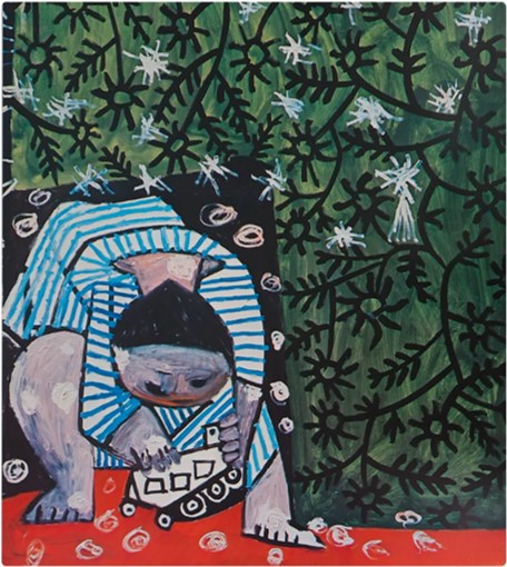
Pablo Picasso’s Bust of a Man, from 1969.
As I’ve commented elsewhere, among the dreariness of abstract art Picasso shines out as having stayed true to representational art.
Another Alexander Calder, Critter with Peaked Head, from 1974.
Funny title, and interesting change of view as one goes around the critter and as one of her three legs disappears (I assume the critter is feminine since she is wearing high heels; but perhaps male critters also wear heels).
Roy Lichtenstein’s Forest Scene, painted in 1980.
Andy Warhol’s Lenin, from 1986.
Normally, I find Warhol’s portraits wearisome and repetitive, but I found these two portraits of Lenin quite arresting.
Keith Haring’s Untitled, painted in the same year as Warhol’s Lenins.
Untitled, but I presume a commentary on the AIDS epidemic that was then sweeping through the US’s gay community and which counted him as one of its victims four years after he completed this painting.
Not Vital’s Untitled (Fuck You), from 1991-2.
I don’t know if this is what Vital intended, but I see this piece as a commentary on those awful collections of deer antlers which you see in many conservative Austrian homes, testimony to the enthusiasm with which the home owner and his ancestors have hunted deer.
If I were a deer, I too would want to have those seven letters dangling from my horns as I faced my hunter.
Maurizio Cattelan’s Untitled (Zorro) from 1997.
I’m assuming that Cattelan was taking the piss out of Lucio Fontana, he of the cut canvases. I feel this ever more strongly given that this painting was hung beside some four or five Fontanas.
Cattelan, by the way, is the same artist who sculpted that hand with its finger raised in front of Milan’s stock exchange; it was the subject of an earlier posting of mine. He seems to be quite a joker.
And finally, Erwin Wurm’s Kastenmann, or Box Man, from 2010.
I don’t know what Mr. Wurm is trying to tell us, it just looks amusing.
I now invite my readers to scroll through all these pictures again. Did something not go wrong with the art we produced in the developed countries some time after the Second World War? Is all that’s left to our art is whether it’s a good joke or not?


