Beijing, 30 November 2012
edited in Bangkok, 29 February 2015
I said in my previous post that I currently lived in a country where everyone had black hair. That is not strictly true. Like everywhere else, Chinese women, young and old, as well as young men, have a fondness for dyeing their hair. The great majority of them have wisely settled for adding reddish tints. This gives them hair-dos with varying shades of red-brown, which goes well with the natural colour of their skin. An unfortunate few have dyed their hair blonde which, with the yellow hues of their skin, simply makes them look ill.
In their colour preferences, Chinese hair-dyers are following what seems to me a broader trend worldwide to add more red to one’s hair. My memory tells me that when I was young, the dyeing colour of choice – at least in Europe – was blonde, but some fifteen years ago the shades definitely shifted into the redder part of the spectrum.
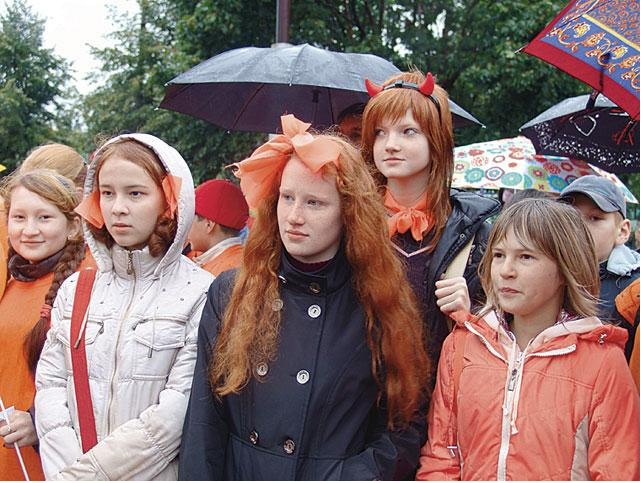
And why not? Naturally red hair is a magnificent sight, and the rarest natural colour in us humans. On average, no more than one or two people in every 100 have red hair. Scotland has the highest proportion, with a little more than one every ten Scotsmen or women having red hair. I remember well being struck by the amount of red-heads around me when I first moved to Edinburgh for University. Ireland follows close behind. And then there is a scattering of red-heads throughout the rest of Europe.
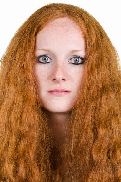
Let me insert here a little photo gallery of some European read heads (probably Scottish or Irish, at least of descent), a young woman
 a young man with a magnificent red beard
 a baby, readying himself or herself for a life on the red side

a slightly older man, looking back at a life spent on the red side.

I feel I have to complete this photo gallery with a picture of the Fair Prince Harry, who has given redness of hair a good name.

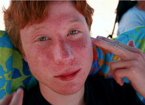
The observant reader will have noticed that most of these wonderful red-heads have blue eyes. The gene mutation which leads to red hair is closely linked to the one which gives rise to blue eyes. Fair, non-tanning skin almost always accompanies red hair, to the distress of red-heads when visiting countries with fierce sunlight:

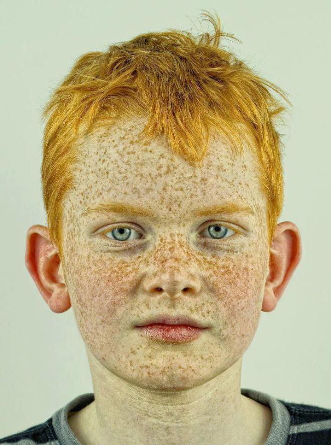
Freckles are also often their lot:
Europe is not the only place to harbour red-heads. Here, in no particular order, are some red-heads from other parts of the world:
Syria:

Turkey:

The Berbers of North Africa, represented here by Morocco’s queen (who is a Berber):

and a small child:

Udmurtia, a small provincial backwater in the Ural mountains of Russia famous for its red-heads:

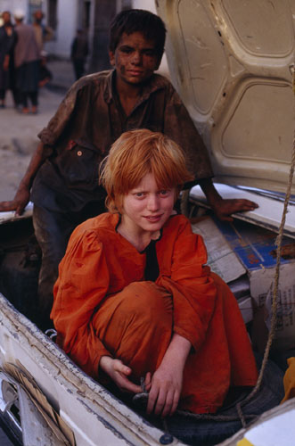
Afghanistan:
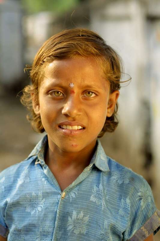
India:
and even Polynesia – this girl is from Tahiti:

Ashkenazi Jews are also well known for their redheads. My representative of this group is Woody Allen; this is a clip from one of his best films, Sleeper:

Nearer to me but also much further back in time are the Tochtarian people who inhabited the Tarim basin of Xingjian Autonomous Region some 4,000 years ago. The bodies of their dead were dessicated and mummified in the desert conditions of the Tarim basin, so many mummies have been unearthed. At least one these, the so-called Beauty of Xiaohe, had what looks like red hair.

Dessicating deserts in Peru have also given the world a share of mummies, some of these being red-heads. These red-headed mummies have had certain archaeologists (notably Thor Heyerdahl) afroth with fancy (and relatively racist) theories of Nordic whites somehow arriving in South America to take the natives in hand. This particular mummy also seems to have been subjected to skull lengthening.

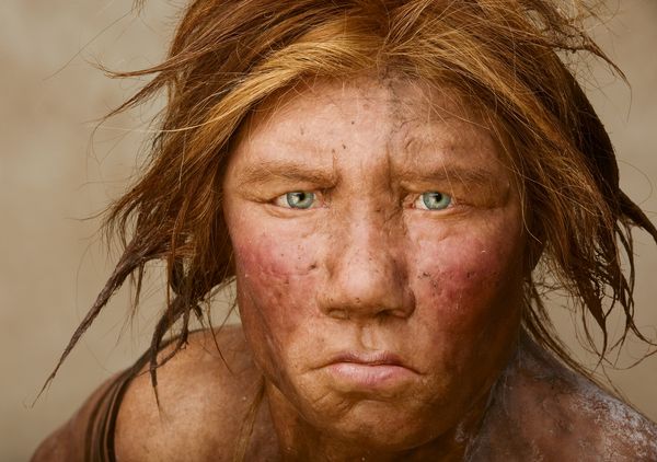
Going back even further, from studies of fossil DNA it seems that some of our Neanderthal cousins were also red-heads:
So come join Edinburgh’s annual Ginger Pride Parade! Immerse yourself in a sea of red hair!

___________________
Ginger girl: http://i.telegraph.co.uk/multimedia/archive/02510/ginger-girl-13_2510537k.jpg (in http://www.telegraph.co.uk/culture/culturepicturegalleries/9932654/I-Collect-Gingers-artist-Anthea-Pokroy-photographs-500-red-haired-people.html?frame=2510537)
Red header with beard: https://s-media-cache-ak0.pinimg.com/736x/96/d0/17/96d017f4374dbd877396ca77e2baf638.jpg (in https://www.pinterest.com/bridgeemelling/bearded-boss/)
Red headed baby: http://3.bp.blogspot.com/-rQ0mt43F_48/UXqtfoVyvGI/AAAAAAAAPow/zK3OEOiHiFI/s1600/150421_343259622462322_454686503_n.jpg (in http://klubkotajasna8.blogspot.com/2013_06_01_archive.html)
Ginger haired old man: https://s-media-cache-ak0.pinimg.com/564x/02/36/0b/02360b9c030976e4bc871f810ac4aba7.jpg (in https://br.pinterest.com/pin/499899627364000820/)
Prince Harry: http://4.bp.blogspot.com/_tR4bYTcAqeQ/SvI-Hwpk8NI/AAAAAAAABsM/OBj6T465Dlc/s400/princeh.bmp
sunburned boy: http://25.media.tumblr.com/tumblr_ld4t18EDYN1qfs58no1_500.png
freckled boy: http://25.media.tumblr.com/tumblr_mbjiv5TNfp1qer9yuo1_1280.jpg
Syrian baby: http://i45.tinypic.com/260x2xu.jpg
Turkish young man: http://t2.gstatic.com/images?q=tbn:ANd9GcSBd3GBpDXFhzwdCW99RLJk_znIncX8Uaory6HOjMPNSpP6n1Kvag
Moroccan Queen: http://badrhariboxer.com/wp-content/uploads/2012/05/moroccan-queen.jpg
Berber girl: http://looklex.com/e.o/slides/berbers02.jpg
Udmurt girls: http://russianpickle.files.wordpress.com/2010/03/udmurt_people_red.jpg
Afghan boy: http://fc04.deviantart.net/fs16/f/2007/122/1/a/Afghan_Redhead_and_boy_by_xerquina.jpg
Indian boy: http://mathildasanthropologyblog.files.wordpress.com/2008/06/light-indian.jpg
Polynesian girl: http://t0.gstatic.com/images?q=tbn:ANd9GcS9dYzPU1dcELZO1dZOJTMta43zg-fJO2tGxOcwAqHJ7XKp0iIpTAJGjDAAnA
Woody Allen: http://www.nerve.com/files/uploads/scanner/sleeper_0.jpg
Tochtarian mummy: http://images.mirror.co.uk/upl/dailyrecord3/feb2011/0/7/mummy-image-2-601127141.jpg
Peruvian mummy: https://s-media-cache-ak0.pinimg.com/736x/2d/43/e4/2d43e4c46a67385e964b409fe38e229a.jpg (in https://www.pinterest.com/aprildherbert/creepy-cool/)
Neanderthal: http://images.nationalgeographic.com/wpf/media-live/photos/000/601/cache/neanderthal-genome_60159_600x450.jpg
Ginger pride parade: http://scrapetv.com/News/News%20Pages/Health/images-3/ginger-rally-uk-support.jpg (in http://scrapetv.com/News/News%20Pages/Health/pages-3/World-misses-prime-opportunity-to-eliminate-gingers-during-pride-parade-Scrape-TV-The-World-on-your-side-2013-08-12.html#.VtRaZEAppEN)


