SWEET POTATOES AND CATAMARANS

Bangkok, 22 November 2015

I was in Vanuatu recently, which, for those readers not familiar with the Pacific, is one of those many little island states that dot the Pacific Ocean, like Tuvalu or Palau or Kiribati. I was there on business, for reasons which are too long to explain here. In any event, as is my habit, when I had a little bit of spare time I went down to the local market in the capital, Port Vila, to see what fruits, veggies, and other local delicacies they might be selling.

market port vila

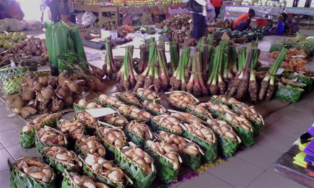
Much of what I saw was familiar, although I don’t think I’ve ever seen taro before (those neat little bunches behind the potatoes)

taro

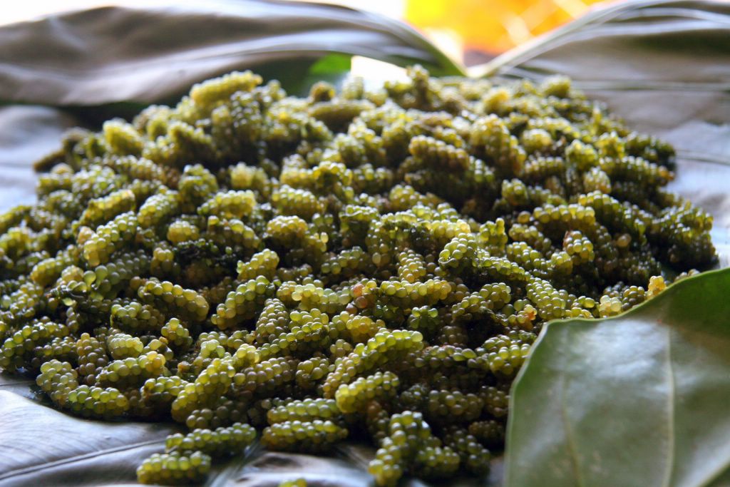
and I’ve definitely never seen sea grapes, which is a kind of seaweed if I’ve understood correctly (no idea how you eat them).

sea grapes

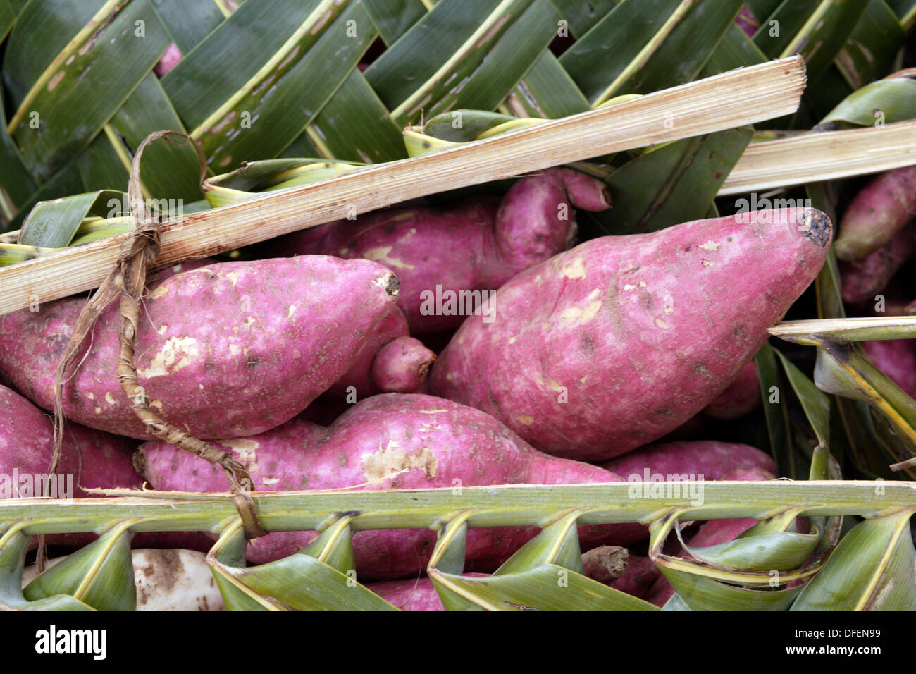
Sweet potatoes fall into the category of the known. Nevertheless, I did pause in front of them and go dreamy.

sweet potato market port vila

It wasn’t so much for the sweet potatoes – I’m not a great fan of this tuber, to be honest – but rather for its story here in the Pacific. Let me explain.

As previous posts attest, I have a great interest in the movement of foodstuffs around the world, so whenever I go to markets I always mentally map how the fruits and vegetables (and sometimes meat) must have originally ended up on the counters before me. True to form, I went through the same exercise in that market in Port Vila. Much of what I was seeing was brought into the Pacific Islands from the West, either brought along for the ride by the original inhabitants of the islands when they migrated out of South-East Asia, or through later regional trade between the Pacific Islands and South-East Asia, or even later through the colonial masters when they took over the islands. But the sweet potato was different. As I’m sure my readers know, the sweet potato originally comes from northern South America and possibly Central America. So how did it make it to the Pacific Islands? Well, it could definitely have come with the Spaniards after they conquered Latin America and set up a long distance trading system between Mexico and the Philippines – and in fact, at least one type of sweet potato was introduced to the Pacific Islands this way. It could also have come from the other direction, via Europe – and this is indeed the way that the Portuguese introduced the sweet potato to this part of the world, mostly to the islands of South-East Asia rather than the Pacific itself, as they sniffed around the area for spices. But there was another route of introduction of the sweet potato to the Pacific Islands, one which is much more fascinating, and this was by the Pacific Islanders themselves, who sailed all the way to South America and brought the sweet potato back with them (and may have left the chicken, although this is much debated). Since I’ve been talking about maps, here’s one which summarizes nicely the spread of the sweet potato in the Pacific:

map of sweet potato spread

The blue line is the Spanish introduction, the yellow line is the Portuguese introduction, and the red line is the introduction by the Polynesians. The evidence for a Polynesian introduction is archaeological (remains of sweet potato in Polynesian tombs datable to a time long before the colonial period), linguistic (as the map shows, there is a definite similarity between the Polynesian/Melanesian name of the sweet potato and its original South American name), and more recently DNA-related, through comparison of gene sequence mappings of the DNA of South American varieties with old specimens kept in European herbariums collected during the first trips of exploration by James Cook, Louis de Bougainville, and others.

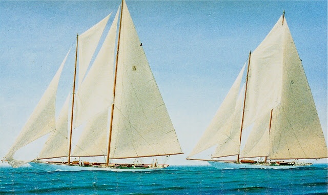
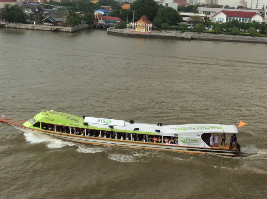
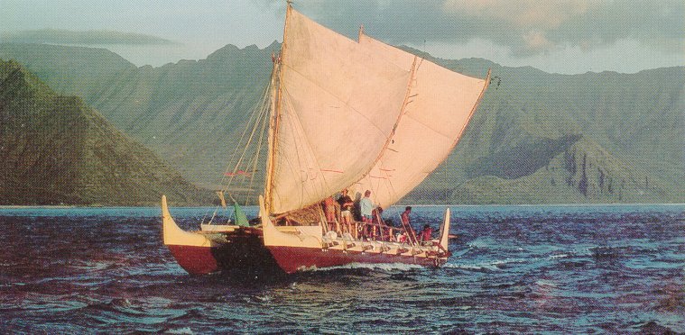
The map also shows the most probable route taken by the Polynesians to reach South America, via Easter Island. But now, let me tell you, East Island is far away from South America. It’s about 3,500 km far away. And on the other side it’s far away from other Pacific Islands. It’s about 3,600 km far away from the islands of French Polynesia, which are the closest biggish islands. Yet, the Polynesians sailed these vast distances – and not on some big comfy ship running on oil and crammed full with the latest navigation equipment but on a boat like this, powered by sail, and where they could only rely on their reading of stars, cloud formations, sea swells, and bird flight patterns to navigate.

polynesian ship

This picture clearly romanticizes the vessel. It must have been a cramped, dangerous voyage. Many times, the ships must have got lost at sea – James Cook writes of coming across a boatful of Polynesians in the middle of nowhere, who had been driven off course by a storm and were asking where they were.

This is a modern version of one of these ships, built in the 1970s,

modern polynesian ship

which clearly shows the unique aspect of their design, the use of two hulls. In fact, this design inspired modern ocean-going catamarans and eventually the truly amazing catamarans that now race in the America’s Cup.

image

These beauties can go up to 80 km/hr, but a more typical speed on a modern ocean going catamaran would be 15 km/hr. Doing a little maths here, it would therefore take a modern catamaran about 10 days to sail from Easter Island to South America. So if luck was with them, if the winds stayed steady and did not get too boisterous, if there were no nasty storms to drive them off course, the Polynesians probably would have had to last 10 days-two weeks out in the Pacific before hitting South America, which seems doable. Getting back, though, must have been considerably harder. I mean, on the way there, the Polynesians just had to hit South America, which is kinda big. On the way back, though, they would have had to hit these tiny specks in the ocean, specks which on top of it were much further away – taking the trade winds out of South America would have meant their having to aim for the French Polynesian islands for their first landfall, and these are 8,000 km away, or something like three weeks’ sailing if all went well.

But some Polynesians made it to South America and a few others made it back, with the sweet potato in tow. Because of these very skillful and very courageous sailors, I was looking at sweet potatoes in the market at Port Vila. No wonder I paused and smiled when I saw these not very tasty tubers.

______________

Port Vila market: https://scottmathiasraw.com/wp-content/uploads/2015/02/img_4446.jpg (in https://scottmathiasraw.com/vanuatu-welcomes-australian-raw-food-chef/)
Taro, Port Vila market: http://www.asiapacificnazarene.org/wp-content/uploads/s_Market-food.jpg (in http://www.asiapacificnazarene.org/five-months-post-cyclone-pam-vanuatu-recovering-thank-you-for-your-prayers-and-partnership/)
Sea grapes: http://photos1.blogger.com/img/164/977/1024/IMG_0110.jpg (in http://becksposhnosh.blogspot.com/2005/09/nama.html)
Sweet potato, Port Vila market: http://c8.alamy.com/comp/DFEN99/purple-colored-sweet-potatoes-in-a-basket-made-of-palm-leaves-on-a-DFEN99.jpg (in http://www.alamy.com/stock-photo-purple-colored-sweet-potatoes-in-a-basket-made-of-palm-leaves-on-a-61174997.html)
Map of spread of sweet potato in Pacific: http://www.pnas.org/content/110/6/2205/F1.large.jpg (in http://www.pnas.org/content/110/6/2205/F1.expansion.html)
Polynesian ship: http://cdn.arstechnica.net/wp-content/uploads/2013/01/kane_waa_small10-640×422.jpeg (in http://arstechnica.com/science/2013/01/polynesians-reached-south-america-picked-up-sweet-potatoes-went-home/)
Modern Polynesian ship: http://pvs.kcc.hawaii.edu/images/canoes/hokulea_circa_1975.jpg (in http://pvs.kcc.hawaii.edu/index/founder_and_teachers/nainoa_thompson.html)
America Cup boat: http://www.examiner.com/article/america-s-cup-event-authority-launches-new-sailing-simulation-app

LET’S CHANGE THE FAO LOGO

Bangkok, 9 September 2015

Fairly often, I walk past the Bangkok office of FAO (the Food and Agricultural Organization, not the Schwartz of the toys), and with time the logo of the Organization, which is placed on the gate of the building, has seeped into my consciousness.

FAO icon

As it’s seeped into my consciousness, I’ve begun to look at it more closely. Let me give you a more formal view of the logo so that we can study it together.

FAO_logo.svg

It’s a simple design, as all good designs should be.

And it’s profoundly colonialist, or at the very least extremely euro-centric.

Let me explain.

What we have here is a stylized head of wheat with a motto in Latin, “Fiat Panis”, “Let There Be Bread”. OK, you may say, so what’s the big deal? FAO is there to eliminate hunger, bread is perhaps the most fundamental of foods (remember Marie-Antoinette’s comment “let them eat cake” when told that the peasants had no bread), and wheat makes bread.

Oh really? The Thais eat bread? And the other South-East Asians? How about the Chinese? The Koreans? The Japanese? Rice reigns supreme here. And while the people of the Indian sub-continent consume bread (naan and roti come to mind), they also consume huge amounts of rice, as well as substantial amounts of sorghum, millet, and maize. Talking of maize, in its birthplace, Mexico, and in much of Central America, it is still the major cereal consumed (think tortillas), while the Spaniards and the Portuguese carried it off to all corners of the globe, so that not only the Indians but the Chinese and many other Asians now also eat large amounts of maize. The same is true of Sub-Sahara Africa – it’s the most consumed cereal in that part of the world, along with millet (many of whose species originated in Africa), sorghum (also originally from Africa), as well as lesser-known grains like teff in the Ethiopian highlands, fonio in the savannah areas of Western Africa, and Africa’s own variety of rice along the rivers of Western Africa. And although the Europeanss who colonized the Americas brought with them the habit of consuming wheat, not only maize but other grains, like qinoa, or its close relative kañiwa, or even amaranth, have hung on.

But FAO, created in the aftermath of World War II, was very much a creation of Europeans and neo-Europeans (the countries in the Americas and Australasia which were colonized by Europeans and whose elites probably ate bread and not tortillas or the local equivalent). Of the 37 original countries who signed up to the FAO when it was created in October 1945, 29 were Europeans or neo-Europeans. Of the remainder, 4 came from the Arab region, also wheat eating. Of the three Asian signatories, India (as we have seen) eats quite a bit of wheat, especially its northern regions where the-then Hindi political elite came from (I’m a bit puzzled that India signed up, though; it was still a British colony). That leaves the Philippines, who no doubt just followed the US lead, and China, represented by the Nationalists who were anxious to keep their friends in the West during their fight to the death with the Communists and so who weren’t going to make a fuss over anything so trivial as a logo (maybe they didn’t even notice it).  As for Liberia, the one lone African signatory (the others all being colonies and therefore not counting as countries), given its history it also no doubt followed the U.S.’s lead.

So wheat it was on the FAO logo. But did they really have to add the Latin motto? Such a super European thing to do! Have something in front of you which looks like a heraldic shield, and slap a Latin motto onto it (it was put there by FAO’s first Director-General, by the way, a Brit; why am I not surprised?). I mean, as a European who had Latin as part of my education (very unwillingly, I should add), I like the motto. It gives an apparent nobility, a timelessness, to a simple message: let me eat. It also reminds me subliminally of my (European) Christian upbringing – I’m old enough to remember Sunday masses in Latin, where of course bread is central to the liturgy. It also reminds me of a line in the New Testament (I wonder if the British Director-General had this in mind when he chose the motto), when Jesus is being tempted in the desert by the devil. At one point, the devil says to him (in the Latin Vulgate version) “Si Filius Dei es, dic lapidi huic ut panis fiat”, “If you are the Son of God, tell this stone to become bread.” Turning stones into bread: a nice description of farming. But all this is very, very elitist, holding meaning to a tiny percentage of the world’s population. It means nothing to the Chinese or Indian farmer, or the campesino in Latin America, or the African subsistence farmer eking out an existence on the edges of life. Yet they are the clients of FAO, not me, white, educated, and urbanite.

So I think we need to redesign FAO’s logo. I’m open to all and any suggestions, but here are my thoughts. First, throw out the motto; let’s keep to the one universal language that we all have, images. Just as an example to encourage us, UNICEF, which has its office next to FAO’s, also has its logo on the gate.

unicef logo

No words, just an image, and of course an absolutely universal image of mother and child. This is what we should aspire to.

My first thought is that the logo should recognize that we all eat lots of different foods all over the world. We can’t have all of them on the logo, but we could have those most eaten. For example, I read that the ten most eaten staple foods in the world are maize, rice, wheat, potatoes, cassava, soybeans, sweet potatoes, yams, sorghum, and plantain. So why not shove all of of them into a cornucopia like this one, so dear to Americans around Thanksgiving and put it on FAO’s logo?cornucopia iconAfter an initial burst of enthusiasm, I hesitate. First of all, I am committing exactly the same sin which I am accusing the original designers of, cultural imperialism. Who, outside of the European and neo-European countries, has ever heard of cornucopias? This was a Roman invention, attributed to several Gods and Goddesses having to do with food and agriculture. Of these, I prefer the Goddess Abundantia, for no other reason than it’s a pretty cool name.

Abundantia

As you can see, she is nestling a cornucopia along her left arm.

Abundantia’s name also happens to show the second big problem with cornucopias. Her name gave us our word “abundance”, and that is indeed the purpose of the cornucopia, to show the overflowing fruits of the earth – that’s why it pops up at Thanksgiving, when everyone is gorging themselves. But abundance is not what 90% of FAO’s clients have. I think it would be rather a slap in their face to flaunt so much abundance.

Why not move away from the fruits of farming to the act of farming itself? And here I’m thinking of the act of ploughing – not completely universal, I grant you, since herdsmen don’t plough, but still pretty symbolic of farming from time immemorial.

egyptian ploughing

Some sort of simplified picture like this could do the trick

hand ploughing-2

although obviously this particular picture carries a lot of European cultural baggage: the horse, the way the man is dressed. But I’m sure a professional designer could come up with something less fixed to a certain time and place. Of course, fitting all of that in a readable form onto a logo might be a challenge. Perhaps the picture should be just the plough itself, something like this.hand ploughAgain, after an initial moment of enthusiasm, I hesitate. I could be accused of wanting farmers to stay in the Stone Age. Why not have a modernist, aspirational logo like a tractor, which no doubt every farmer, sweating away as he ploughs his field with his ox or horse or other beast of burden, would devoutly wish for? Something like this:

tractor logo

But frankly I don’t like tractors much; I have a rather contrasted relationship with this piece of agricultural machinery. So I’ll nix that idea.

After some thought, I suggest we should go for something much simpler, something much more fundamental, something much more basic: this

planting-3aAfter all, once you strip out all the technology, all the sophistication, all those damned tractors, isn’t that what farming is essentially about, nurturing a plant to grow?

_______________________

FAO logo: https://upload.wikimedia.org/wikipedia/commons/thumb/d/db/FAO_logo.svg/2000px-FAO_logo.svg.png (in https://en.wikipedia.org/wiki/Food_and_Agriculture_Organization_of_the_United_Nations)
UNICEF logo: http://www.somalicurrent.com/wp-content/uploads/2014/12/UNicef.png (in http://www.zwallpix.com/unicef-logo.html)
Cornucopia icon: http://www.clker.com/cliparts/1/8/a/5/128509193232136462thanksgiving-cornucopia-large.jpg (in http://www.clker.com/clipart-71521.html)
Statue of Abundantia: http://arachne.uni-koeln.de/images/Abbildungen/FADatenbankabb0488/BA-Museum-Neg-NrBard115_2211,05.jpg (in http://arachne.uni-koeln.de/browser/clarac_index.php?view%5Blayout%5D=clarac_page&clarac%5Bsearch%5D%5BPS_WebseiteID%5D=3125)
Egyptian ploughing: https://upload.wikimedia.org/wikipedia/commons/thumb/9/91/Maler_der_Grabkammer_des_Sennudem_001.jpg/1280px-Maler_der_Grabkammer_des_Sennudem_001.jpg (in https://commons.wikimedia.org/wiki/File:Maler_der_Grabkammer_des_Sennudem_001.jpg)
Hand ploughing: http://image.shutterstock.com/display_pic_with_logo/300715/300715,1243435606,4/stock-photo-farmer-and-horse-drawn-plough-30987703.jpg (in http://www.shutterstock.com/pic-30987703/stock-photo-farmer-and-horse-drawn-plough.html)
Hand plough: http://img.index.hu/imgfrm/4/5/6/4/BIG_0007494564.jpg (in http://forum.index.hu/Article/showArticle?go=99788228&t=9201739)
Tractor logo: Hand ploughing: https://s-media-cache-ak0.pinimg.com/736x/ed/04/8b/ed048bb8cfea5f269418c1476160f152.jpg (in http://janesbrickroad.blogspot.com/2010/07/jacobs-creek.html)
Planting: http://thumb9.shutterstock.com/display_pic_with_logo/2857603/257887916/stock-vector-hand-holding-a-leafy-plant-symbol-for-download-vector-icons-for-video-mobile-apps-web-sites-and-257887916.jpg (in http://www.shutterstock.com/s/planting+seeds/search.html)

TROMPE L’OEIL AND STINGINESS

Bangkok, 27 July 2015

Trompe l’oeil is a very respectable art form, with a long and distinguished presence in the world of art, at least in Western art. I am told that the Greeks and Romans practiced it, although I do not recall ever having seen an example. In any event, artists took it up again with a vengeance during the Renaissance, and art thereafter is littered with pieces which “fool the eye”, tricking the viewer to see three-dimensional depth where there is none. We have a beautiful example just up the road from our apartment in Milan, in the church of Santa Maria presso San Satiro. My not-yet wife took me there on my first trip to Milan in 1975 and my eyes were indeed fooled.
image
What I had taken to be a deep apse behind the altar is actually an almost flat wall. The clever artist in question was Bramante, who painted it in the 1480s. In this case, he didn’t do it just to show how good he was, it was to give a feeling of greater depth to a church which was squeezed in between the adjoining buildings.

I could go on giving other examples from High Art, but actually I want to focus on a lower form of the art found in the province of Liguria. We’ve just come back from spending a week by the sea, near Genova, the province’s capital (and from where I managed to launch several of the previous posts).

One of my recurring pleasures as I walk the streets of any conurbation in Liguria, from Genova down to the smallest village, is to come across houses like these.
image
This form of trompe l’oeil is only found in Liguria, to the extent that the practice is almost a D.O.C.. In these cases, the painter (I hesitate to call him artist) embellishes what is otherwise the drab and flat facade of a house (you see an example to the right in the photo) with architectural elements which are painted so cleverly as to fool the eye into thinking that they are three-dimensional and “real”. The result is to make an ordinary house look more imposing, which in the old days no doubt (and perhaps even today) raised the residing family’s social standing a notch or two. It is even a way of making up for unfortunate blemishes in a facade, like the absence of a window which mars the symmetry of a house.
image
What is nice is to see is examples which run from the fresh and new to various states of weathering and finally decrepitude brought about by sun, rain, and more recently pollution.
image
image
image

image

Of course, one has to ask oneself why this art form is so popular in Liguria and nowhere else. My theory, for what it’s worth, is that it is a reflection of the well-known stinginess of the Genoese (and more generally Ligurians). In Italy, the Genoese have the same reputation as the Scots in England for being tight fisted, and there are loads of jokes about it, as indeed there are in the case of the Scots (“There was an Englishman, an Irishman, and a Scotsman in a pub. The Englishman stood a round, the Irishman stood a round, but the Scotsman just stood around”; sorry, I thought I would just quickly throw that one in). According to this theory, then, the Genoese (and by reflection the Ligurians) preferred to paint architectural elements onto their facades à la trompe l’oeil rather than go with the real things, because it cost them less.

I’m sure the Genoese must feel that this typing of them as scrooges by the rest of Italy is grossly unfair and they probably find it very irritating to be the butt of incessant jokes about it. But as they say, “there is no smoke without fire”. There must surely be some reason why they got this reputation. Curious to see what I could find out, I did an internet search on the topic (in truth, my wife did it since she’s very good at internet searches). Several suggestions popped up. One is that Liguria is in general a very poor land, made up of steep hills and little good agricultural land. People who live in such lands tend to be more careful with their hard-earned wealth scratched out of an unforgiving earth than those of us from richer lands (I’m sure this is the basis for the Scots’ reputation for stinginess). Another suggestion is that the Genoese in particular made much of their wealth in banking (they were the bankers of the Spaniards in the 16th century), and like all bankers got into the habit of not throwing their money around like we foolish non-bankers do. A third, which I like so much that I have adopted it, is a variant on the second (I have to thank Grimaldina, a citizen of Genova, for bringing it to my attention).

In 1586 or thereabouts Philip II, King of Spain, decided that he was going to invade England, to uphold the Catholic cause of course, but also to teach the damned English a lesson for attacking Spanish treasure fleets and shipping more generally. The worst offender was this gentleman, Sir Francis Drake

image

A great Englishman for the English, but nothing more than a damned pirate for the Spaniards.

To invade England, Phillip was going to need a navy, and a big one. As I said, the Genoese were the bankers of the Spaniards, so he came to them for the funds to build the necessary ships. I suspect the King made the Genoese an offer they couldn’t refuse. In any event, after much hesitation because it was a huge amount of money, and no doubt after extracting juicy concessions about trading monopolies for Genova in England once conquered, the Genoese accepted to fund the venture. Thus was built the Spanish Armada, or the Grande y Felicísima Armada, the “Great and Most Fortunate Armada”, as the Spaniards called it. And here, just for the hell of it, I throw in pictures of Philip II and Elizabeth I (it’s clear already from the pictures who’s going to win; I mean, look at Phillip II, have you ever seen such a nasty scowl?)
image

image

Alas, the Spanish Armada was perhaps great but it was not fortunate. After several engagements in the English Channel, where overall the Spaniards got the worst of it
image
the Armada was driven by the winds up into the North Sea, all the way up to Scotland. At that point, the Spanish commander decided to give up and go home. His idea was to round the top of Scotland, head out into the Atlantic, and then turn south. He turned too soon. His remaining ships found themselves too close to the west coast of Ireland, where, hit by terrible Atlantic gales, many were driven ashore. Of the 130 ships which left Spain only 67 limped home. The English cheered, but the Genoese cried; their fortunes had sunk to the bottom of the sea along with the ships. Genova went into a steep economic decline thereafter, from which it never really recovered. Thus was born the Genoese’s parsimony (and not stinginess, as stressed by Grimaldina). Like all great families which fall on hard times, it had to keep up appearances with less money in its pocket: ideal conditions for heavy adoption of trompe l’oeil.

________________

Santa Maria presso San Satiro: https://upload.wikimedia.org/wikipedia/commons/2/27/Sansatiro5.jpg (in https://it.m.wikipedia.org/wiki/Bramante#Santa_Maria_presso_San_Satiro_.281482-1486.29)
Genoese facade-1: http://www.sampierdarena.ge.it/joomla/images/phocagallery/villesamp/litoraneo/pallavicinocreditoitaliano/thumbs/phoca_thumb_l_dsc_0617.jpg (in http://www.sampierdarena.ge.it/joomla/index.php?option=com_content&view=article&id=94:villa-pallavicino-sec-xvi-via-sampierdarena-71&catid=48:litoraneo&Itemid=59)
Fake windows: https://dearmissfletcher.files.wordpress.com/2015/03/finestre-6.jpg (in https://dearmissfletcher.wordpress.com/2015/03/page/5/)
Genoese facade-2: https://timelessitaly.files.wordpress.com/2013/11/20131103-175731.jpg (in http://timelessitaly.me/tag/nervi/)
Genoese facade-3: http://rotellando.vanityfair.it/files/2015/06/IMG_6719.jpg (in http://rotellando.vanityfair.it/2015/06/16/piemonte-10/)
Genoese facade-4: http://cdn.pleinair.it/wp-content/uploads/106011.jpg (in http://www.pleinair.it/meta/viaggi-camper-l-impero-dipinto/)
Genoese facade-5: http://www.liguria.beniculturali.it/getImage.php?id=779&w=100&h=100&c=0&co=1&f=0 (in http://www.liguria.beniculturali.it/index.php?it/136/percorsi-tematici/3/5/3)
Sir Francis Drake: https://en.m.wikipedia.org/wiki/Spanish_Armada#/media/File:Gheeraerts_Francis_Drake_1591.jpg (in https://en.m.wikipedia.org/wiki/Spanish_Armada)
Phillip II: https://en.m.wikipedia.org/wiki/Spanish_Armada#/media/File:Philip_II,_King_of_Spain_from_NPG.jpg (in https://en.m.wikipedia.org/wiki/Spanish_Armada)
Elizabeth I: https://en.m.wikipedia.org/wiki/Spanish_Armada#/media/File:Elizabeth_I_(Armada_Portrait).jpg ( in https://en.m.wikipedia.org/wiki/Spanish_Armada#/media/File:Elizabeth_I_(Armada_Portrait).jpg)
Spanish Armada fighting English ships: https://en.m.wikipedia.org/wiki/Spanish_Armada#/media/File:Invincible_Armada.jpg (in https://en.m.wikipedia.org/wiki/Spanish_Armada)

BEAUTIFUL BRIDGES

Bangkok, 19 March 2015

Every morning, when my wife and I have breakfast on the balcony, I am faced with this.

Rama VIII bridge

“This” is Rama VII Bridge, which crosses the Chao Phraya River, linking Thonburi with the more central parts of Bangkok. It was opened in 2002.

I don’t like this bridge. I don’t exactly know why. After discussions with my wife, I have come to the conclusion that I find the number of cables excessive, the colour scheme – sickly yellow on grey concrete – quite off-putting, and that conical thing on top of the bridge’s single pylon – seemingly a lotus bud – faintly ridiculous.

My meditations on what I didn’t like about the bridge led me to ask myself what I did like in bridges. After surfing through any number of sites claiming to list the 10, or 20, or 30, most beautiful bridges in the world, I have concluded that what gets me going in a bridge’s design is the play between simple geometric forms. Not any forms, mind you: the circle – or rather the semicircle – and its interplay with the line, preferably curved, is the best. And balance is required.

Let me start with the semicircle and shallow trianglesemicircle and triangleor shallow parabolasemicircle and wide parabola(Please excuse my rather basic sketches. I’m not an expert in the use of Paint)

The most beautiful bridge in this class must be the Rakotz Brücke in Germany

rakotz bridge

But this bridge, the Ponte della Maddalena in Italy, is a near second.

ponte del diavolo

I particularly like the three little skips which the bridge makes before it makes the final jump across the river. And it’s a real bridge, built to bring people and their goods and animals from one side to the other, rather than the Rackotz Brücke, which was just built for show.

I really feel I should add a picture of the Mostar Bridge.

mostar bridge

It looks a bit heavy, especially because of the building accretions on either end. But the bridge itself is a very nice example of the semi-circle-plus-triangle genre, and the white stone it is made of is really lovely. It’s also highly symbolic of the wars in ex-Yugoslavia. The bridge is in what is now the country of Bosnia-Herzegovina. During the wars, it was fought over repeatedly, and this beautiful bridge was among the many old buildings in the city which were destroyed. After the wars, it was rebuilt exactly as it has been, a triumph of hope over hate.

The Chinese also liked to build such bridges. They call them moon bridges. This one, the Jade Belt Bridge in the Summer Palace Park in Beijing, must be the best-known of this type.

jade belt bridge

But like the Rakotz Brücke it’s just for show. I prefer this bridge, the Liija Bridge, thrown over a canal in Jiangsu province, because it is a real working bridge – or at least it was.

liija bridge

Alas, in this day and age where the car reigns supreme over our roads, humped bridges like these are not “user friendly”. That curved line needs to be straightened so that cars can cross without a second thought.semicircle and lineA very pretty bridge in this class, opened in 1932, is Bixby Creek Bridge on California State Road 1 through the Big Sur, although the semicircle has become a parabola, no doubt to make the bridge stronger.

Bixby Bridge

I guess we must have passed over it 20 years ago – without a second thought – when we drove down this road from San Francisco to Los Angeles on a wonderful summer holiday we had with the kids … But I digress.

A lovely bridge in the same class, opened only six years ago, is the Hoover Dam Bypass Bridge, which spans the Colorado River.

Hoover Dam bypass bridge

I normally dislike bridges or anything else made of metal trusses. They look so much like the clunky awkward things I used to make with my Meccano set when I was young: all engineering and no beauty. But this train viaduct, the Garabit Viaduct in France, opened in 1884, has great visual appeal.

garabit viaduct

It may come as no surprise to the reader to know that the bridge was built by Gustave Eiffel, he of the Eiffel tower in Paris (I think the family resemblance between the two constructions is obvious).

That straight line sitting atop the parabola can also float downwards and lie across it, like so, with the parabola getting shallower.

parabola cut by lineThis bridge, the Lupu Bridge in Shanghai, is a nice example of the type.

Lupu Bridge

The line can float all the way down

parabola on lineas it has with this bridge, the Apollo Bridge in Slovakia’s capital, Bratislava.

apollo-bridge Bratislava

Now that the line has floated all the way down we can flip the parabola, like so

suspensionand we have the suspension bridge!

I have a very soft spot for suspension bridges, as I’ve mentioned in a previous post. It has something to do with the sheer etherealness of these bridges, the feeling they give of just a few strands thrown over a wide, empty, normally watery space. My favourite in this class has to be the Verazzano Narrows Bridge in New York.

Verazzano Narrows Bridge

Many people – and many web sites – say the Golden Gate Bridge is a beautiful suspension bridge. But I’ve always found it clunky, and I have to say I dislike its colour scheme.

I also want to throw in a picture of the Humber Bridge in northern England. It seems to be the most stripped down of all suspension-bridge designs I’ve ever seen. I can hardly believe it stays up.

Humber Bridge

And now I have to come full circle, as it were, back to the King Rama VII Bridge with which I started this post. I’ve learned as I’ve researched on bridges that the fundamentally triangular design of this bridgetrianglesis popular in many modern bridge designs. Studying these, I have grudgingly come to the conclusion that the design is not bad looking as long as equal-sided triangles are used. Looking back at the picture which started this post, the reader will see that in the case of the King Rama VII Bridge, the triangle is not equal-sided, which gives me a displeasing sense of imbalance; I add this to my list of dislikes about the bridge. Imbalance is also the reason why I do not like the Puente del Alamillo in Seville, Spain, even though this is a great favourite in posts dedicated to beautiful bridges.

Puente del Alamillo

All that straining backwards makes me feel quite exhausted.

After these harrumphs of disapproval, it’s time for me to throw in a few pictures of bridges that are stars in this class. The Millau viaduct, which soars over the river Tarn in southern France, must surely be the superstar in the category

millau viaduct

but I think this bridge, the Cooper River Bridge in South Carolina, is just as graceful on a more modest scale.

cooper river bridge

Well, that was a pleasant tour of the internet. I must say, it’s nice to see that those painful classes of geometry which I endured when I was young have finally come in useful after 50 years.

____________________

Rakotz Bridge: http://static.boredpanda.com/blog/wp-content/uploads/2014/10/old-bridges-26__880.jpg (in http://www.boredpanda.com/old-mysterious-bridges/#post5)
Ponte della Maddalena: http://static.boredpanda.com/blog/wp-content/uploads/2014/10/Il-Famoso-Ponte-del-Diavolo-Fiume-Serchio-Lucca-a21756847__880.jpg [in http://www.boredpanda.com/ponte-del-diavolo-sul-serchio-garfagnana-italia/%5D
Mostar Bridge: http://9.thumbs.scribol.com/10/sites/default/files/images/800px-StariMost22jpg.jpg?v=1 (in http://scribol.com/anthropology-and-history/13-most-beautiful-bridges-on-earth)
Jade Belt Bridge: http://upload.wikimedia.org/wikipedia/commons/thumb/e/e1/Gaoliang_Bridge.JPG/800px-Gaoliang_Bridge.JPG (in http://en.wikipedia.org/wiki/Jade_Belt_Bridge)
Liija Bridge: https://c1.staticflickr.com/1/107/292647611_8f55820571.jpg (in https://www.flickr.com/photos/bridgink/292647611/)
Bixby Bridge: http://www.scotttanseyphoto.com/img/panorama/cacoastaerialsmanmade/Bixby-Bridge.jpg (in http://www.scotttanseyphoto.com/CalCoastAerialsManmade.html)
Hoover dam bypass bridge: http://www.dealba.net/wp-content/uploads/2012/05/Hoover_C-FHWA-003-1978_cc.jpg (in http://www.dealba.net/industries-served/media-outreach/hoover-dam-bypass-bridge/)
Garabit Viaduct: http://u.jimdo.com/www70/o/sa6549607c78f5c11/img/id3aa3a1f81738f2e/1416666799/std/copyright-whisky-co.jpg (in http://www.europeanbestdestinations.com/top/most-beautiful-bridges-in-europe/)
Lupu Bridge: http://www.globalsalesgrowth.com/wp-content/uploads/2013/02/Lupu-Bridge.jpg (in http://www.globalsalesgrowth.com/shanghais-lupu-bridge)
Apollo Bridge Bratislava: http://www.52insk.com/wp-content/uploads/2011/04/apollo-bridge-by-Karol-Vaclavik.jpg (in http://www.52insk.com/2011/first-slovak-state/)
Verrazano Narrows Bridge: http://michaelminn.net/newyork/infrastructure/verrazanno-narrows_bridge/2008-07-25_16-38-30.jpg (in http://michaelminn.net/newyork/infrastructure/verrazanno-narrows_bridge/)
Humber Bridge: http://upload.wikimedia.org/wikipedia/commons/4/4b/Humber_Bridge.jpg (in http://commons.wikimedia.org/wiki/File:Humber_Bridge.jpg)
Puente del Alamillo: http://upload.wikimedia.org/wikipedia/commons/a/a1/Puente_del_Alamillo_en_Sevilla.jpg (in http://commons.wikimedia.org/wiki/File:Puente_del_Alamillo_en_Sevilla.jpg)
Millau viaduct: http://u.jimdo.com/www70/o/sa6549607c78f5c11/img/i7521c17c35fcc549/1417528244/std/cpakmoi.jpg (in http://www.europeanbestdestinations.com/top/most-beautiful-bridges-in-europe/)
Cooper River bridge: http://library.sc.edu/blogs/mirc/files/2012/07/New-CRB.jpg (in http://library.sc.edu/blogs/mirc/feature-video-july-24th-old-cooper-river-bridge/)
All other photos are mine

MEXICO: PAINTED SIGNS

Bangkok, 13 January 2015

It was at Tlaxcala that I began to notice it.

We’d taken a bus from Mexico City to visit this small town, since it was described as a nice example of colonial Mexican architecture and town planning. It certainly was pleasant enough, as were Chiapas de Corzo and San Cristóbal de las Casas, two other colonial-era towns which we visited later. The latter two have been declared “pueblos magicos”, magic towns, a slogan dreamed up by the Mexican tourism authorities (clever branding, although I do feel duty-bound to whisper that the pueblos in Tuscany, for instance, or any number of pueblos which my wife and I have visited in Spain, are more magico than Tlaxcala and the two official pueblos magicos that we visited).

In any event, my point in mentioning the visit to Tlaxcala is another. What I began to notice as we walked around the town was the lack of modern signage on the shops. To understand what I mean, let me insert here a picture of the shopping street in Vienna, the Graben, where we often went for a stroll and coffee when we lived there.
image
Notice the abundant use of neon shop signs, tacked onto the shop fronts. For better or for worse (and in my opinion for worse; it drives me crazy in this age of climate change to see all those illuminated shop signs blazing out into the night), this is now the accepted and expected type of design for shop signs.

So it was with great interest that I saw in Tlaxcala that shop signs tended to be of the old-fashioned type, painted by hand
image
image
Alerted to this phenomenon, I made sure to get some close-ups of such signs in San Cristóbal
image
image

I began to notice that advertisements were often painted too. The following style of painted advertisement was definitely my favorite, with this particular example coming from San Lorenzo Zinacantán.
image
These types of advertisements, to be found on otherwise bare walls, seem always to be announcing some upcoming event. Notice the large, rounded, friendly, inviting font, but placed at a slight angle denoting future excitement, and with a very pleasing colour scheme which starts with a dark colour and shades off into a lighter one. I throw in here some other signs of this genre that I spotted from buses or trains flashing by.
image
image

It would seem that the honorable profession of sign painter is alive and well in Mexico! (this reminds me of a wonderful novel from India, another country with a great sign painting tradition, “The Painter of Signs”, by R.K. Narayan; great novelist, by the way, I highly recommend him to my readers).

Of course, painting on walls has a long and noble tradition in Mexico. This art form must have reached its apogee with the great Mexican muralists Diego Rivera, José Orozco, and David Siqueiros. Already 35 years ago, when we first visited Mexico, we had reverently visited a number of the murals by these artists. This time around, we visited Rivera’s murals in the Secretaría de Educación Pública, just behind the cathedral on the Zocalo in Mexico City. As was his style, they are very political, very “leftie”; they made me and my wife smile as they brought back memories of the excited discussions of our youth. These two murals, “The Capitalist’s Dinner” and “Death of the Capitalist”, epitomize them all.
image
image
In San Cristobal, up some back streets, I saw what I fear are today’s inheritors of Rivera, Orozco, and Siqueiros
image
image
It’s sad really. All that grand, elevated talk of our youth has degenerated into the childish babble of these cartoons. But the rot doesn’t finish there, for Mexico suffers from the same mindless graffiti which defaces so many of our cities

image
“Fuck you. I exist”

What are our civilizations reduced to?

__________________

Mariahilfestrasse 1: http://austriacazare.ro/wp-content/uploads/2012/10/mariahilfer-strasse.jpg (in http://austriacazare.ro/shopping/mariahilferstrasse/#photoGallery%5Bgallery-503%5D/3/)
Calle 20 de noviembre , Tlaxcala: http://www.mexicoenfotos.com/estados/tlaxcala/tlaxcala/MX13379190432534&album=01&province=tlaxcala&city=tlaxcala&pagina=6
Avenida Vicente Guerro, Tlaxcala: http://www.mexicoenfotos.com/estados/tlaxcala/tlaxcala/MX13362760603306&album=01&province=tlaxcala&city=tlaxcala&pagina=6
Shop signs, San Cristobal: my photos
Painted advertisement signs: my photos
Cartoon wall paintings, San Cristobal: my photos
Graffiti, Mexico City: http://3.bp.blogspot.com/-hsTD7FnkGKs/UIEueVASNkI/AAAAAAAAAQs/PJ0N-K0omig/s1600/150559_545018925524744_786800387_n.jpg (in http://thevilgang.blogspot.com/2012/10/el-graffiti-de-la-ciudad-de-mexico.html)

MEXICO: MUSEO DE ARTE POPULAR

Bangkok, 10 January, 2015

While in Mexico City over the Christmas break, my wife and I visited two museums, the Palacio de Bellas Artes and the Museo de Arte Popular. The Bellas Artes is the more Worthy of the two, having vast panels by Great Mexican Painters such as Diego Rivera, David Siqueiros, José Orozco, and others. When we visited, it also had some Worthy exhibitions, one of these being on modern art from cubism onwards, which mixed global titans like Picasso and Pollock with Mexicans. I have mentioned in a previous post how so much of the world looks the same everywhere nowadays, especially where clothes are concerned: everyone, everywhere, dresses the same, particularly the young. I was struck by the same sensation in this exhibition of modern art. Everyone’s modern art was the same everywhere: Diego Rivera’s cubism looked just like Braque’s, Frida Kahlo’s surrealism was indistinguishable from Magritte’s, Gunther Gerzso’s abstract expressionism is no different from Willem de Kooning’s or Mark Rothko’s. In a word, there was nothing particularly Mexican about any of the art on show from Mexican artists. Another, depressing, effect of globalization.

So you can imagine my relief when we visited the Museo de Arte Popular (which I think we can translate as the Museum of Folk Art) and saw pieces which were quite typically Mexican, pieces I would not find in a museum of folk or other art in Europe or the US or Japan or even Thailand where we currently live. (In truth, I’m sure I would find similar pieces in the other Latin American countries, but that’s OK; these countries do after all share a fair amount of cultural history, Hispanic and pre-Hispanic).

So it is with pleasure that I can share with readers photos of some of the pieces I most liked. I hope I will be excused their generally poor quality. They are all taken with my iPhone, and in many instances through the glass of the exhibition cases which often created irritating problems of reflections.

I start with that typical form of folk art, ceramics. Here are some pots and a plate I particularly fancied:
image
image
image
with this one being my favorite of the genre
image
There was also a lot of woven rattan and similar objects. I’m not a big fan of this art form, but I do add here a picture of a container made with a mix of bark and fibres, which had a certain attraction
image
Not particularly Mexican all this, you might argue, so let me continue with a subject very close to the average Mexican’s heart, religion. In the museum collection, it was captured for the most part with that typically Mexican (or perhaps Latin American) fondness for little set scenes. So we have a crucifixion
image
a last supper – but why are they eating watermelon??
image
and a last judgement
image
while the Tree of Life was a very popular motif, made into a lovely candelabra in this example
image
Then there were several examples of ex-votos, that exceedingly popular genre of folk religious painting (and not just in Mexico; Italian churches are littered with them, as are churches in Austria and probably every other Catholic country). Normally, they record a person being saved from some catastrophe or illness, but in this particular case a certain Mr. Jesus Gomez Reyez was thanking the Good Lord for getting his American passport regularized back in 1962, a touching commentary on so many Mexicans’ yearnings to escape to America
image
Religion has much to do with death, and the Mexicans have turned death into a high art, especially that most striking vision of the death which awaits us all, the skeleton. The museum has a particularly rich collection of this art form, of which I show a small selection, starting with this wonderful variation on that insipid form of religious art, the statues of saints in churches
image
I must say, despite the grimness of the topic these skeletons are always remarkably cheerful. Here we have a bunch of skeletons thoroughly enjoying a huge meal – echoes of the last supper?
image
another happily kicking a football around
image
yet another, a child’s skeleton, blowing us a raspberry
image

while here we have an earnest swain declaring his undying love to a simpering and blushing maiden
image
and finally, a very popular character in the skeleton cast of characters, a “Catrina”, a female skeleton dressed to the nines in a 19th Century style
image
We loved these Catrinas so much that we bought a ceramic version and carried it back to Bangkok, where it now stands on our dressing room table.

Keeping to the broad religious theme, devils are also a popular topic. I include three, one blowing a raspberry, something which I have never particularly associated with devils (but a common theme it would seem; does blowing raspberries have some deeper meaning in Mexico?)
image
another showing a bunch of devils taking part in a last-supper type of meal – eating watermelon again! (what’s with this business of watermelon?)
image
and a grimmer scene, a devil rapist (I suppose rape is as bad a problem in Mexico as anywhere else).
image

The little scenes which seem such a popular subject spill over into normal, day-to-day life. We have here a seller in the market (watermelon-eating again …)

image

Fairgrounds seem a popular topic, especially Ferris wheels

image
while here we have a grimmer scene from life, a fire. Many escape from the doors of these towers but one person has had to throw himself off the top.
image
This large needlework piece wonderfully captures the myriad activities of daily life
image
I add one close-up of the many scenes on this piece
image

The final theme is animals, which are a popular subject for folk artists. I feel I should start with a turkey, which was first domesticated in pre-Hispanic Mexico.
image
I continue with a cat, because my wife reminded me that when we were last in Mexico 35 years ago we bought a ceramic cat, which currently faithfully sits in storage in Vienna waiting for our return to Europe.
image
But I also add a dog, in this case in the form of a teponatzle (a type of musical instrument),
image
continue with what appears to be a brightly coloured hedgehog
image
and finish with a couple of birds: what looks like a macaw, fashioned as a handle of a jug
image
and this truly magnificent peacock
image
On the topic of animals, I feel I have to include a picture of this monster
image
The Mexicans seem to have a great fondness of such monsters, which we saw in a number of places, on a much larger scale, being used as floats of some sort.

Well, I don’t want to give everything away about this museum. I hope I’ve persuaded some readers to visit it if they happen to be in Mexico City: Calle Revillagigedo 11, Cuauhtémoc, very central; open every day except Monday.

___________

pictures: all mine

MEXICO: BASHING THE PIÑATA

Mexico City, 4 January, 2015

As my wife and I wandered around Mexico City this last week, we were struck by these strange ornaments which we saw hanging in many places. This particular one, for instance, was hanging in a street somewhere

pinata 002

while this one, somewhat incongruously, swung over the cars in a gas station.

image

Intrigued, I asked our son what they were. Piñata, he told us.

Ah. I had never heard of them.

Undeterred, I rolled up my sleeves and did some research (i.e., browsed the web). I am now ready to report my findings.

What we have here is an example of the strategy used by the Catholic church in the early years of the Spanish conquest of Mexico to christianize the local populations. The church adopted, with the necessary adaptations, those local religious traditions which happened to have similarities with Catholic traditions. The thinking was that this would make Catholicism more familiar, more “user friendly” for the local populations, who would therefore convert more readily (and if necessary, a little gentle pressure from the sharp end of a sword could no doubt be used to help along in the decision-making process).

In the case of the piñata, the local religious tradition in question was part of the Aztec festival for their patron god Huitzilopochtli, sun god, god of war, and god of human sacrifice.
image
The whole of the Aztec month of Panquetzaliztli, which ran from 7 to 26 December in today’s calendar, was dedicated to this festival. The people decorated their homes and trees with paper flags, there were ritual races, processions, dances, songs, prayers, and to top it all off there were human sacrifices.

Only one of the festival’s activities is of interest us here. In it, priests would place a clay pot on a pole in front of the statue of the god. The pot was filled with tiny treasures inside and decorated with colorful feathers outside. The pot would be ritually broken with a stick or club, and the treasures would fall to the feet of the statue as an offering.

It so happened that the Spaniards had a very similar custom, the Dance of the Piñata, which took place during Lent. There, too, a decorated clay pot, the piñata, was suspended and during some kind of dance routine got broken with a stick. Quite what the religious significance of this was is unclear to me, nor do I know if there was anything in the pot.

The canny Franciscan monks who were spearheading the conversion efforts in Mexico (along with Dominicans) figured that they could harness this Lenten custom from Old Spain to a new Christmas custom in New Spain and in so doing help to draw away the indigenous people from their old, “pagan”, “idolatrous”, “devil-worshipping”, etc. religion. They also borrowed from a superficially similar Mayan custom. The Mayans had a game rather like blind man’s buff, where a player was blindfolded, perhaps spun around to disorient him, and then left to try and hit and break a suspended clay pot. No doubt his blundering misses made spectators roar with laughter. Again, I don’t know if there was anything in the pot.

The Franciscans used all these threads to weave together a new, fun custom which the indigenous people were encouraged to practice, in the church grounds no doubt, in the run-up to Christmas. A clay pot, filled with sweets and other goodies, and decorated on the outside, was suspended. The “players” were blindfolded, and guided by the onlookers, would try and bash the pot and release the goodies. If successful, everyone would throw themselves on the goodies. But of course the Franciscans gave the whole thing a religious twist, using the new piñata “game” to inculcate in the locals some Christian catechism. Thus, the clay pot represented Satan, with the outer decorations now transmuted into seven colorful cones or horns representing the seven deadly sins (for those of my readers who have momentarily forgotten which these are, we have, in alphabetical order: envy, gluttony, greed, lust, pride, sloth, and wrath). The outside was made beautiful to remind the viewer that evil is tempting, and the goodies inside the pot represented the temptations of wealth and earthly pleasures. Once the game started, it became a morality play for demonstrating the three theological virtues of Faith, Hope, and Charity. The blindfolded players represented Blind Faith, groping their way towards salvation. The piñata now represented Hope. The onlookers looking up at the hanging piñata were actually gazing towards Heaven, yearning for the salvation that would come from the smashing the pot and the triumph of Faith over Evil. The sweets and other goodies that showered forth now suddenly became the rewards of maintaining the Faith. But everyone shared in the goodies, thus symbolizing Charity. After this dose of religion, it seems to me only correct to include this statue of a Franciscan monk having a bash at a piñata.

image

If any of the players impatiently waiting to have a go at smashing the pot understood any of these theological subtleties I take my hat off to them. If my own youthful experience of catechism is anything to go by, I would guess that they quietly let the priest blather on about whatever he wanted to blather on about and then they got down to the serious business of having some fun. These two photos, which I took in the Museo de Arte Popular (about which more later in a future post), capture nicely the fun aspect of this religious game.

image

image

I’m sure it is the jolliness of smashing something and scrambling around for goodies that makes older Mexicans remember piñata with fondness rather than the catalogue of the seven deadly sins and the triumph of Faith over Evil. In fact, at some point it seems to me that the piñata lost much of its religious connotations and simply became a game to play at parties, and at the same time there was a switch from a ceramic pot to hold the goodies to one made of papier-mâché or cardboard – no doubt fond mothers were worried about having their dear ones and those of their neighbors showered with pottery shards during the children’s parties they organized.
image
Indeed, I have this vague memory of a similar game being played at the birthday party of one of my son’s friends years ago in Italy. By the way, for those of you who like me are fond of useless facts, the Spaniards borrowed the piñata from the Italians, where it was called pignatta. And it seems that the ultimate source of the custom was China, although how it got from the Middle Kingdom to Italy is a bit of a mystery to me (my sources suggest Marco Polo, but he gets mentioned whenever no-one has a good idea how things got transmitted from China to Europe).

In any event, it now looks like the piñata is morphing into a simple Christmas decoration. I certainly don’t think that all the piñatas we’ve seen hung up are there to be bashed vigorously with a stick. In this new identity they have become the equivalent of those stars which seem such a popular Christmas street decoration.
image
Soon, they will morph once more, becoming tame Christmas tree decorations. Indeed, if this Christmas tree at one of Mexico City’s bus stations is anything to go by, the morphing has started already.
image
From reverent offering to the sun god to cheesy decoration on a Christmas tree, the fall has been long and hard.

_____________

Piñata: my photo
Huitzilpochtli: http://upload.wikimedia.org/wikipedia/commons/c/cb/Huitzilopochtli_telleriano.jpg (in http://en.m.wikipedia.org/wiki/Huitzilopochtli)
Franciscan monk hitting piñata: http://en.m.wikipedia.org/wiki/Piñata#/image/File:MonkPiñataAcolman1.JPG (in http://en.m.wikipedia.org/wiki/Piñata)
pix from the museo de arte popular: mine
Children hitting a piñata: http://en.m.wikipedia.org/wiki/Las_Posadas#/image/File:Las_Posadas_Pinata.jpg (in http://en.m.wikipedia.org/wiki/Las_Posadas)
Christmas street decorations: http://wallpaperest.com/wallpapers/street-outdoor-christmas-decorations_074228.jpg (in http://toplowridersites.com/iphone-5-38528-christmas-christmas-street-decoration-jpg/)
piñata on Christmas tree: my picture

KEEP IT SIMPLE

Bangkok, 19 November, 2014

I was in Myanmar last week for the first time in my life, with a team of colleagues. Unfortunately, our trip coincided with an ASEAN Summit in the new capital Nay Pyi Taw, which was attended by sundry political worthies, including President Obama and Premier Li Keqiang. We seemed to have spent most of the week fleeing from these worthies. We hurriedly visited various government Ministries in Nay Pyi Taw in the two days before the Summit started and rode out of town to Yangon the night the politicos started arriving. We were congratulating ourselves on having missed the craziness which usually accompanies the presence of political heavyweights, but we had not reckoned on President Obama following us down to Yangon. His motorcading around the city to meet with Aung San Suu Kyi and do various other things like visit a church snarled Yangon’s already chronically congested traffic and made our lives a misery as we threaded our way through back roads to arrive more or less on time at our various meetings.

But actually this post has nothing to do with President Obama or any other Big Cheese. It has to do with a stop we made somewhere in all this threading, at a market. One member of the team had made promises to his wife to bring a little something back to her, and the other team members thought this was an ideal occasion to pick up some Burmese bibelots. Unwillingly, I tagged along. As I feared, the market was a tourist trap: store after store of rubbish and store keepers hovering ready to pounce. But I preferred to walk around grouchily than sit in the van grouchily.

I had a faint glimmer of hope when I came across a store which sold lacquerware from Bagan. I’d read about the ancient Burmese king who had conquered his way through northern Thailand, Laos and over to Yunnan, and brought back skilled lacquerware craftsmen in his baggage train, using them to create a new luxury industry in his capital Pagan. Might I find something worth contemplating in the store?

Alas not. For one thing, I cannot stand places which look like this.

image

All that stuff pressing claustrophobically in on you! The feeling of being the proverbial elephant in a china shop, bumping into something and bringing mounds of breakables crashing down around your ears! My immediate reaction is to run out of such places. But I controlled my urge to run and looked. And liked not what I saw. This picture shows the typical designs being offered for sale.
image
Too much, too much! Too – damned – much! All those dense, dense designs. It makes me think of Australian Aboriginal art, which I wrote about in an earlier post. In art, in design, the KISS principle applies (Keep It Simple, Stupid!). Now it could just be that modern makers of Bagan lacquerware use these designs because tourists have shown a preference for them, and he who pays the piper calls the tune. But a look at older designs suggests that the Burmese kings and their aristocracy also liked busy designs, although this is a good deal better than the modern stuff.
image
No, give me Japanese lacquerware any day. Look at this bento box in the maki-e style
image
Or this box in the Aizu style
image
Or this tray in the Negoro style (where the upper red layers of lacquer are intended to gradually wear away with use, revealing the black lacquer underneath).
image
These are old fashioned if not antiques. Modern Japanese lacquerware is just as lovely. Look at this:
image
Or if you find that this has strayed too far from lacquerware, how about this vase?
image
Or if you find the design too modern, how about this?
image
Beauty is in simplicity of form and of pattern.

I have spoken.

_____________________________

Myanmar lacquerware store: https://c1.staticflickr.com/5/4106/4989036093_92231568aa_z.jpg (in https://www.flickr.com/photos/kelvinlls/4989036093/)
Typical modern Bagan lacquerware: http://www.travelwireasia.com/wp-content/uploads/2012/06/IMG_6223.jpg (in http://www.travelwireasia.com/2012/07/5-great-arts-and-crafts-to-buy-in-burma/)
Yun lacqerware tray: http://image0-rubylane.s3.amazonaws.com/shops/owensantiques/263.1L.jpg (in http://www.rubylane.com/item/197251-263/Burmese-Red-Lacquer-Tray-Court-Scenes)
Maki-e bento box: http://image0-rubylane.s3.amazonaws.com/shops/781325/ju7.1L.jpg (in http://www.rubylane.com/item/781325-ju7/Japanese-Traditional-Laquer-Maki-e-Bento)
Aizu box: http://www.swarthmore.edu/library/exhibitions/japan/gallery/images/lacquer-box-2f.jpg (in http://www.swarthmore.edu/library/exhibitions/japan/gallery/lacquer-box.php)
Negoro tray: http://content.ngv.vic.gov.au/col-images/xl/EPUB000495.jpg (in http://publications.ngv.vic.gov.au/essays/negoro-lacquer-the-refined-beauty-and-rustic-ambience-of-medieval-japan/#.VGyipmIaySM)
Modern Japanese lacquerware-1: http://www.materialtimes.com/files/files/2014/03brezen/uru.jpg (in http://www.materialtimes.com/vsimame-si/jedovata-kraska.html)
Modern Japanese lacquerware-2: http://www.orientaltreasurebox.com/item.php?id=1601&cat_id=8 (in http://www.orientaltreasurebox.com/category.php?page=3&cat_id=8)
Modern Japanese lacquerware-3: http://toku-art.up.n.seesaa.net/toku-art/image/mutsumi20104.jpg?d=a75 (in http://toku-art.seesaa.net/archives/200709-1.html)

PERAMBULATING PARQUETS

Bangkok, 26 October 2014

My wife has been busy getting to know Bangkok in her usual favorite way, taking the bus (with me joining her on the weekends). When she told the very nice Thai couple whom we have befriended in the building that she takes the bus to get around, they stared at her and finally managed to ask, “the aircon buses?” When she said no, no, the normal buses, they tittered nervously. When pressed, they confessed to have not taken a bus in twenty years. (This reminds me of a scene early in our marriage. It was downtown Baltimore, 1978 or 9. We wanted to get somewhere, I forget where, so we approached a nice young man sitting on a bench eating his lunch and asked him what bus we might take. He confessed that he had no idea, that he had never taken a city bus in his life. We stared at him: how could it be that someone had NEVER taken a bus? The difference between a European and an American, I suppose. But I digress.)

It is true to say that the (non-aircon) buses of Bangkok are not the most handsome of buses. In fact, they obviously have had a hard-scrabble life.
image
And their technology looks – and sounds – very old-fashioned. For instance, whenever the drivers change gears (using a huge gear shift as big as the seated drivers themselves), it sounds distinctly like they are double-declutching (a term which I would imagine is meaningless to anyone below the age of 60). The drivers are always in a tearing hurry, no doubt due to being perennially bottled up in Bangkok’s terrible traffic, so getting on and off buses is an athletic accomplishment. To get on, wave down the bus, rush for the door, swing in as the bus already starts to move off. To get off, ring for the stop, balance yourself on the balls of your feet, hustle down the steps the moment the doors start clattering noisily open, and drop down into the street as the bus already moves off. And while inside, hang on for dear life as the bus barrels its way down the city’s streets, riding roughshod over every pothole and other imperfection in the road’s mantle.

But as I grimly hang on in the bus, bouncing up and down on the (really quite comfortable) seats, I cannot help but wonder at the beautiful parquet floor which the buses have. Look at that! Who has ever seen parquet floors in buses?
image
Well, “parquet” may be pushing it a little, but this is really nice wood they’ve used. No trash soft wood here, being rubbed to pieces by passenger’s dirty shoes. This is close-grained hardwood. I would be proud to have a floor of that in our living room, sanded down and waxed into a rich red-brown color, instead of the fake plasticized “parquet” which our miserly landlord has laid down and which rings hollow every time we walk across it. I wince when I see how this beautiful wood has been mercilessly screwed down onto to the bus chassis, with big, gleaming, screws. Aie-aie-aie!

The only thing that worries me here is the wood’s provenance. This is not plantation wood, nor I’m sure is it certified wood from responsibly managed forests. I fear that this is just brutally logged wood from Myanmar or Laos or perhaps Indonesia (Thailand has already cut down much of its forests).
image
Perhaps it would be better for Bangkok to shift to modern, gleaming, air-conditioned, buses with plasticized floors
imageand leave this beautiful wood standing in its wilderness, soaring up towards the sky.
image

_______________
Bangkok bus: http://www.langeasy.com/images2/bkk/bus2.jpg (in http://www.langeasy.com/cities/bangkok/bangkokpage1.html)
Bangkok bus floor: my photo
Illegal logging: http://www.globalpost.com/sites/default/files/imagecache/gp3_slideshow_large/illegal_logging_in_anlong_veng_ii.jpg ( in http://pixgood.com/illegal-loggers.html)
Modern city bus: http://i01.i.aliimg.com/photo/v2/280618923_1/SLK6111_Aluminum_Body_City_Bus.jpg (in http://www.skyscrapercity.com/showthread.php?t=1468014)
Mahogany tree soaring: http://treepicturesonline.com/tree-mahogany.jpg (in http://treepicturesonline.com/mahogany_tree_pictures.html)

TUGGING AT MY HEARTSTRINGS

Bangkok, 9 October 2014

Our living room is small, but it has a magic view on the Chao Phraya River. Two of the living room’s walls are all glass and allow us a wonderful view up and down the river.

image

image

My wife and I maximize this view every morning by dragging our table out onto the narrow balcony which wraps around our living room and taking our breakfast – tea, cereal, and tropical fruit – all the while watching the parade of boats moving up and down the river.

Let’s be clear, the boats we see are not as handsome as these 1920s yachts.

image

I suppose the most striking boat we see are the long-tailed boats which skim across the river’s surface, their huge roaring motors in the stern peremptorily signaling their presence to one and all.

image

The water buses that ply the river aren’t so showy, but their raked bow gives them a certain allure.

image

My heart, though, goes out to the lowly ugly tugs which rumble slowly up and down the river dragging trains of barges behind them – slowly, so very slowly when the barges are full, slightly more jauntily when they are empty.

image

image

I sit there, watching them tug and strain, and will them on: “Go, little tug, go! You can do it! Attaboy!”

They may work hard, but these tugs are no shrinking violets. No drab work clothes for them. No siree, their owners paint them strong, happy colors, to signal how proud they are of their work partners. I mean, look at them!

image

image

As these tugboats pass, flaunting their color schemes, I can’t help but think dreamily of the tugboats of my youth, like Theodore the Tugboat

image

or Little Toot the Tugboat

image

or even Scuffy the Tugboat

image

Toot, toot!! Tug away, fellas! Job well done! I hope you get a rest and a good lube job in the evening. Toot, toot!!

__________________

Views of Chao Phraya river: my photos
1920s yachts: http://abrushwithsail.blogspot.com/2012/06/grand-yachts-of-1920s.html
long-tailed boat: http://swissnomads.com/wordpress/wp-content/uploads/2013/09/long-tail-boat.jpg
water bus: my wife’s photo
tub boat and barges: my photo and http://www.panoramio.com/m/photo/47654772
colourful tugboats: my wife’s photos
Theodore the Tugboat: http://www.mtcw.ca/theodoretugboat/Tours.php
Little Toot the Tugboat: http://blog.keloland.com/lund/blog/2010/12/20/aunt-leilas-records/
Scuffy the Tugboat: http://www.betterworldbooks.com/scuffy-the-tugboat-sail-away-id-0375826963.aspx